CanvasXpress Demo with Reveal JS

Isaac Neuhaus

CanvasXpress in Reveal JS

This demo shows the ability to easily integrate CanvasXpress with ggplot in R and create a presentation in Reveal JS

Scatter2d Plot

  • Data: mpg dataset
  • Plot with ggplot
  • Plot with CanvasXpress

Data: mpg dataset

This dataset contains a subset of the fuel economy data that the EPA makes available on https://fueleconomy.gov/. It contains only models which had a new release every year between 1999 and 2008 - this was used as a proxy for the popularity of the car.

# A tibble: 6 × 11
  manufacturer model displ  year   cyl trans      drv     cty   hwy fl    class 
  <chr>        <chr> <dbl> <int> <int> <chr>      <chr> <int> <int> <chr> <chr> 
1 audi         a4      1.8  1999     4 auto(l5)   f        18    29 p     compa…
2 audi         a4      1.8  1999     4 manual(m5) f        21    29 p     compa…
3 audi         a4      2    2008     4 manual(m6) f        20    31 p     compa…
4 audi         a4      2    2008     4 auto(av)   f        21    30 p     compa…
5 audi         a4      2.8  1999     6 auto(l5)   f        16    26 p     compa…
6 audi         a4      2.8  1999     6 manual(m5) f        18    26 p     compa…

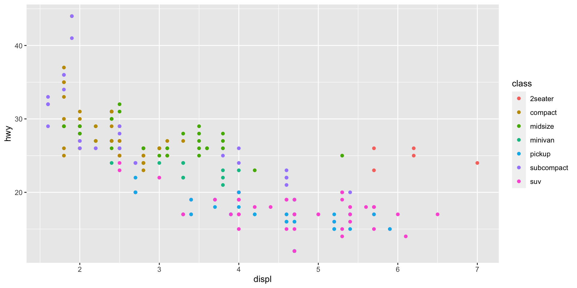
Plot Scatter2D with ggplot

Compare displacement (displ) vs highway efficiency (hwy) and color the data by vehicle class (class). Store the ggplot object in a variable.

Plot Scatter 2D with CanvasXpress

Use the ggplot object stored in the variable ‘s’ and plot with CanvasXpress

You may want to make this page somehow BIG for this demo!

  • Tooltips – Mouseover data points

  • Toolbar – Mouseover top of the plot

    Funnel & Tools

Boxplot

  • Plot with ggplot
  • Plot with CanvasXpress

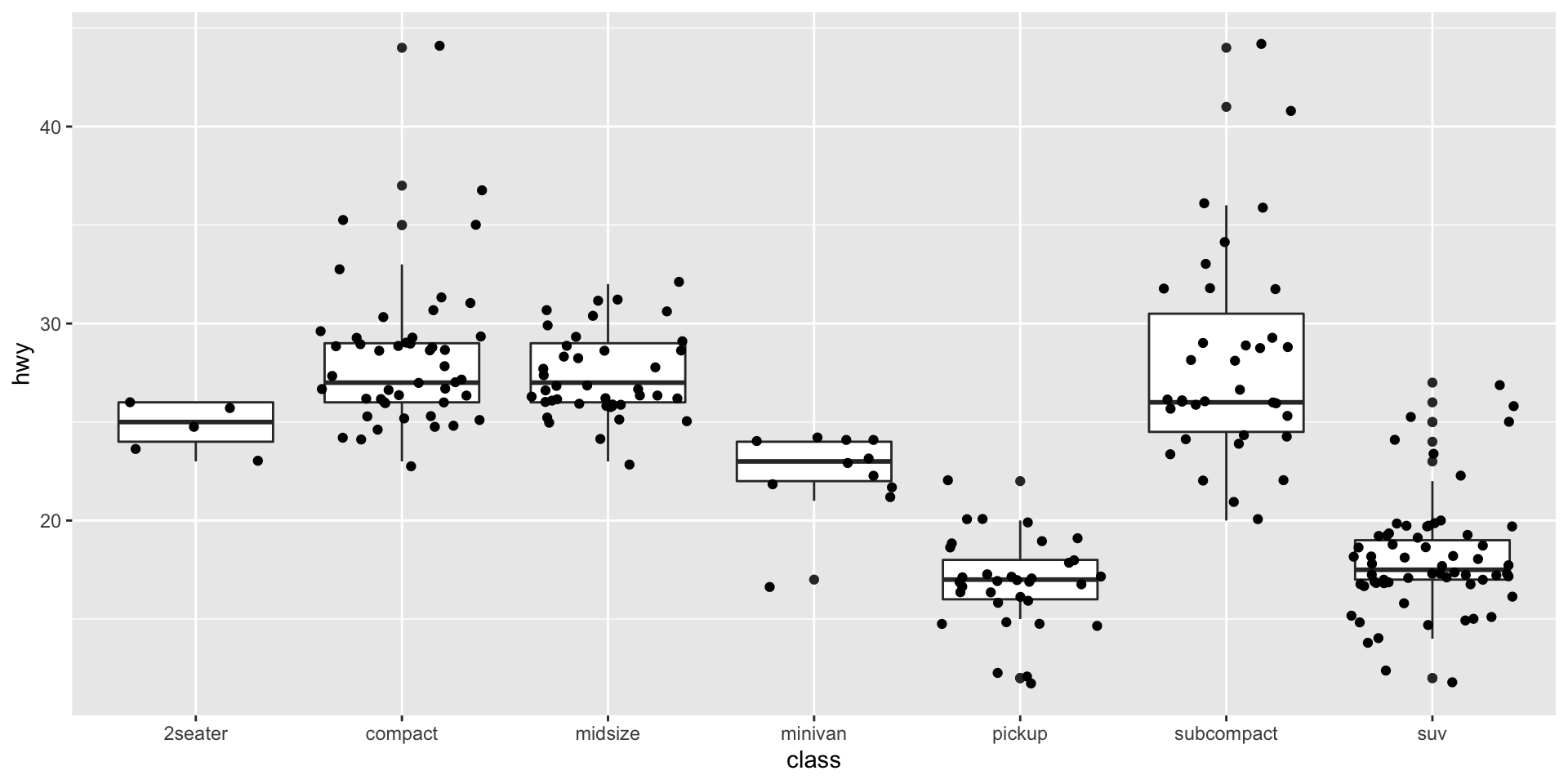
Plot Boxplot with ggplot

Look at the distribution of the highway millage (hwy) in each of the vehicle classes (class)

Plot Boxplot with CanvasXpress

Use the ggplot object stored in the variable ‘b’ and plot with CanvasXpress

Demo

  • Broadcast – Go to the Scatter 2D plot above

    1. Press ‘Shift’ and drag the mouse to select points in the vissualization (they should turn red)

    2. Go to the Boxplot visualization below and check out the selected data points!

This is something cool!

Double-Click on the image