Building Interactive Scientific Dashboards in R
A Guide to Shiny and CanvasXpress
Abstract
This paper provides a comprehensive guide to integrating the CanvasXpress JavaScript visualization library with R’s Shiny web application framework. It demonstrates how to move beyond static plots to build dynamic, professional-grade dashboards tailored for scientific data exploration. We will cover the fundamental concepts of Shiny’s reactivity, the core functions of the canvasXpress R package, and practical techniques for creating interactive applications. Through a series of examples, from basic input-driven charts to advanced linked plots and a final case study on a gene expression dataset, this guide equips R users with the skills to combine R's powerful data manipulation capabilities with CanvasXpress's sophisticated, reproducible, and interactive visualizations.
1. Introduction: The Need for Interactive Data Exploration
1.1 The Power of Interactive Dashboards
In modern data analysis and scientific communication, the static report is rapidly being replaced by the dynamic, interactive dashboard. Where a static plot presents a single, curated view of the data, an interactive application invites the user to explore, ask questions, and discover insights on their own. This shift is particularly crucial in scientific fields, where datasets are often complex and multi-dimensional, and the ability to filter, zoom, and re-aggregate data on the fly is essential for a comprehensive understanding.
1.2 Introducing the Tools
This guide focuses on two powerful tools that, when combined, provide an elegant solution for building these applications in R:
- Shiny: R’s premier framework for creating web applications directly from R code. Shiny abstracts away the complexities of web development (HTML, CSS, JavaScript), allowing data scientists and researchers to build and share powerful web apps using their existing R skills.
- CanvasXpress: A JavaScript visualization library designed specifically for the demands of scientific data. It excels at rendering large datasets, offers a vast library of over 40 chart types (including many specialized for biology and chemistry), and is built with a unique focus on full reproducibility.
1.3 The Synergy of Shiny and CanvasXpress
The synergy between these two tools is the core of this paper. Shiny provides a robust, reactive backend that allows for powerful data manipulation and analysis in R. CanvasXpress provides a sophisticated, interactive, and visually appealing frontend for data visualization. By combining them, we can create dashboards where user interactions in the browser trigger live R code on the server, with the results instantly displayed in a dynamic CanvasXpress chart.
2. Getting Started: Environment and Core Concepts
2.1 Installation and Setup
First, ensure you have the necessary packages installed from CRAN.
install.packages("shiny")
install.packages("canvasXpress")
install.packages("htmlwidgets") # Needed for JS() function
2.2 The Key Functions: canvasXpressOutput and renderCanvasXpress
The canvasXpress package provides two key functions for use with Shiny:
canvasXpressOutput(): This function is called inside theuito create a placeholder where your interactive chart will be displayed.renderCanvasXpress(): This function is used inside theserverlogic to generate and render the chart.
2.3 Your First Shiny App with CanvasXpress
The following code creates a minimal Shiny app that displays a single, non-reactive CanvasXpress scatter plot. This “Hello, World!” example is a great way to confirm your environment is working correctly.
# app.R
library(shiny)
library(canvasXpress)

# --- Data Setup ---
plot_data <- data.frame(
  expression = rnorm(100, mean = 0, sd = 1),
  proteomics = rnorm(100, mean = 2, sd = 1.5)
)
rownames(plot_data) = sample(paste0("Gene-", 1:10000), 100, replace = FALSE)
# --- End Data Setup ---

ui <- fluidPage(
    titlePanel("My First CanvasXpress Shiny App"),
    mainPanel(
        canvasXpressOutput("myScatterPlot")
    )
)

server <- function(input, output) {
    output$myScatterPlot <- renderCanvasXpress({
        canvasXpress(
            data = plot_data,
            graphType = "Scatter2D",
            title = "Expression vs. Proteomics",
            xAxis = list("expression"),
            yAxis = list("proteomics")
        )
    })
}

shinyApp(ui = ui, server = server)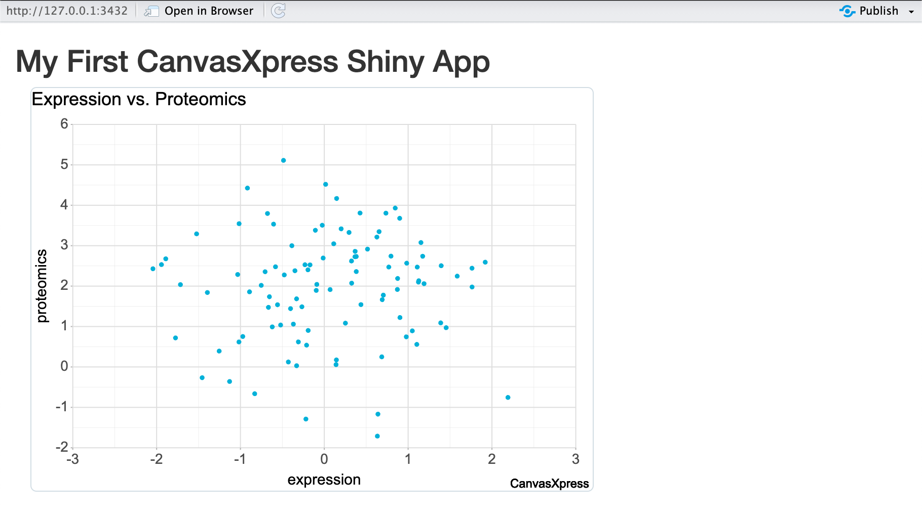
3. Unleashing Reactivity: Connecting Inputs to Visualizations
3.1 Creating a Reactive Chart
The magic of Shiny is its reactive model. When a user changes an input, any output that depends on it is automatically re-rendered. Let’s modify our app to allow the user to dynamically select which variables to plot on the X and Y axes.
# app.R
library(shiny)
library(canvasXpress)

# --- Data Setup ---
plot_data <- data.frame(
  expression = rnorm(100, mean = 0, sd = 1),
  proteomics = rnorm(100, mean = 2, sd = 1.5),
  clinical = rnorm(100, mean = 4, sd = 2)
)
rownames(plot_data) = sample(paste0("Gene-", 1:10000), 100, replace = FALSE)
# --- End Data Setup ---

ui <- fluidPage(
    titlePanel("Reactive CanvasXpress Chart"),
    sidebarLayout(
        sidebarPanel(
            selectInput("x_var", "X-Axis Variable:",
                        choices = names(plot_data), selected = "expression"),
            selectInput("y_var", "Y-Axis Variable:",
                        choices = names(plot_data), selected = "proteomics")
        ),
        mainPanel(
            canvasXpressOutput("myReactiveChart")
        )
    )
)

server <- function(input, output) {
    output$myReactiveChart <- renderCanvasXpress({
        canvasXpress(
            data = plot_data,
            graphType = "Scatter2D",
            title = paste(input$y_var, "vs.", input$x_var),
            xAxis = list(input$x_var),
            yAxis = list(input$y_var)
        )
    })
}

shinyApp(ui = ui, server = server)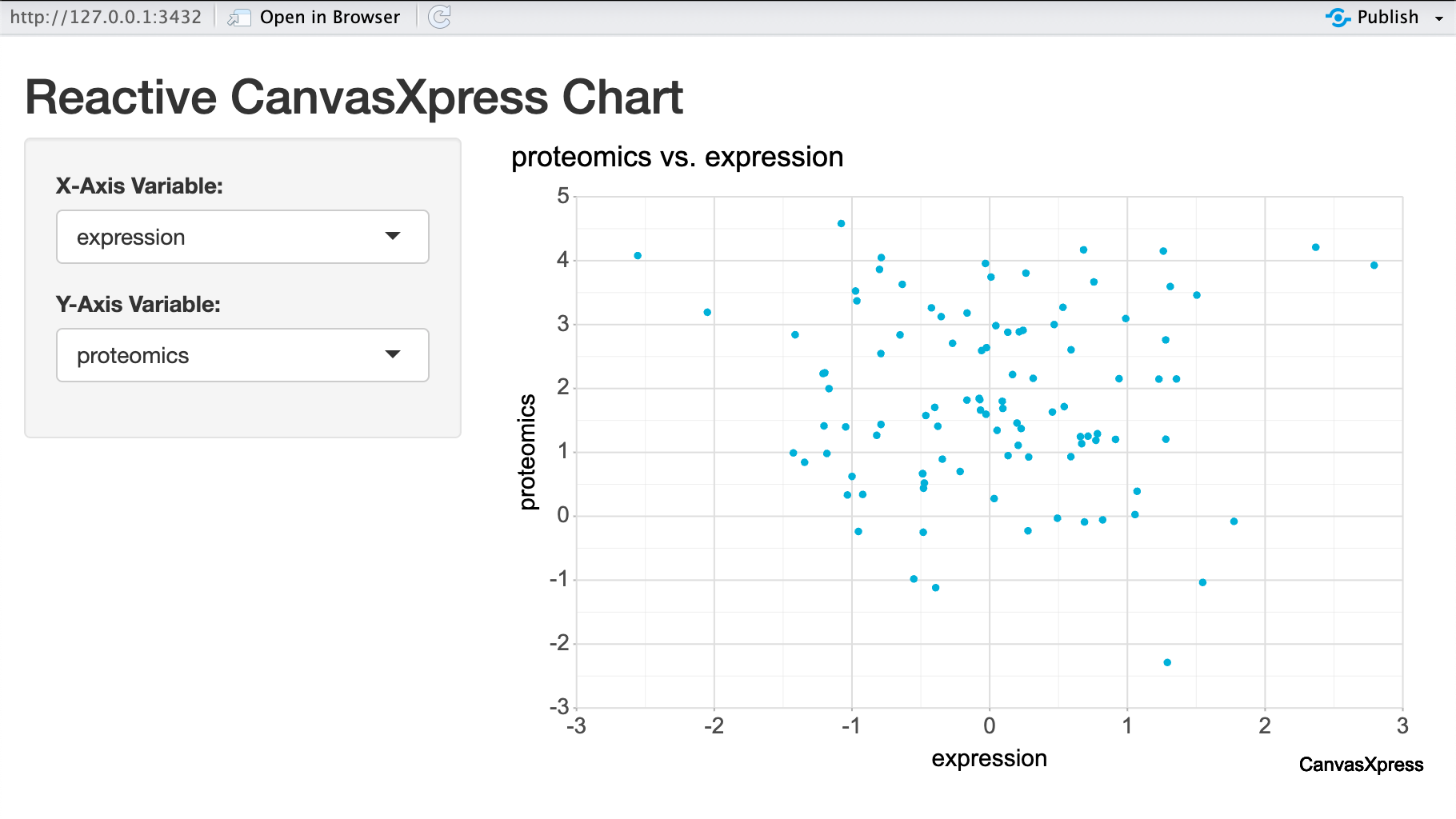
4. Advanced Techniques: Two-Way Communication and Linked Plots
4.1 Building a Drill-Down Dashboard
User interactions with a CanvasXpress chart (like clicks) can send information back to the Shiny server. This allows us to create linked plots, like a drill-down dashboard where clicking a summary bar chart updates a detail plot. To do this, we define a custom JavaScript function for the events parameter, which uses Shiny.setInputValue to send the clicked data back to the server.
# app.R
library(shiny)
library(canvasXpress)
library(dplyr)
library(htmlwidgets)

# --- Data Setup ---
plot_data <- data.frame(
  pVal = runif(n = 100, min = 0, max = 1),
  logFC = runif(n = 100, min = -3, max = 3)
)
plot_data$Group <- ifelse(plot_data[["pVal"]] <= 0.1, ifelse(plot_data[["logFC"]] >= 0, "Increased", "Decreased"), "No Change")
rownames(plot_data) = sample(paste0("Gene-", 1:10000), 100, replace = FALSE)
# --- End Data Setup ---

ui <- fluidPage(
    titlePanel("Drill-Down Dashboard"),
    fluidRow(
        column(4, canvasXpressOutput("summaryPlot")),
        column(8, canvasXpressOutput("detailPlot"))
    )
)

server <- function(input, output, session) {
    selected_group <- reactiveVal("No Change")

    observeEvent(input$summaryPlot_click, {
        clicked_group <- input$summaryPlot_click$clicked_group
        if (!is.null(clicked_group)) {
            selected_group(clicked_group)
        }
    })

    output$summaryPlot <- renderCanvasXpress({
        summary_df <- plot_data %>% count(Group) %>% as.data.frame()
        rownames(summary_df) <- summary_df$Group

        canvasXpress(
            data = t(summary_df[, "n", drop = FALSE]),
            graphType = "Bar",
            title = "Gene Groups (Click a Bar)",
            events = JS("{
                'click':
                    function (o, e, t) {
                        if (o && o.y && o.y.smps) {
                            Shiny.setInputValue('summaryPlot_click', {clicked_group: o.y.smps[0]}, {priority: 'event'});
                        }
                    }
            }")
        )
    })

    output$detailPlot <- renderCanvasXpress({
        group <- selected_group()
        data_to_plot <- plot_data[plot_data$Group == group, ]

        canvasXpress(
            data = data_to_plot,
            graphType = "Scatter2D",
            title = paste("Volcano Plot for", group, "Genes"),
            x = "logFC",
            y = "pVal",
            colorBy = "Group"
        )
    })
}

shinyApp(ui = ui, server = server)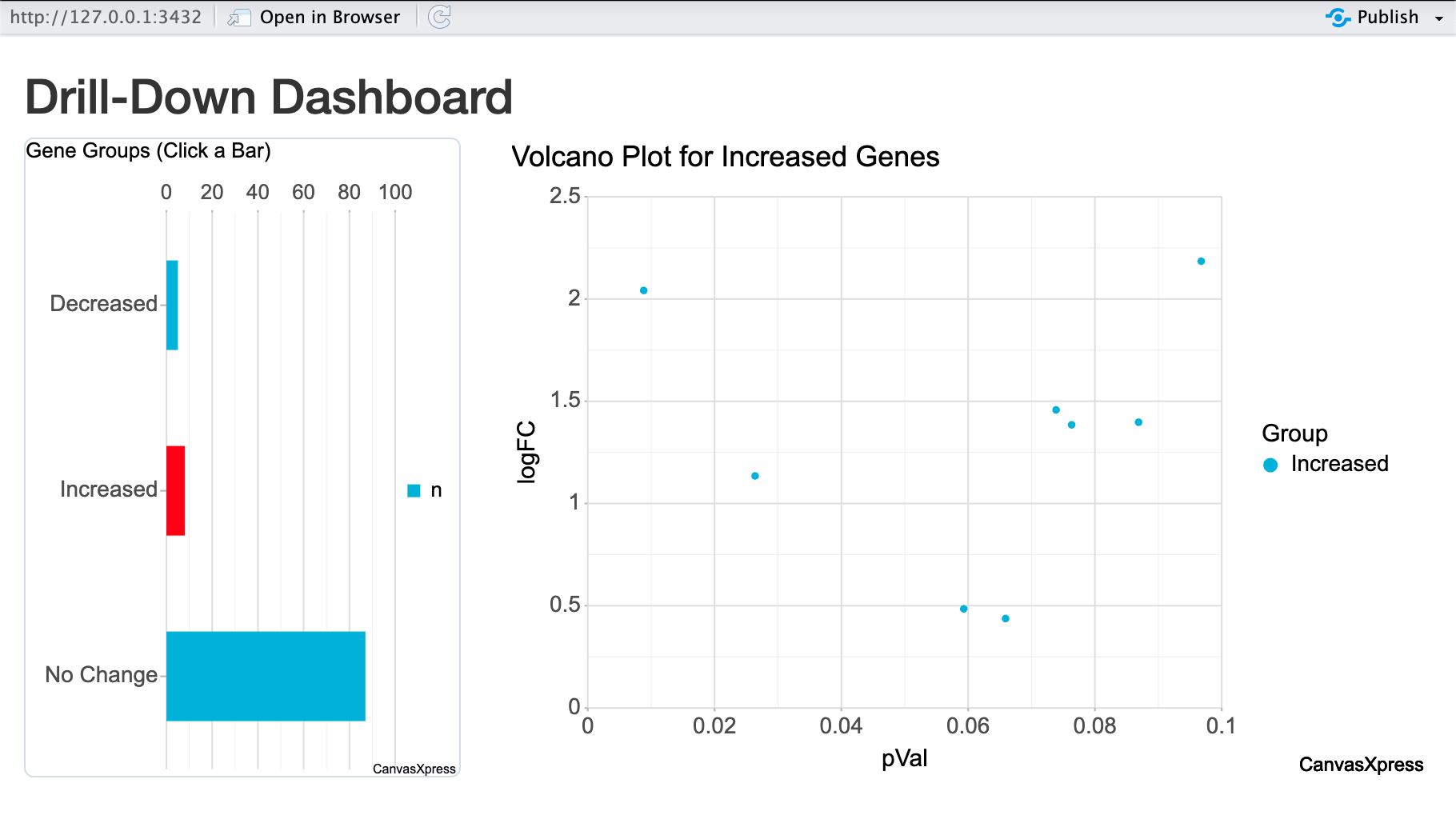
4.2 Client-Side Interactivity for Performance
For large datasets, sending data from the server for every minor change is slow. A better technique is to send the data once, then use Shiny to send small JavaScript messages to re-configure the plot in the browser, avoiding costly data transfers. This creates a hybrid model: major data changes are server-side, while minor visual tweaks are client-side.
# app.R
library(shiny)
library(canvasXpress)

# --- Data Setup ---
# (Same plot_data as previous example)
# --- End Data Setup ---

ui <- fluidPage(
    titlePanel("Client-Side & Server-Side Interactivity"),
    tags$head(
        tags$script(HTML("
            Shiny.addCustomMessageHandler('colorSelection', function(message) {
                const plotContainer = document.getElementById(message.plotId);
                if (plotContainer) {
                    const canvasElement = plotContainer.querySelector('canvas');
                    if (canvasElement) {
                        const canvas = CanvasXpress.getObject(canvasElement.id);
                        if (canvas) {
                            const val = message.color == 'None' ? false : message.color;
                            canvas.changeAttribute('colorBy', val);
                        }
                    }
                }
            });
        "))
    ),
    sidebarLayout(
        sidebarPanel(
            selectInput("xaxis_selector", "X-Axis (Server-Side):",
                        choices = c("expression", "proteomics", "clinical"), selected = "expression"),
            selectInput("yaxis_selector", "Y-Axis (Server-Side):",
                        choices = c("logFC", "pVal"), selected = "logFC"),
            selectInput("color_selector", "Color Points By (Client-Side):",
                        choices = c("None", "Group", "tissue"))
        ),
        mainPanel(
            canvasXpressOutput("myPlot")
        )
    )
)

server <- function(input, output, session) {
    output$myPlot <- renderCanvasXpress({
        canvasXpress(
            data = plot_data,
            graphType = "Scatter2D",
            title = "Hybrid Reactivity Example",
            xAxis = list(input$xaxis_selector),
            yAxis = list(input$yaxis_selector),
            events = TRUE
        )
    })

    observeEvent(input$color_selector, {
        session$sendCustomMessage(
            type = "colorSelection",
            message = list(
                plotId = "myPlot",
                color = input$color_selector
            )
        )
    }, ignoreNULL = FALSE)
}

shinyApp(ui = ui, server = server)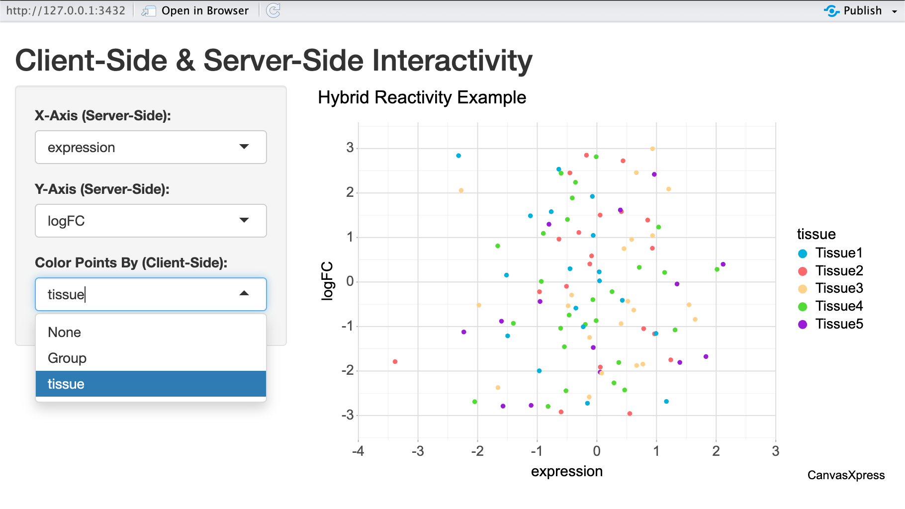
5. Case Study: An Interactive Gene Expression Explorer
To demonstrate these concepts, we will build a complete Shiny app for exploring a biological dataset. The app will allow users to select a tissue type and view a boxplot of gene expression levels for the cell lines within that tissue.
# app.R
library(shiny)
library(canvasXpress)
library(dplyr)

# --- Data Setup ---
plot_data <- data.frame(
  expression = rnorm(100, mean = 0, sd = 1),
  cellLine = sample(paste0("CellLine", 1:8), 100, replace = TRUE),
  tissue = sample(paste0("Tissue", 1:5), 100, replace = TRUE)
)
rownames(plot_data) = sample(paste0("Gene-", 1:10000), 100, replace = FALSE)
# --- End Data Setup ---

ui <- fluidPage(
    titlePanel("Gene Expression Explorer"),
    sidebarLayout(
        sidebarPanel(
            selectInput("tissue", "Select Tissue:",
                        choices = unique(plot_data$tissue),
                        selected = "Tissue1")
        ),
        mainPanel(
            canvasXpressOutput("expressionBoxplot"),
            hr(),
            dataTableOutput("filteredTable")
        )
    )
)

server <- function(input, output) {
    filtered_data <- reactive({
        req(input$tissue)
        plot_data %>% filter(tissue == input$tissue)
    })
    output$expressionBoxplot <- renderCanvasXpress({
        fdata <- filtered_data()

        # Data needs to be reshaped for boxplot
        data_for_plot <- t(fdata[, "expression", drop = FALSE])
        colnames(data_for_plot) <- rownames(fdata)

        # Annotations for grouping
        smp_annot <- fdata[, "cellLine", drop = FALSE]

        canvasXpress(
            data = data_for_plot,
            smpAnnot = smp_annot,
            graphType = "Boxplot",
            groupingFactors = list("cellLine"),
            title = paste("Expression in", input$tissue)
        )
    })
    output$filteredTable <- renderDataTable({
        filtered_data()
    })
}

shinyApp(ui = ui, server = server)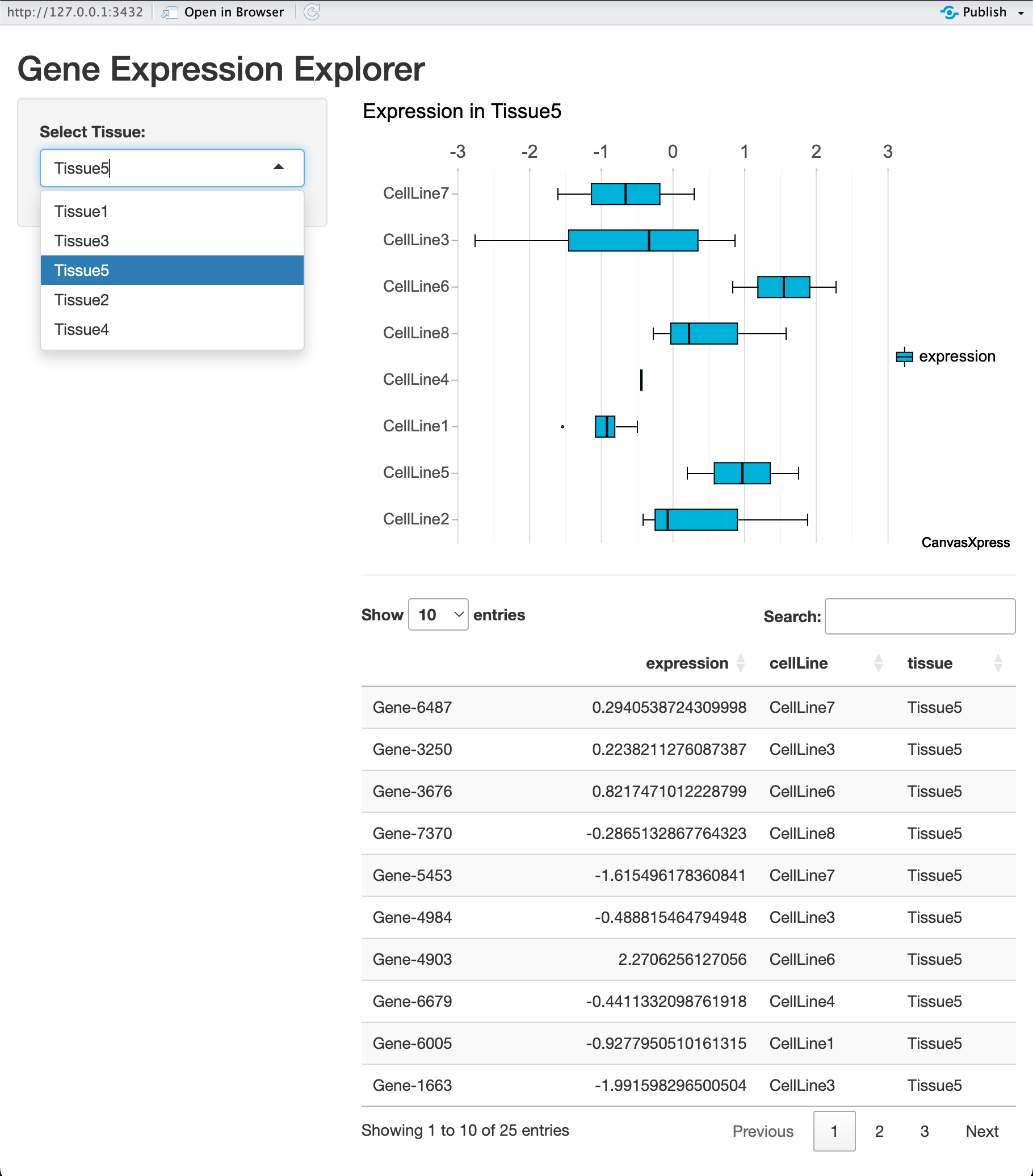
6. Conclusion and Further Resources
6.1 Summary of Key Concepts
Throughout this paper, we have demonstrated the powerful partnership between Shiny and CanvasXpress. By leveraging Shiny’s reactive backend for data manipulation and CanvasXpress’s interactive frontend for visualization, R users can build sophisticated and engaging data exploration tools without needing to become web developers. We have shown how to create reactive charts, link plots for drill-down analysis, and apply these techniques to a real-world scientific case study.
6.2 Best Practices
- Use
reactive()expressions to encapsulate data filtering logic to prevent redundant calculations. - Start with a simple, static version of your app first, then incrementally add reactivity.
- Keep the UI clean and intuitive. Don’t overwhelm the user with too many input options at once.
6.3 Next Steps
We have only scratched the surface of what is possible. The official CanvasXpress documentation is the best resource for exploring its vast library of chart types, advanced configuration options, and specialized features for scientific visualization.