Interactive Sunburst Chart for Data Analysis
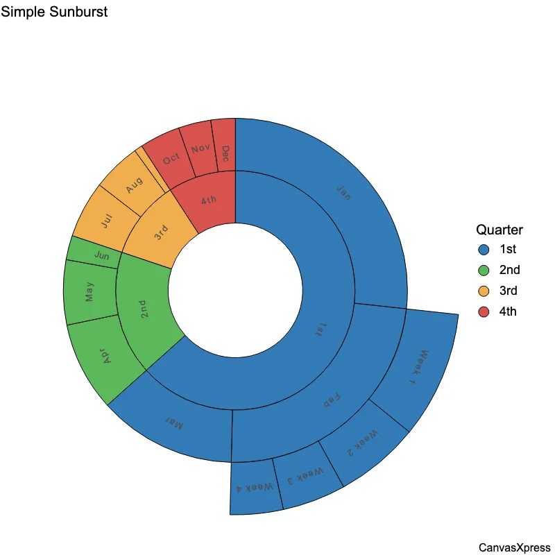
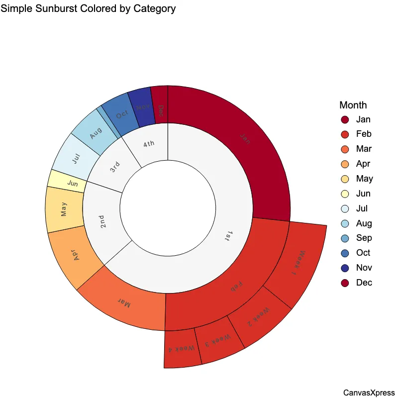
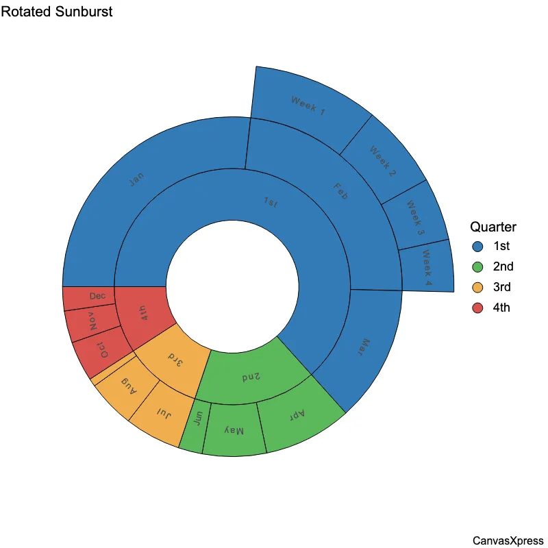
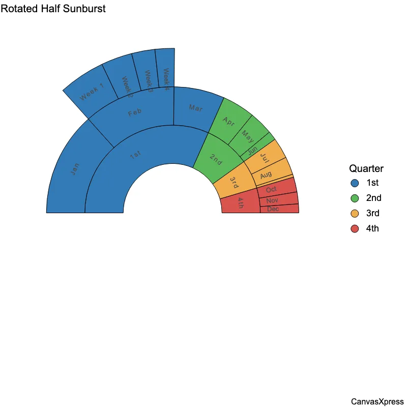
Sunburst graphs provide a hierarchical visualization of data, ideal for showcasing hierarchical structures and proportions. They are particularly useful for exploring complex datasets with nested categories, offering an intuitive way to understand the relationships between different levels. Applications range from visualizing file systems to exploring organizational structures, making them a versatile tool for data analysis and communication. Interactive sunburst charts enhance user engagement, allowing for drill-down exploration of individual segments. By combining visual appeal with interactive capabilities, these charts effectively convey intricate information in an easily digestible format. The ability to highlight specific segments and dynamically adjust the view makes sunburst graphs a powerful method for uncovering patterns and insights within hierarchical data.
<html>

  <head>
    <!-- Include the CanvasXpress library in your HTML file -->
    <link rel="stylesheet" href="https://www.canvasxpress.org/dist/canvasXpress.css" type="text/css"/>
    <script src="https://www.canvasxpress.org/dist/canvasXpress.min.js"></script>
  </head>

  <body>

    <!-- Create a canvas element for the chart with the desired dimensions -->
    <div>
      <canvas id="canvasId" width="600" height="600"></canvas>
    </div>


    <!-- Create a script to initialize the chart -->
    <script>

      // Use a data frame (2D-array) for the graph
      var data = [
        [ "Id", "Sales", "Quarter", "Month", "Week", "Color"],
        [ "Sales1", 3.5, "1st", "Jan", null, "red"],
        [ "Sales2", 1.2, "1st", "Feb", "Week 1", "blue"],
        [ "Sales3", 0.8, "1st", "Feb", "Week 2", "green"],
        [ "Sales4", 0.6, "1st", "Feb", "Week 3", "grey"],
        [ "Sales5", 0.5, "1st", "Feb", "Week 4", "red"],
        [ "Sales6", 1.7, "1st", "Mar", null, "blue"],
        [ "Sales7", 1.1, "2nd", "Apr", null, "green"],
        [ "Sales8", 0.8, "2nd", "May", null, "grey"],
        [ "Sales9", 0.3, "2nd", "Jun", null, "red"],
        [ "Sales10", 0.7, "3rd", "Jul", null, "blue"],
        [ "Sales11", 0.6, "3rd", "Aug", null, "green"],
        [ "Sales12", 0.1, "3rd", "Sep", null, "grey"],
        [ "Sales13", 0.5, "4th", "Oct", null, "red"],
        [ "Sales14", 0.4, "4th", "Nov", null, "blue"],
        [ "Sales15", 0.3, "4th", "Dec", null, "green" ]
      ];

      // Create the configuration for the graph
      var config = {
         "circularArc" : 360,
         "circularRotate" : 0,
         "circularType" : "sunburst",
         "colorBy" : "Quarter",
         "colorScheme" : "Bootstrap",
         "graphType" : "Circular",
         "hierarchy" : ["Quarter","Month","Week"],
         "objectBorderColor" : "rgb(0,0,0)",
         "showTransition" : false,
         "title" : "Simple Sunburst",
         "xAxis": ["Sales"]
      }

      // Event used to create graph (optional)
      var events = false

      // Call the CanvasXpress function to create the graph
      var cX = new CanvasXpress("canvasId", data, config, events);

    </script>

  </body>

</html>
<html>

  <head>
    <!-- Include the CanvasXpress library in your HTML file -->
    <link rel="stylesheet" href="https://www.canvasxpress.org/dist/canvasXpress.css" type="text/css"/>
    <script src="https://www.canvasxpress.org/dist/canvasXpress.min.js"></script>
  </head>

  <body>

    <!-- Create a canvas element for the chart with the desired dimensions -->
    <div>
      <canvas id="canvasId" width="600" height="600"></canvas>
    </div>


    <!-- Create a script to initialize the chart -->
    <script>

      // Create the data for the graph
      var data = {
         "x" : {
            "Color" : ["red","blue","green","grey","red","blue","green","grey","red","blue","green","grey","red","blue","green"],
            "Month" : ["Jan","Feb","Feb","Feb","Feb","Mar","Apr","May","Jun","Jul","Aug","Sep","Oct","Nov","Dec"],
            "Quarter" : ["1st","1st","1st","1st","1st","1st","2nd","2nd","2nd","3rd","3rd","3rd","4th","4th","4th"],
            "Week" : [null,"Week 1","Week 2","Week 3","Week 4",null,null,null,null,null,null,null,null,null,null]
         },
         "y" : {
            "data" : [
              [3.5,1.2,0.8,0.6,0.5,1.7,1.1,0.8,0.3,0.7,0.6,0.1,0.5,0.4,0.3]
            ],
            "smps" : ["Sales1","Sales2","Sales3","Sales4","Sales5","Sales6","Sales7","Sales8","Sales9","Sales10","Sales11","Sales12","Sales13","Sales14","Sales15"],
            "vars" : ["Sales"]
         }
      }

      // Create the configuration for the graph
      var config = {
         "circularArc" : 360,
         "circularRotate" : 0,
         "circularType" : "sunburst",
         "colorBy" : "Quarter",
         "colorScheme" : "Bootstrap",
         "graphType" : "Circular",
         "hierarchy" : ["Quarter","Month","Week"],
         "objectBorderColor" : "rgb(0,0,0)",
         "showTransition" : false,
         "title" : "Simple Sunburst",
         "xAxis": ["Sales"]
      }

      // Event used to create graph (optional)
      var events = false

            // Call the CanvasXpress function to create the graph
      var cX = new CanvasXpress("canvasId", data, config, events);

    </script>

  </body>

</html>
library(canvasXpress)
y=read.table("https://www.canvasxpress.org/data/r/cX-sunburst-dat.txt", header=TRUE, sep="\t", quote="", row.names=1, fill=TRUE, check.names=FALSE, stringsAsFactors=FALSE)
x=read.table("https://www.canvasxpress.org/data/r/cX-sunburst-smp.txt", header=TRUE, sep="\t", quote="", row.names=1, fill=TRUE, check.names=FALSE, stringsAsFactors=FALSE)
canvasXpress(
  data=y,
  smpAnnot=x,
  circularArc=360,
  circularRotate=0,
  circularType="sunburst",
  colorBy="Quarter",
  colorScheme="Bootstrap",
  graphType="Circular",
  hierarchy=list("Quarter", "Month", "Week"),
  objectBorderColor="rgb(0,0,0)",
  showTransition=FALSE,
  title="Simple Sunburst",
  xAxis=list("Sales")
)


