CanvasXpress Software Design
Visualizations optimized to enhance the user experience and facilitate data exploration.
CanvasXpress's Design Philosophy
CanvasXpress is meticulously engineered to provide a superior user experience for data visualization and exploration. Our design philosophy centers on several key principles that ensure our platform is not only powerful but also intuitive, scalable, and transparent. This page outlines the core tenets of our software design, from its responsive and interactive interface to its robust backend capabilities. Explore how CanvasXpress's thoughtful design empowers users to uncover insights from their data with confidence and ease.
Web Responsive Design
With CanvasXpress, you can create designs that are size adjustable and can be maximized to fill up your entire screen for better visualization. Now you can work smarter and easily spot trends in designs. Take, for example, these three graphs; all you need to do is hover your mouse on the graph, then click the maximize icon ![]() to zoom in and out. Press it again to reset back.
to zoom in and out. Press it again to reset back.
View
CanvasXpress provides out of the box advanced analytics features to get you up and running in no time. Get access to easy-to-use tools that let you see and understand your data. With our data filters and data tables, you can convert graphs into a data exploration framework without compromising the flow of analysis.
To use these tools, as seen in the example below, just hover your mouse over the graph and select the funnel-like icon ![]() to toggle the widgets.
to toggle the widgets.
Scalability
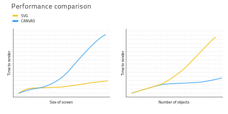
With CanvasXpress as a repository for your data, you can efficiently manage visual analysis, solve business problems, and gain insights for business growth. In contrast to other JavaScript libraries based on SVG, CanvasXpress is built on the <canvas> element fitted with innovative features that’ll take your analysis to the next level.
Here is an example of a heatmap that harbors more than a million data points.
Full Audit
Effective data visualization is key to business decision making and growth. With the CanvasXpress analytics solution, users can explore datasets without losing the original visualization due to changes in configurations. No other platform in the market has the capabilities to track and store users' progress throughout the data exploration process to provide a full audit at any point in the timeline.
This unique feature of the CanvasXpress application is a convenient tool for education and reproducible research.
The example below shows a heat map that was completely reconfigured by the user during data exploration. To return this data to its original visualization, simply hover your mouse over the heatmap and click the time-reversed icon ![]() .
.
Atomic Image
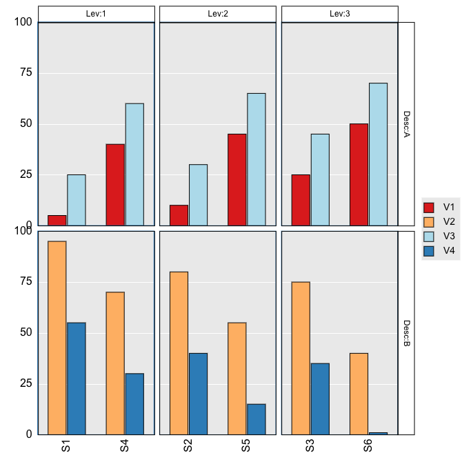
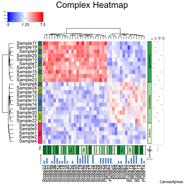
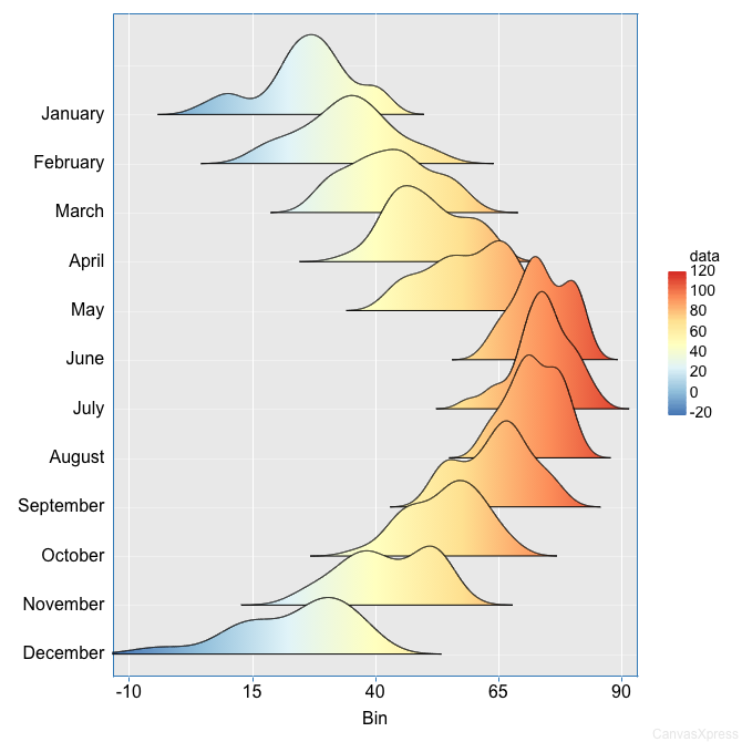
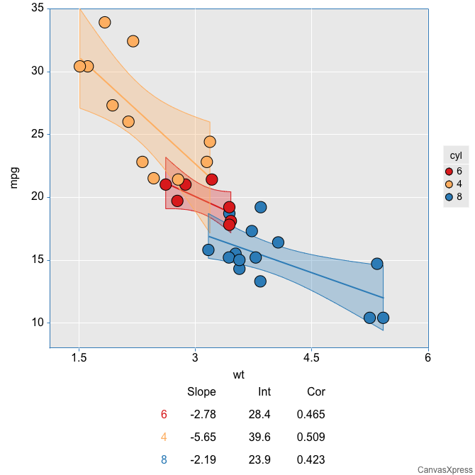
CanvasXpress is a limitless visual analytics platform, and yet another groundbreaking feature is its ability to store data and all end-user custom modifications as metadata inside the image, awesome right?
You can easily bring back the entire data stored on an image file by dragging and dropping the file on the CanvasXpress visualization interface. This distinctive feature cannot be found in any other application in the market today.
Frequently Asked Questions
What is responsive design in CanvasXpress?
Responsive design in CanvasXpress allows visualizations to automatically adjust their size to fit different screen dimensions, including a maximize feature for full-screen viewing, enhancing user experience and trend spotting.
How does CanvasXpress facilitate data exploration?
CanvasXpress provides out-of-the-box advanced analytics features like easy-to-use data filters and data tables, which enable users to see, understand, and explore their data interactively without compromising analysis flow.
Why is CanvasXpress more scalable than SVG-based libraries?
CanvasXpress is built on the HTML5 <canvas> element, which is better suited for handling large datasets (e.g., over a million data points) compared to SVG-based libraries, allowing for efficient visual analysis and business insights.
What is the 'Full Audit' feature and its benefits?
The 'Full Audit' feature in CanvasXpress tracks and stores all user progress and configurations during data exploration. This unique capability ensures reproducibility of research and provides a complete audit trail at any point in the timeline, preventing loss of original visualization due to changes.
How does the 'Atomic Image' feature work?
The 'Atomic Image' feature allows CanvasXpress to store all data and end-user custom modifications as metadata directly inside the image file. Users can easily restore the entire data and visualization state by simply dragging and dropping the image file onto the CanvasXpress interface.