CanvasXpress vs. Apache ECharts
A factual, side-by-side comparison of two JavaScript data visualization libraries.
Short answer
CanvasXpress and Apache ECharts are both JavaScript charting libraries, but they target different jobs. CanvasXpress is a self-contained visualization library built for scientific, bioinformatics, and analytical work — it ships an interactive data table, built-in statistical transforms, reproducible state, and specialized plots (heatmaps, genome browsers, Venn, circular/Circos, dendrograms) with no external dependencies. Apache ECharts is a general-purpose, business-dashboard charting library with a very large ecosystem, strong performance on standard chart types (line, bar, pie, scatter, geo/map), and broad theming. ECharts is included in the performance benchmarks — and its optimized large canvas mode is genuinely fast, which we report honestly.
Choose CanvasXpress when you need scientific or statistical plots, in-chart data exploration, or reproducible analysis. Choose ECharts when you need conventional business dashboards, geographic maps, or a large community ecosystem.
The same dataset, two libraries
To keep it fair, here is the identical dataset — quarterly revenue for three products — rendered by both libraries as a grouped bar chart.
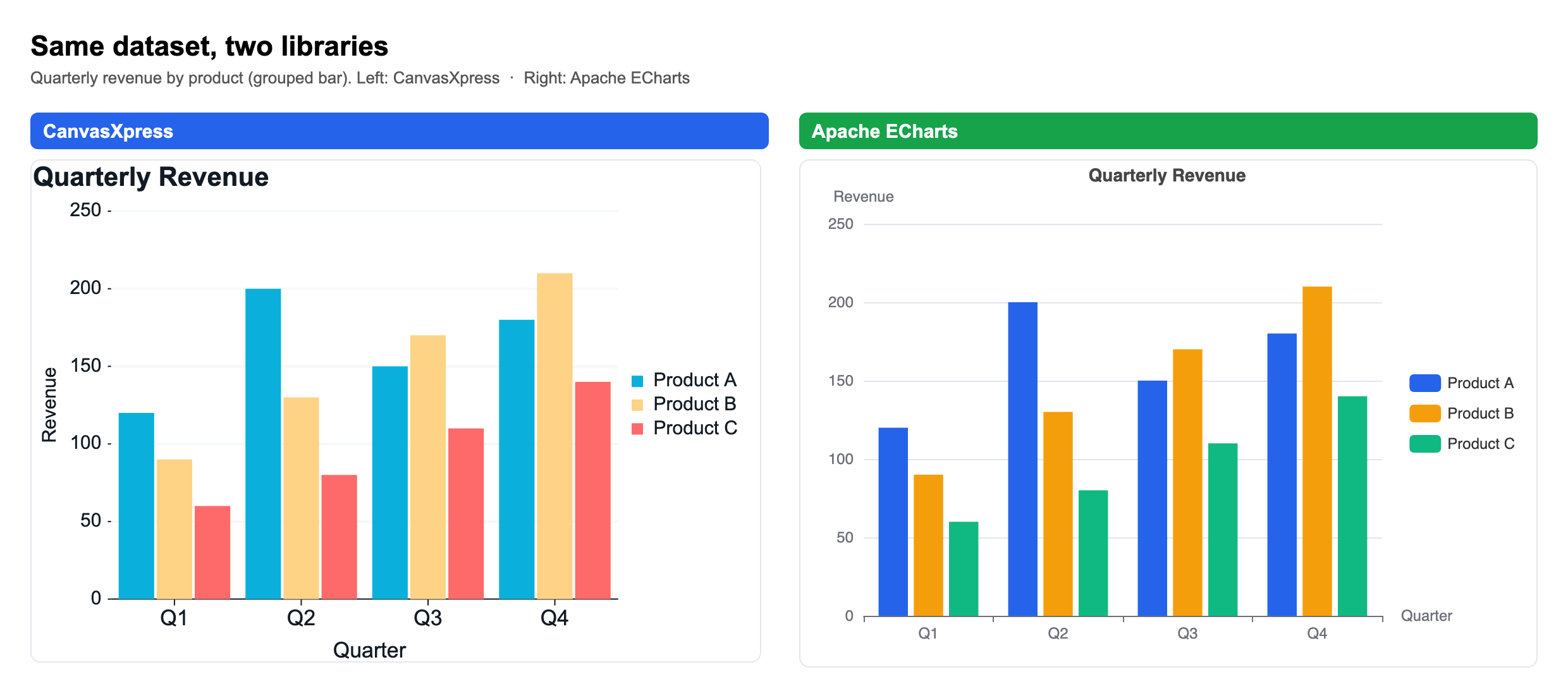
On a standard chart like this the two look nearly identical — and that is the honest truth: for line, bar, pie, and scatter, either library does the job well. The difference shows up when you leave the standard chart types behind.
At-a-glance comparison
| Dimension | CanvasXpress | Apache ECharts |
|---|---|---|
| Primary use case | Scientific, bioinformatics, statistical visualization | General-purpose / business dashboards |
| Dependencies | Zero external dependencies (self-contained) | Self-contained core; some features via extensions |
| License | Source-available; free anywhere including commercial as long as the attribution mark stays visible; commercial license removes the mark | Open source (Apache-2.0) |
| Chart types | 50+ incl. heatmap, genome browser, Circos/circular, Venn, dendrogram, boxplot, violin | 20+ standard incl. line, bar, pie, scatter, geo/map, graph |
| Built-in data table | Yes — interactive, filter/sort/exploration | No native data grid |
| Statistical transforms | Built in (clustering, regression, KDE, binning, aggregation) | Not built in (pre-compute externally) |
| Reproducibility | Full chart state serializes to a single JSON config | Config-driven; no built-in reproducible session/state export |
| R / Python integration | Native R (canvasXpress CRAN) and Python packages | Community wrappers (e.g. pyecharts) |
| Best fit | Researchers, analysts, bioinformaticians | Web developers, BI dashboards |
What each library is
CanvasXpress is a source-available JavaScript data visualization library created by Isaac Neuhaus. It renders interactive charts entirely in the browser with no external dependencies, and it is the core visualization engine used in scientific and bioinformatics platforms. Every CanvasXpress chart is defined by a single JSON configuration, which makes charts fully reproducible and shareable.
Apache ECharts is an open-source JavaScript charting library, originally developed by Baidu and now an Apache Software Foundation project. It focuses on general-purpose and business charts, offering strong theming, geographic map support, and a large community ecosystem.
Key differences
Scientific and bioinformatics charts. CanvasXpress provides specialized plots — genome browser, Circos, heatmaps with clustering, Venn diagrams, and dendrograms — out of the box. ECharts requires custom or extension work to reach these.
Built-in data table and in-chart exploration. CanvasXpress ships an interactive data table for filtering, sorting, and creating calculated and binned fields directly in the chart. ECharts has no native data grid.
Statistical transforms. CanvasXpress computes clustering, regression, KDE, and aggregation client-side. ECharts expects pre-computed data.
Reproducibility and state. A CanvasXpress chart serializes its entire state — data, layout, transforms, and selections — into one JSON configuration that reproduces the exact view.
R and Python integration. CanvasXpress has first-party R (CRAN) and Python packages. ECharts is used from Python mainly via community wrappers such as pyecharts.
Where ECharts is the stronger choice
Named plainly, so the rest of this page is credible — ECharts wins in real areas:
- Geographic and map visualization. ECharts has mature, built-in geo/map and GL globe support; CanvasXpress does not match it here.
- Very large general datasets. ECharts' incremental rendering and WebGL layer (echarts-gl) are highly optimized for large standard charts.
- Community and ecosystem. As an Apache project ECharts has a very large community, extensive theming, and many third-party extensions.
- Server-side rendering. ECharts supports SSR to SVG/canvas for fast first paint and email/report contexts.
- General business-dashboard breadth. For conventional BI charts its defaults, animations, and options are extensive and battle-tested.
CanvasXpress trades that breadth for depth in scientific and reproducible analysis: specialized bioinformatics chart types, in-chart exploration and statistics, single-JSON reproducibility, native R/Python, and an MCP server. Pick the tool whose strengths match the work.
Where each one wins
Choose ECharts when you build general business dashboards, need geographic/map charts, want the largest community ecosystem, or primarily render standard chart types.
Choose CanvasXpress when you build scientific or bioinformatics visualizations, need in-chart data exploration and statistical transforms, want fully reproducible chart state, or work primarily in R or Python.
Try it
Every example on this site runs live in the browser. Explore the examples gallery or read the full library comparisons.
