CanvasXpress UI Styles
One option restyles every widget around a chart, in light and in dark.
Introduction to UI Styles
The HTML widgets around a chart (the toolbar, context menus, the Customizer, the data table, the data filters and the dialogs) are drawn in a UI style, set with dataUIStyle. The style sets the accent colour, the bars and borders, and the table striping. It is independent of the chart theme, which styles the chart itself.
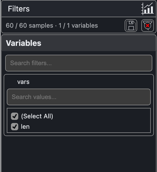
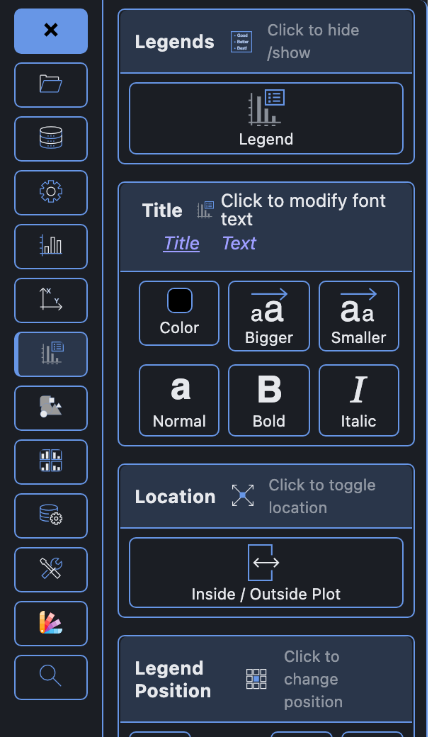
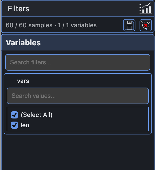
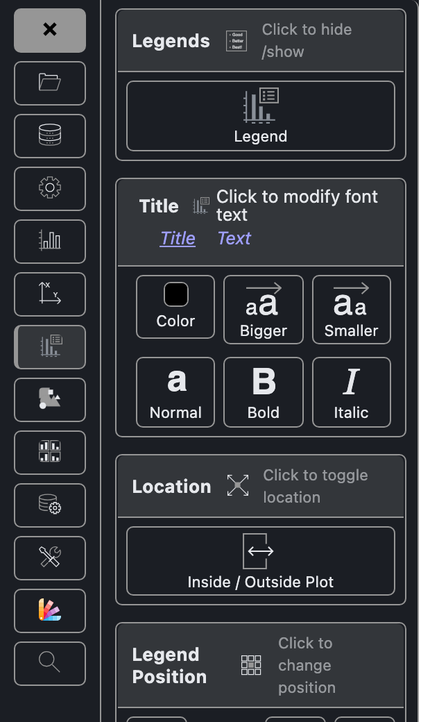
Every style has a light and a dark form. In dark, all styles share the same dark surfaces and text, and each keeps its own accent colour, lightened so it stays easy to read on a dark background. This page shows some of the built-in styles; new styles may be added over time.
Choosing a Style
Two options work together: dataUIStyle picks the style, and widgetsTheme picks light or dark.
var cX = new CanvasXpress("canvasId", data, {
  graphType: "Boxplot",
  dataUIStyle: "bms",     // the UI style (default "modern")
  widgetsTheme: "dark"    // "theme" (default), "light", "dark" or "auto"
});
widgetsTheme | Widgets are drawn |
|---|---|
theme (default) | Following the chart theme (cxdark and cxblue are dark), otherwise the page container, for example a dark dashboard |
light | Always light |
dark | Always dark |
auto | Following the operating system’s light or dark appearance |
Styles
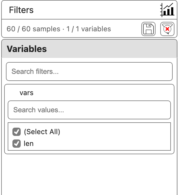
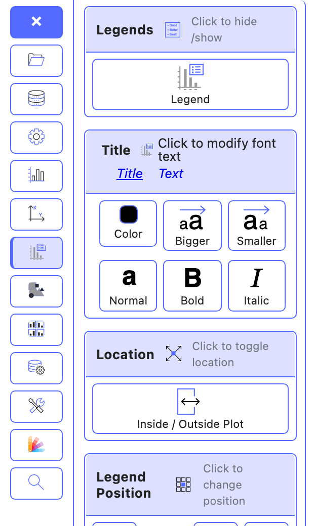
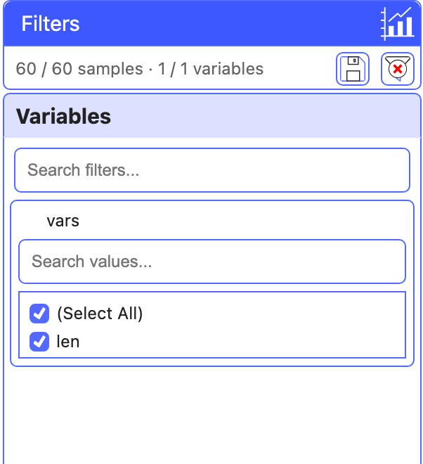
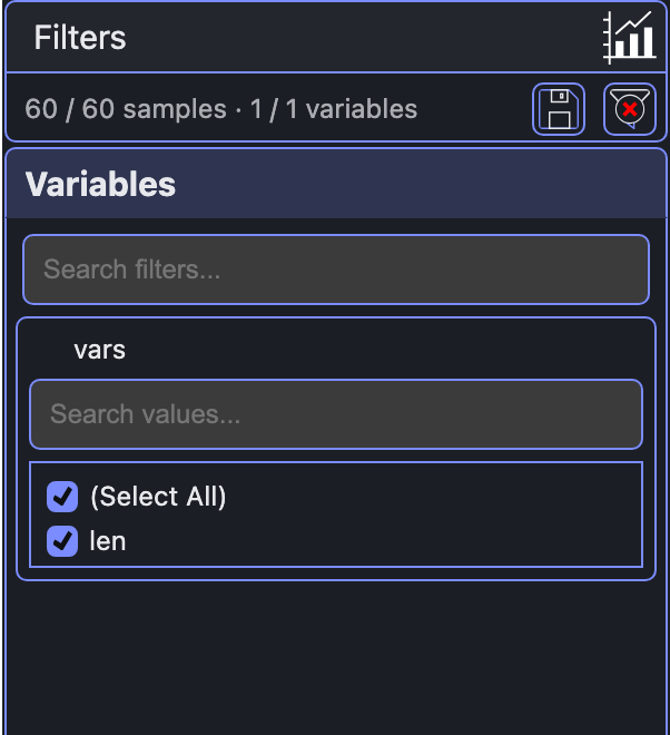
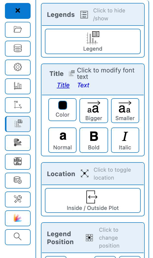
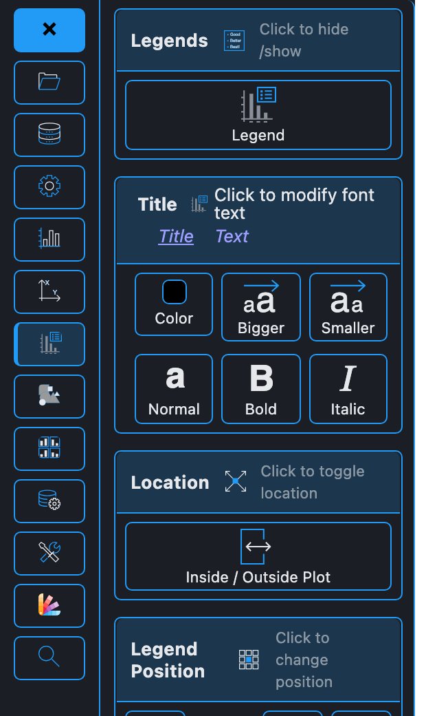
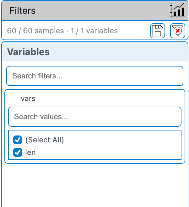
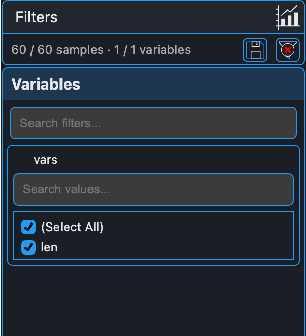
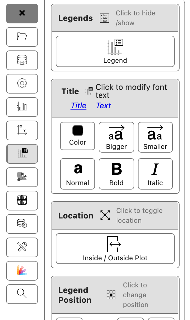
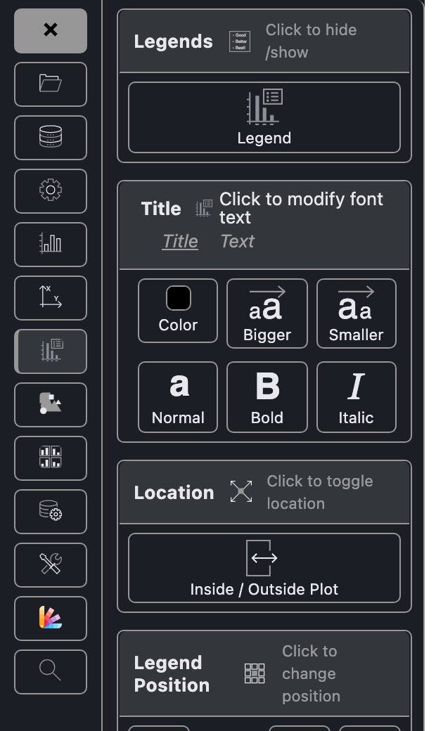
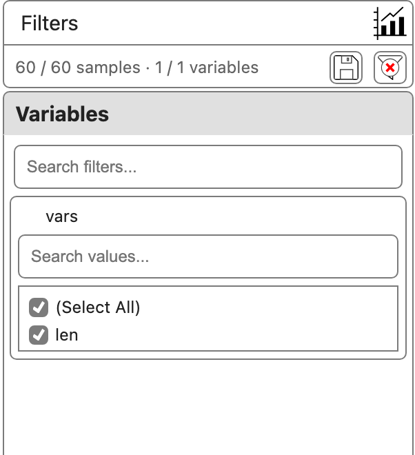
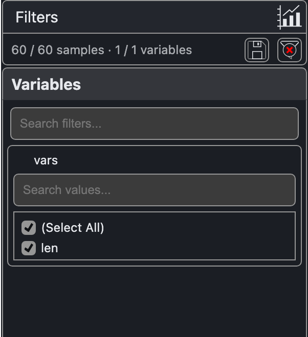
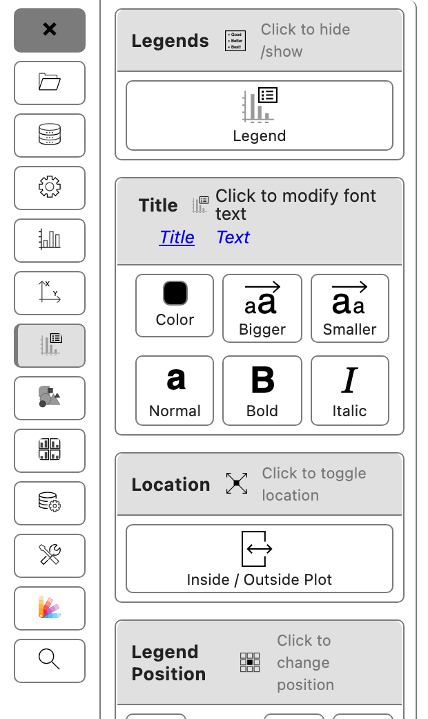
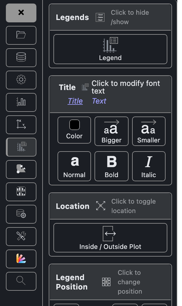
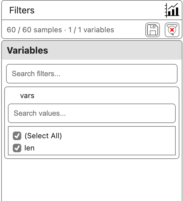
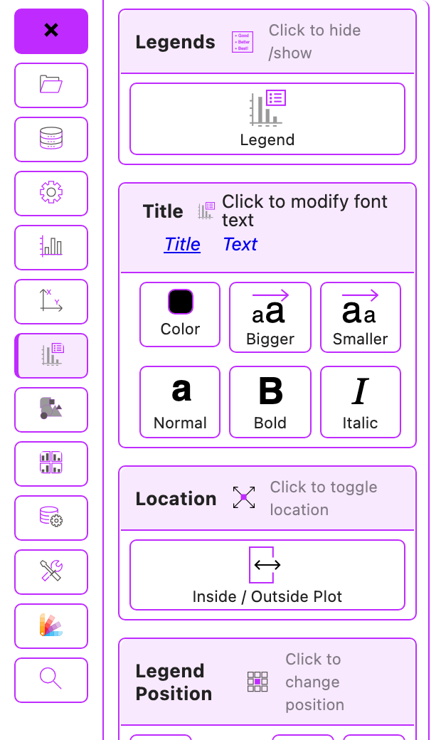
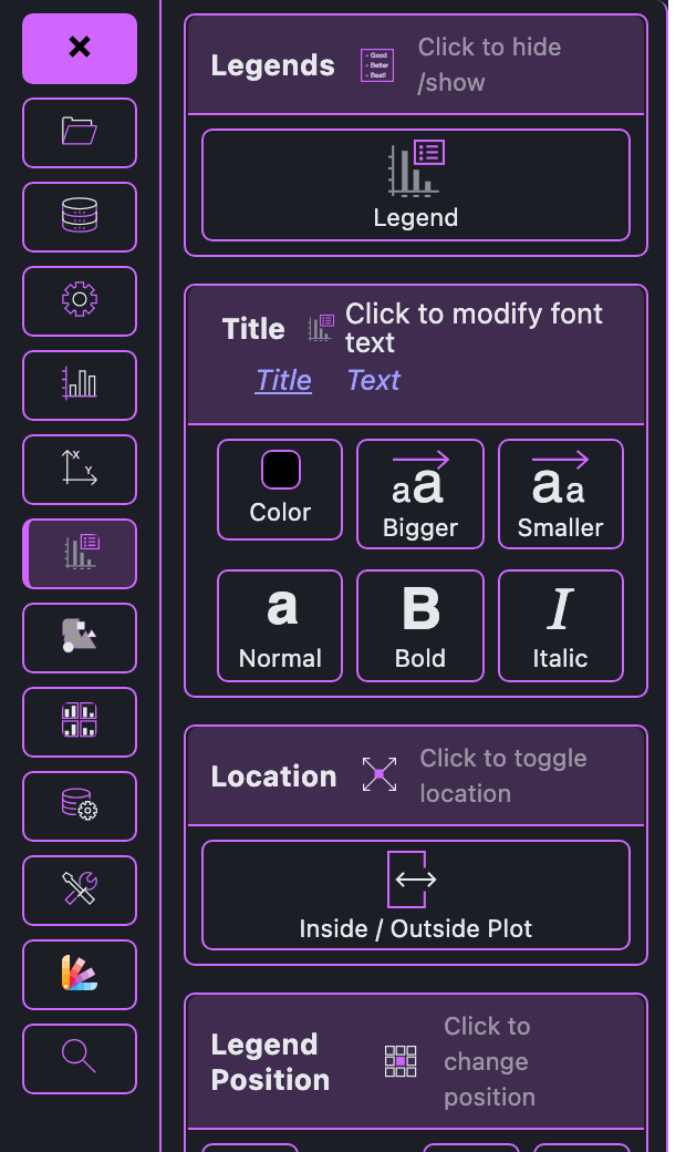
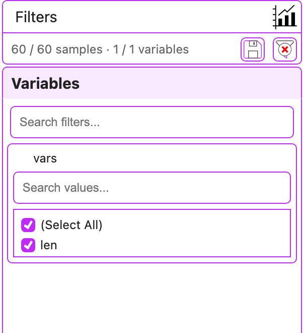
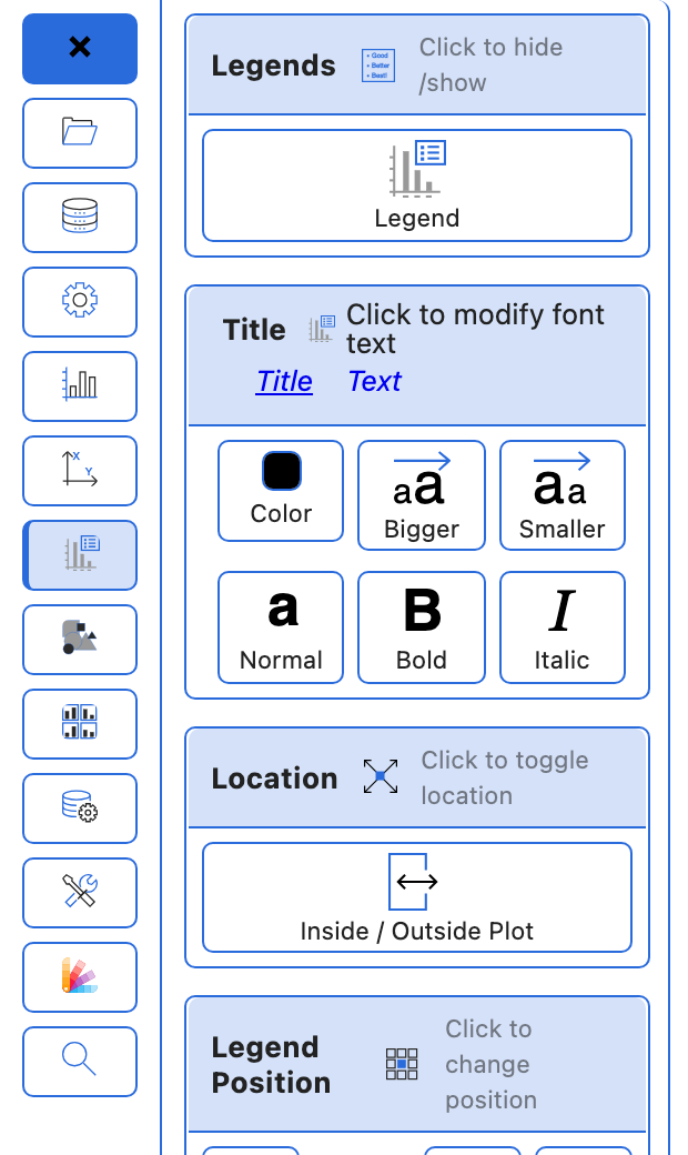
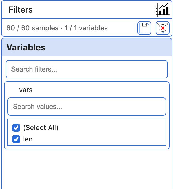
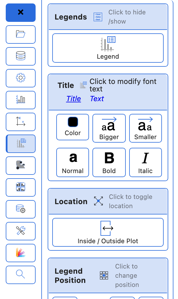
Each style shown in light and dark, side by side, in the Customizer’s Legends panel and the data filter panel. In dark, the surfaces and text are shared; the accent is each style’s own, lightened for the dark background. The neutral styles (stripped, old, ngs360) stay neutral.
modern
The default. Indigo accent with an indigo title bar on the data table and filters, and light-indigo row striping.
Customizer

Data filters
cx
CanvasXpress blue accent with a grey title bar and grey row striping.
Customizer
Data filters
stripped
Minimal and neutral: grey accent with the faintest, translucent hairlines.
Customizer
Data filters
old
Neutral grey accent; data table cells are coloured by their values.
Customizer
Data filters
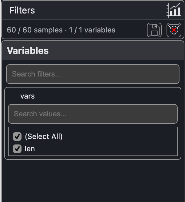
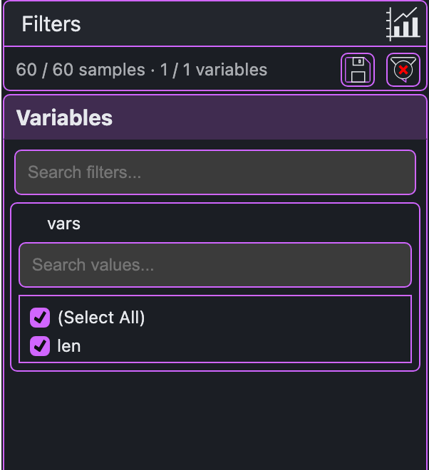
bms
Purple accent on white bars.
Customizer
Data filters
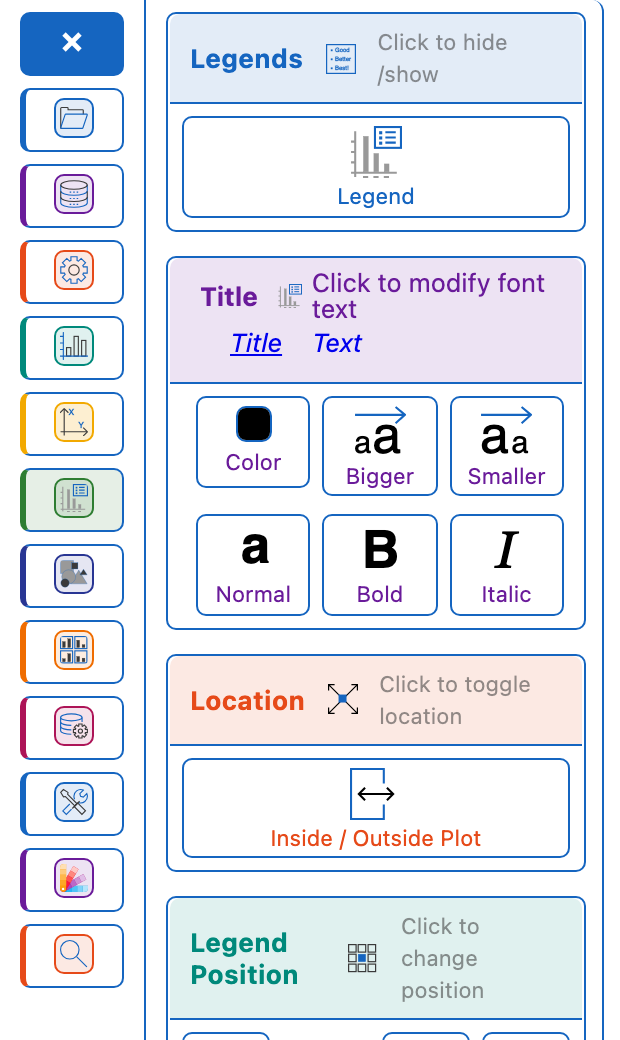
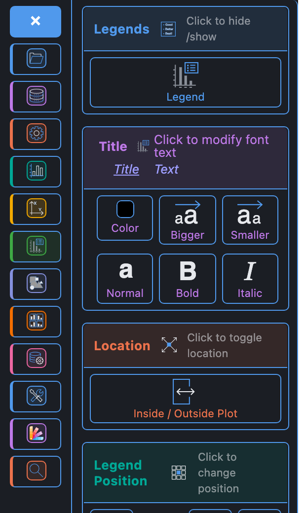
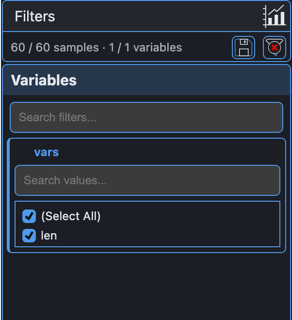
colorful
Blue base accent, and each Customizer card and filter gets its own colour from a nine-colour palette. Data table cells are coloured by value and the selected row is highlighted in amber.
Customizer
Data filters

rdc
Blue accent with light-blue row striping.
Customizer
Data filters
ngs360
Neutral grey accent, with the NGS360 logo in the data table banner.
Customizer
Data filters