By Isaac Neuhaus · September 28, 2026
Disclosure: I am the author and lead maintainer of CanvasXpress. I've tried to write the comparison I would want to read if I were choosing, including where Spotfire is clearly the better choice. If you spot something unfair or out of date, please say so in the comments and I'll correct it.
If you work in pharma, biotech or any other data-heavy science, you have almost certainly met Spotfire. It has been a fixture of R&D analytics for two decades, and for many teams it is simply "the tool we look at data in."
CanvasXpress comes from the same world. It began in pharmaceutical bioinformatics, and heatmaps, oncoprints, genome tracks and volcano plots were first-class chart types from the start. So the question comes up often: should we use CanvasXpress or Spotfire?
The short answer used to be "they're different categories of product": Spotfire is a platform and CanvasXpress is a library. That is still true of the core library. It is less true now that CanvasXpress-Dashboards exists. It is a self-hostable dashboard application built on the engine, and several of its core ideas are deliberately modeled on Spotfire's. So this comparison has two layers.
What each one is
Spotfire (now part of Cloud Software Group, formerly TIBCO) is a full analytics platform. Analysts open Spotfire Analyst, connect to data, build visualizations by drag and drop, add statistics and predictive models, and publish analyses to a Spotfire Server or Spotfire Cloud for others to use. It includes an in-memory data engine, many data connectors, scripting through TERR, R and Python data functions, streaming data support, and a long track record in regulated industries. Scientific vendors also build on it; Revvity's Signals Lead Discovery, for example, is built on Spotfire.
CanvasXpress is a visualization and analysis engine: a source-available JavaScript library with R, Python and React interfaces over the same engine. You embed it in your own web application, Shiny app, Jupyter notebook, Quarto report or pipeline. It renders 40+ chart types from one portable JSON specification. It also has a no-code interactive UI for zooming, filtering, faceting, transforming and linking charts, so the people viewing a chart can explore it without writing code.
CanvasXpress-Dashboards (MIT-licensed) is the platform layer on top of the engine. It has two parts:
- An embeddable renderer. One JSON spec describes a grid of linked charts, and it renders in any web page.
- A complete self-hosted application (one
docker compose up). It has sign-in, a no-code Builder, saved dashboards, dataset uploads and share links.
For a Spotfire user, much of it will look familiar:
- Marking across related tables. You declare relationships between data sources. Selecting rows in one chart then marks the related rows in charts built on other sources, across several hops.
- A Filters panel and filter schemes. It has checkbox lists with counts, numeric ranges and search, and named filter states you can save and switch between.
- R and Python data functions. A snippet runs over other sources on the server, and its result feeds charts like any other data source. It reruns when its inputs or parameters change.
- Joins (inner, left, right, outer) that blend sources, pushed down to the database when both sides live there.
- Live data. Charts can subscribe to streams, and parameter controls re-query the database.
- Governance. Roles, row- and column-level security, OpenID Connect single sign-on, a tamper-evident audit log, dashboard-to-dataset lineage, immutable version history, and electronic signatures aimed at 21 CFR Part 11.
- Scheduling. Data refreshes, alerts evaluated separately for each recipient (so an alert never reveals data a person isn't allowed to see), and emailed dashboard subscriptions.
- Git-native specs. Every dashboard is a versioned JSON file, and a CLI can validate, migrate and diff two versions.
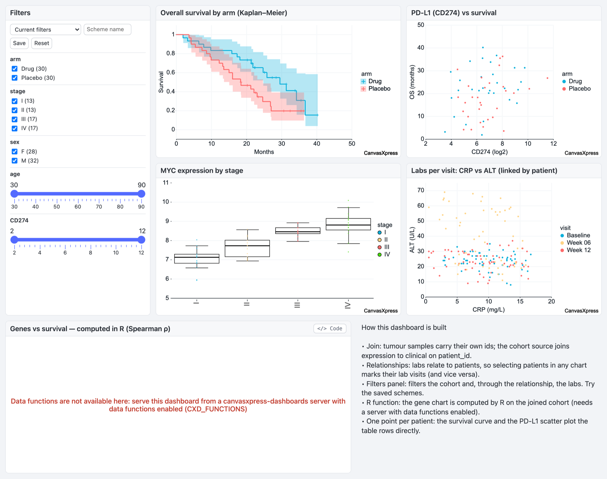
In short, Spotfire is a mature analytics platform. CanvasXpress is an engine you can embed anywhere, and CanvasXpress-Dashboards turns it into a self-hosted platform that covers much of Spotfire's dashboard workflow. It is far younger, and narrower on analytics.
Where Spotfire is stronger
These are real advantages, and they are often the deciding ones.
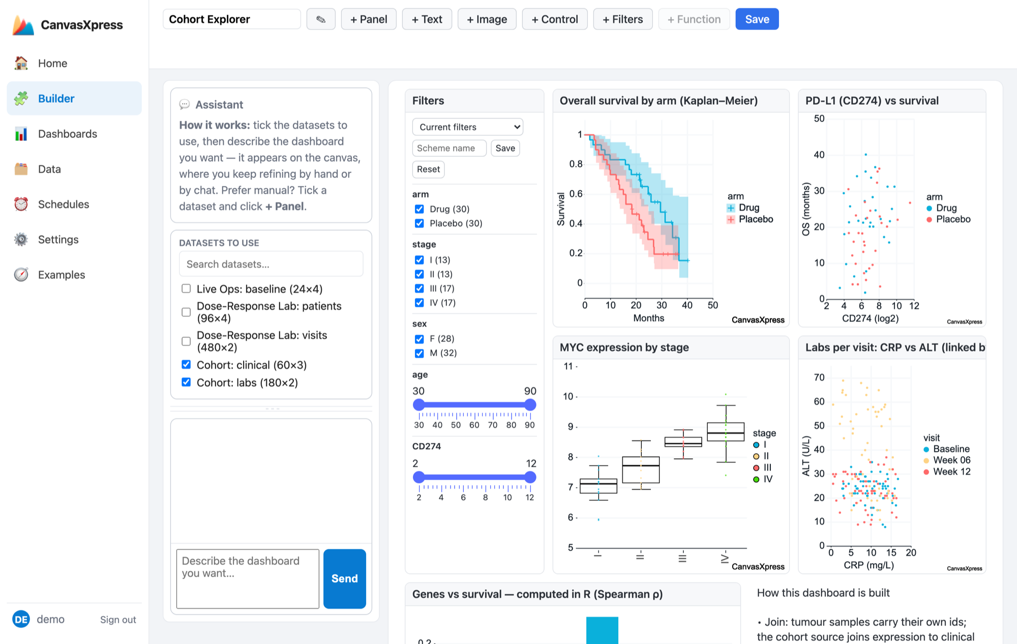
1. Depth of the analyst experience. CanvasXpress-Dashboards has a no-code Builder, so "an analyst builds a dashboard without code" is no longer only a Spotfire story. But Spotfire Analyst is a deeper tool for open-ended analysis. It offers more visualization properties, richer data-table management, more ways to transform data interactively, and years of refinement driven by exactly this kind of user.
2. In-tool statistics and predictive analytics. Spotfire ships a broad statistical and predictive toolkit. The CanvasXpress engine includes clustering (hierarchical and k-means), five regression fit types, LOESS, correlation, summary statistics, calculated fields, binning, aggregation and time-series forecasting (exponential smoothing that matches R's HoltWinters). The dashboard layer's R and Python data functions let you bring your own models. Still, Spotfire offers far more out of the box, and its TERR engine and data-function ecosystem are much more mature. CanvasXpress's function runtime is off by default. Its sandboxing is defense in depth, not a multi-tenant sandbox, and anonymous viewers of shared links cannot run functions.
3. Data connectivity and an in-memory engine. Spotfire has a wide set of native connectors and an in-memory columnar engine for fast exploration of large tables. CanvasXpress's connectors cover a smaller set (SQL via SQLAlchemy, DuckDB/Parquet, Google Sheets and a few SaaS sources). They push aggregation, filtering and joins down to the database instead of holding data in memory. That design works well, but the breadth of connectors is not comparable.
4. Real-time and streaming analytics. Both can put live streams on a chart. Spotfire goes further with mature stream analytics and monitoring. CanvasXpress appends streamed data to charts and dashboards, but it does not analyze the stream.
5. Maturity, scale and vendor support. This is the biggest honest gap. Spotfire has two decades of large deployments, validated installations in GxP environments, a professional-services ecosystem, and a vendor with support contracts and SLAs. CanvasXpress-Dashboards was first released in mid-2026 and is at version 0.10. Its governance features (row- and column-level security, SSO, audit log, e-signatures) are real, but they have not been proven over years of large enterprise deployments. The project is also maintainer-led. There is a small team of committers and a published succession policy, but it is not a large company. For many procurement processes, that alone decides it.
6. Community and vendor ecosystem. More analysts know Spotfire, more consultants sell it, more internal training material exists for it, and scientific software vendors build products on it. That is worth a lot.
Where CanvasXpress is stronger
1. Embedding, with or without a server. The engine drops into a web page, a Shiny app, a Dash or Streamlit app, a Jupyter/Colab/marimo notebook, a VS Code notebook or a Quarto document in a few lines, and it runs entirely client-side. A full dashboard spec renders the same way: no server, no per-viewer license. When you do want a server (sign-in, saved dashboards, security, scheduling), you self-host the MIT-licensed application. Embedding Spotfire means pointing an iframe or JavaScript API at a licensed Spotfire server. If charts need to live inside your application for many users, that difference dominates.
2. Code-first reproducibility, down to the dashboard. A CanvasXpress figure is a plain JSON document, and so is a whole dashboard: data bindings, layout, panels, relationships and filters. You can version it in Git, get readable structural diffs in code review, validate it against a published schema, generate it from R or Python, and re-render it identically later. Every user interaction on a chart is recorded as a replayable operation, and every dashboard save creates an immutable, hashed version. Spotfire's .dxp analysis file is a proprietary binary built around the GUI. It is powerful, but it is hard to diff, review or generate programmatically.
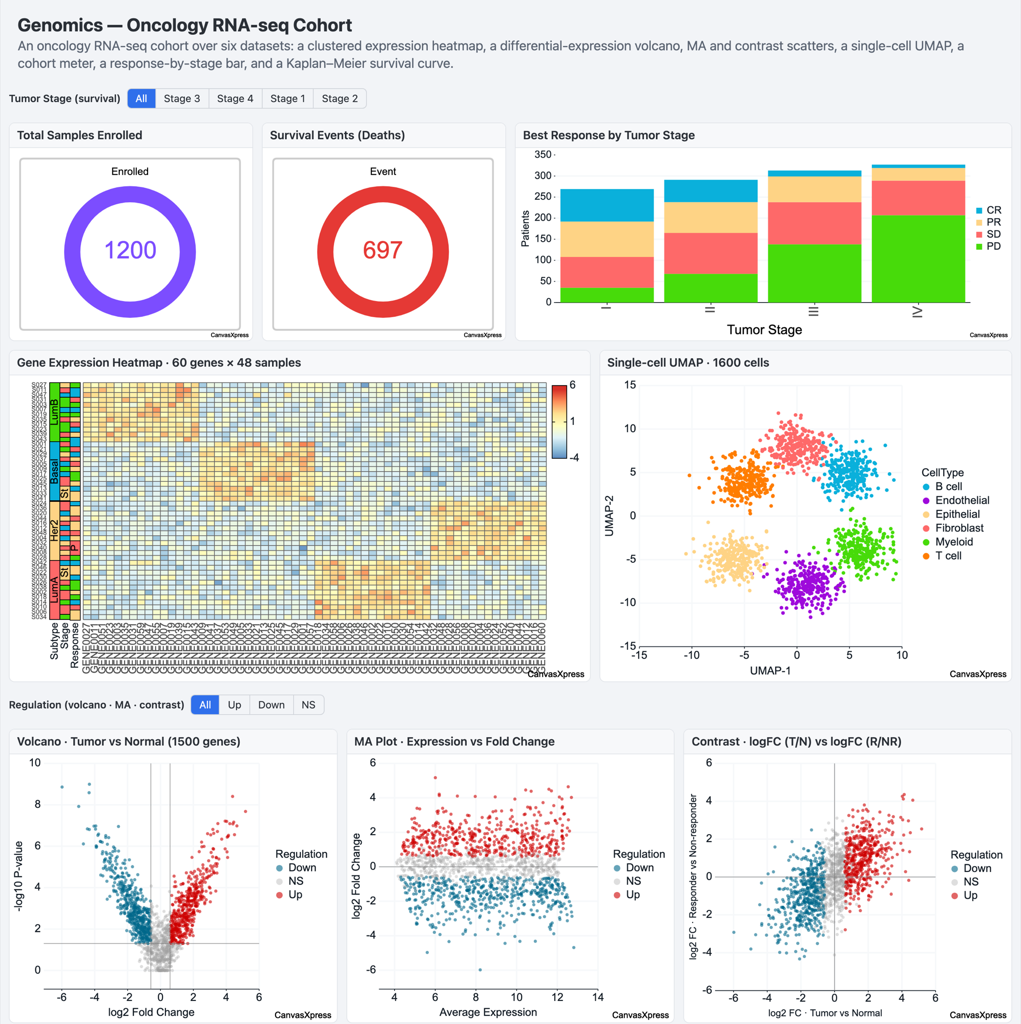
3. Scientific chart types out of the box. Heatmaps with dendrograms and side annotations, oncoprints, genome browser tracks, circular (Circos-style) plots, networks, Kaplan-Meier curves and volcano plots are built into the engine, and so they work in any dashboard panel. Spotfire can do much of this, but often through Mods, extensions, vendor add-ons or custom work.
4. R and Python workflows. CanvasXpress is on CRAN and Bioconductor (including a bridge for SummarizedExperiment objects) and on PyPI, and it can convert many ggplot2 plots into interactive charts. For a bioinformatician who lives in R or Python, making a chart interactive is one more function call, not a switch to another tool.
5. Cost structure. The CanvasXpress engine is free to use anywhere, including in commercial products, as long as its small attribution mark stays visible. A paid commercial license removes the mark. The dashboards package is MIT, the R package is GPL-3 and the Python package is MIT. Spotfire is a commercial subscription priced per user or per core. For a small team, or an application with thousands of viewers, the difference can be large. For an enterprise that already has a Spotfire agreement, it may not matter at all.
6. AI agents. CanvasXpress has a built-in AI copilot, an AI dashboard builder, and an MCP server (canvasxpress-mcp), so AI agents can create and edit figures from natural language, and it can run against a fully local model. Spotfire has its own Copilot features, which work inside the Spotfire platform. Which one matters depends on where your AI tooling lives.
Things to be clear-eyed about
- "Source-available" is not "open source." The dashboards package is MIT-licensed, but it runs on the CanvasXpress JavaScript library, which uses a community attribution license rather than an OSI-approved license. You can read, use and modify the code, but the attribution requirement is a real condition. If your organization requires OSI-licensed dependencies, check with legal first.
- Young versus proven. CanvasXpress-Dashboards covers a surprising share of Spotfire's dashboard workflow (marking, filters, data functions, joins, governance, scheduling), but at version 0.10. Pilot it before betting a regulated deployment on it.
- Browser rendering has limits. CanvasXpress renders in the browser. It handles large datasets well for a charting library (there is a public, reproducible benchmark page, including cases where other libraries win), and database pushdown keeps large tables on the server. But it is not a substitute for an in-memory analytics engine working on hundreds of millions of rows.
- Spotfire is not standing still either. It continues to add cloud, AI and Mods capabilities, and its extension model narrows some of the gaps above.
So which should you choose?
Choose Spotfire when:
- Scientists need deep, open-ended interactive analysis in a mature desktop tool, with broad built-in statistics and predictive modeling.
- You need many native data connectors, an in-memory engine for very large tables, or real-time stream analytics.
- You need a long-established, vendor-supported, validated platform, or you already have one.
- Your workflows rely on vendor applications built on Spotfire.
Choose CanvasXpress (and CanvasXpress-Dashboards) when:
- Visualization needs to live inside your own application, portal, notebook or report, or you want a self-hosted dashboard platform without per-seat licensing.
- Reproducibility matters: charts and dashboards as version-controlled, diffable JSON, with interaction replay, version history and e-signatures.
- Your team works in R, Python or JavaScript, and wants the same charts in code and in dashboards.
- You need scientific charts (heatmaps, oncoprints, genome tracks, networks) with no add-ons.
- You're comfortable adopting a young platform, and piloting it, in exchange for those benefits.
And quite often, use both. A sensible pattern is Spotfire for analysts' heavy interactive analysis, and CanvasXpress for the charts and dashboards built into internal applications, bioinformatics pipelines, notebooks and publications. They compete more than they used to, but they are still complementary more often than not.
Try CanvasXpress: canvasxpress.org. The site has a side-by-side comparison with Tableau and Spotfire, an accessibility conformance report, and reproducible benchmarks. CanvasXpress-Dashboards is npm install canvasxpress-dashboards, or docker compose up for the full app. Corrections are welcome in the comments.
Also in this series: CanvasXpress vs. Tableau · CanvasXpress vs. Plotly Dash.
