By Isaac Neuhaus · September 28, 2026
Disclosure: I am the author and lead maintainer of CanvasXpress. I've tried to write a fair comparison, including the places where Dash is clearly the better choice. If anything here is inaccurate or out of date, please say so in the comments and I'll fix it.
Dash is the default answer for a lot of Python data scientists who need to turn an analysis into a web app. You write Python, get an interactive application, and never touch JavaScript. So when people ask how CanvasXpress compares, it helps to be precise about what is being compared:
- Dash is an application framework. Its charts usually come from Plotly (plotly.js), but Dash itself is about layouts, inputs and callbacks, written in Python.
- CanvasXpress is a visualization engine with built-in exploration and cross-chart linking. CanvasXpress-Dashboards is the layer that composes those charts into dashboards, either declared in JSON or built in a no-code Builder, and optionally served by a self-hosted application.
So the fair comparison is "Dash + Plotly" versus "CanvasXpress + CanvasXpress-Dashboards." For dashboards specifically, they compete head-on. For general applications, Dash is in a different category.
What each one is
Dash (by Plotly, MIT-licensed open source) lets you build web applications entirely in Python. You describe a layout of components (graphs, dropdowns, sliders, tables, text) and wire them together with callbacks: Python functions that run on the server when an input changes and return new outputs. Charts are Plotly figures. The ecosystem includes Dash Core Components, Dash AG Grid, Dash Bootstrap Components, Dash Bio (clustergrams, Manhattan and volcano plots, Circos, sequence and molecule viewers), multi-page apps, background callbacks for long jobs, and a commercial Dash Enterprise for deployment, authentication and scaling.
CanvasXpress is a source-available JavaScript library with R, Python and React interfaces over one engine. It renders 40+ chart types from a single portable JSON specification, built on a grammar of graphics. Every chart comes with a no-code interactive UI: filtering, sorting, faceting, transforms, calculated fields, binning and aggregation, plus linked selections across charts. It runs entirely in the browser, so it drops into a web page, a notebook (Jupyter, Colab, marimo, VS Code), a Quarto report, a Shiny app, a Streamlit app, or a Dash app. It started in pharmaceutical bioinformatics, and scientific charts are first-class.
CanvasXpress-Dashboards (MIT-licensed) composes those charts into dashboards from one JSON spec: a grid layout, data bindings, and panels that coordinate automatically. Much of what you would write as Dash callbacks is declared instead:
- Cross-filtering and marking. Selections link charts, including charts on different data sources through declared relationships.
- Filter controls. A Filters panel with counts, ranges and saved filter states, plus dropdown, radio or slider controls that filter every chart.
- Parameter controls that re-query a database and refresh the charts bound to it.
- Config controls that change a chart's settings live.
- Joins that blend sources.
- R or Python data functions that run on the server and feed charts like any other source.
- Live streams that append to charts.
The spec renders in any page with no server. For a full application, the bundled self-hosted server (one docker compose up) adds sign-in, a no-code Builder, an AI builder, saved and shared dashboards, dataset uploads, roles, row- and column-level security, OpenID Connect single sign-on, an audit log, version history and scheduled refreshes, alerts and email subscriptions.
The same dashboard, built both ways
To make this concrete, I built the same small dashboard in each tool from the same public dataset (Gapminder 2007, which ships with Plotly): a continent filter, a GDP-versus-life-expectancy bubble chart, and life expectancy by continent.
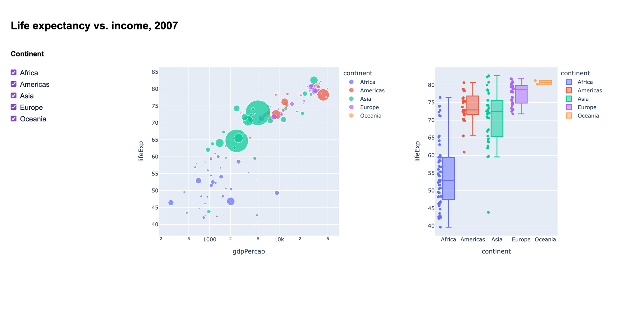
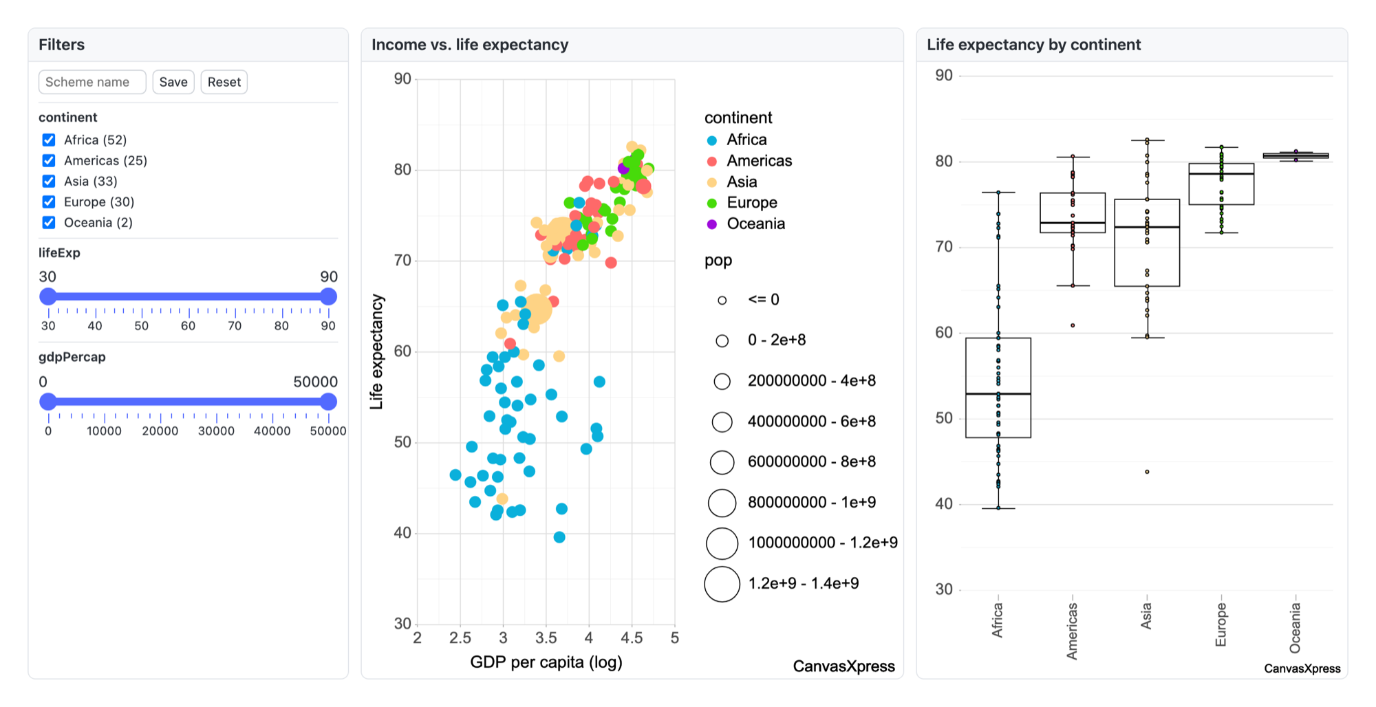
Two things the pictures show honestly. Dash took more code, but it gave me complete control over what each interaction does. With default settings, Plotly also drew two parts better in this example: its bubble sizes read more clearly, and its log axis shows real values (1,000, 10k) where CanvasXpress shows exponents (2 to 5). Both apps' sources are linked at the end, so you can reproduce the comparison.
Where Dash is stronger
1. General-purpose applications in pure Python. This is Dash's core strength, and here CanvasXpress does not compete. Forms, multi-step workflows, a button that trains a model and shows the result, custom pages driven by URL parameters, arbitrary logic on every interaction: Dash callbacks can do anything Python can do. CanvasXpress-Dashboards can do a great deal within a dashboard, but it is not a framework for building arbitrary applications.
2. Unlimited server-side logic. In Dash, any interaction can run any Python on the server. CanvasXpress-Dashboards covers the common dashboard cases:
- A parameter control can re-query a database.
- Joins and aggregations can be pushed down to the database.
- An R or Python data function can recompute a source when its inputs or parameters change.
That is a structured subset, not general callbacks. Its function runtime is also off by default, is sandboxed as defense in depth (not a multi-tenant sandbox), and is not available to anonymous viewers of shared links. If your app needs bespoke Python behind every click, Dash is the natural fit.
3. Truly open source. Dash and Plotly are MIT-licensed. CanvasXpress-Dashboards is MIT too, but it runs on the CanvasXpress JavaScript library, which is source-available under a community attribution license. It is free to use anywhere, including commercially, but its small attribution mark must stay visible unless you buy a commercial license. If your organization requires OSI-approved licenses for the whole stack, Dash passes that check and CanvasXpress does not.
4. Community, ecosystem and maturity. Plotly and Dash have a very large user base, a busy community forum, a lot of Stack Overflow answers, many third-party component libraries, and years of production use. They show up in countless tutorials and courses, and AI coding assistants have seen enormous amounts of Dash code. CanvasXpress is maintainer-led, with a small group of committers and a published succession policy. CanvasXpress-Dashboards was first released in mid-2026 and is at version 0.10. The difference in ecosystem size and track record is large and it matters.
5. Large-data rendering for some chart types. Plotly's WebGL traces (such as scattergl) handle very large point clouds well. CanvasXpress renders to HTML5 Canvas and does well for a charting library (its public, reproducible benchmarks compare it with Plotly's SVG and WebGL renderers and show where each one wins), but for some large-scatter cases WebGL has the edge.
6. A vendor-supported enterprise path. Dash Enterprise gives companies a commercially supported way to deploy, authenticate and scale apps, backed by Plotly. The CanvasXpress-Dashboards server has comparable governance features, but not a vendor support contract or a long deployment record behind them.
Where CanvasXpress is stronger
1. Linked, explorable dashboards with little or no code. In Dash, most interactivity beyond Plotly's built-in zoom, pan, hover and select is code you write and maintain: a callback to filter, another to cross-filter between charts, another to sync selections, more for a filter panel. In CanvasXpress, every chart already lets the end user filter, sort, facet, transform, add calculated fields, bin and aggregate. In CanvasXpress-Dashboards, cross-filtering, marking across related sources, filter panels and saved filter states are a few lines of JSON, or a few clicks in the Builder. For exploratory data dashboards, that removes most of the plumbing, and a non-programmer can build and change them.
2. No server required, until you want one. A CanvasXpress chart or a whole CanvasXpress dashboard can be a static HTML file, a notebook cell or a report, and it stays fully interactive when emailed, archived or hosted on a static site. A Dash app always needs a running Python server for its callbacks. (Plotly figures can be exported to standalone HTML, but you lose the Dash layer when you do.) When you want sign-in, sharing, security and scheduling, the self-hosted CanvasXpress-Dashboards server adds them without you writing an app.
3. Governance built in rather than built by you. Out of the box, the CanvasXpress-Dashboards server includes:
- roles and row- and column-level security;
- OpenID Connect single sign-on and a tamper-evident audit log;
- dashboard-to-dataset lineage;
- immutable version history with electronic signatures aimed at 21 CFR Part 11;
- scheduled refreshes, alerts evaluated separately for each recipient's permitted data, and emailed subscriptions.
With open-source Dash, you would assemble most of this yourself or get parts of it through Dash Enterprise.
4. Reproducibility and an audit trail. A CanvasXpress chart and a CanvasXpress dashboard are both portable JSON documents. They are versionable, diffable (a CLI produces readable structural diffs for code review), validated against a published schema, and re-renderable identically from R, Python or JavaScript. Every user interaction on a chart is recorded as a replayable operation. A Dash app is reproducible as code, but the interactive session (what a user filtered and in what order) is not recorded unless you build that yourself. For regulated or publication work, that difference counts.
5. Scientific chart types in the core engine. Clustered heatmaps with dendrograms and annotations, oncoprints, genome browser tracks, circular plots, networks, Kaplan-Meier curves and volcano plots are native. To be fair, Dash Bio covers a good part of this list for Dash users. The difference is that in CanvasXpress these charts share one engine, one spec and one exploration UI, work in any dashboard panel, and behave the same way in R, Python and JavaScript.
6. R users are first-class. CanvasXpress is on CRAN and Bioconductor, with the same engine as the Python and JavaScript versions, and it can convert many ggplot2 plots into interactive figures. Dashboard data functions can be written in R as easily as Python. Dash is overwhelmingly a Python ecosystem. Plotly has R bindings, and there is a Dash for R, but most of the community and development energy is in Python.
7. AI agents. CanvasXpress ships a built-in AI copilot, an AI dashboard builder and an MCP server, so agents can create and edit figures from natural language against a validated spec. It can also run against a fully local model with outbound AI calls turned off. Plotly has been adding its own AI-assisted app-building tools, and assistants generate Dash code very well because there is so much of it in their training data. Which suits you depends on whether you want agents writing code or editing a dashboard specification.
You can use them together
Dash and CanvasXpress are not mutually exclusive. There is an MIT-licensed canvasxpress-dash package:
from dash import Dash, html
from canvasxpress_dash import CanvasXpress

app = Dash(__name__)
app.layout = html.Div([
    CanvasXpress(
        data={"y": {"vars": ["Revenue"], "smps": ["Q1", "Q2", "Q3", "Q4"],
                    "data": [[10, 14, 9, 17]]}},
        config={"graphType": "Bar", "title": "Quarterly Revenue"},
        height=420,
    ),
])
app.run(debug=True)
To be clear about its current limits: the component renders the chart inside an iframe. A Dash callback can regenerate the chart with new data or config, but clicks and selections inside the CanvasXpress chart do not currently flow back into Dash callbacks. For now it works best as "a rich, self-contained scientific chart in a Dash layout," not as a fully callback-wired Dash graph.
Things to be clear-eyed about
- Framework versus declarative dashboards. If you need an application with arbitrary logic, Dash is the framework. If you need dashboards, CanvasXpress-Dashboards gets you linked, governed, explorable dashboards with far less code, but within the limits of what its spec can declare.
- License. MIT (Dash/Plotly) versus MIT dashboards on a source-available engine with an attribution condition (CanvasXpress JS). The CanvasXpress R package is GPL-3 and the Python package is MIT, but all of them load the JS library under its own license.
- Young versus proven. CanvasXpress-Dashboards is at version 0.10. Dash has years of production use.
- Ecosystem size. You will find far more answers, examples and people who already know Dash.
- Canvas versus WebGL. CanvasXpress is fast, but for very large scatter plots, Plotly's WebGL traces may win.
So which should you choose?
Choose Dash when:
- You are building a general application: forms, workflows and custom Python logic behind interactions.
- You need behavior that goes beyond what a dashboard spec can declare.
- You need an MIT-licensed stack end to end, or the Plotly/Dash community, maturity and ecosystem matter most.
- You want a vendor-supported deployment path (Dash Enterprise).
Choose CanvasXpress (and CanvasXpress-Dashboards) when:
- You need linked, explorable dashboards (cross-filtering, marking, filter panels, joins) without writing and maintaining callbacks, or built by non-programmers in a no-code Builder.
- Dashboards must work with no server (static HTML, notebooks, reports, archived supplements), or on a self-hosted server with SSO, row-level security, audit and scheduling included.
- Reproducibility matters: charts and dashboards as JSON specs, with interaction replay and version history.
- Your team uses R as much as Python, or needs scientific charts with one consistent engine across languages.
- You're comfortable adopting, and piloting, a young platform.
Or combine them: Dash for the application shell and custom server logic, with CanvasXpress charts embedded where a self-contained, highly interactive scientific figure is the right tool.
Try CanvasXpress: canvasxpress.org. The site has a side-by-side comparison with Plotly, reproducible benchmarks against Plotly's SVG and WebGL renderers, and an accessibility conformance report. CanvasXpress-Dashboards is npm install canvasxpress-dashboards, or docker compose up for the full app. The Dash component is pip install canvasxpress-dash. The two Gapminder apps shown above are at gapminder-dash-app.py, gapminder-canvasxpress.html and gapminder.json. Corrections are welcome in the comments.
Also in this series: CanvasXpress vs. Spotfire · CanvasXpress vs. Tableau.
