Master Data Visualization with Dot Plots
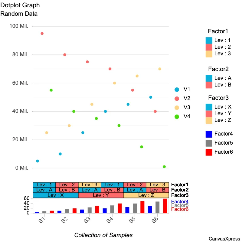
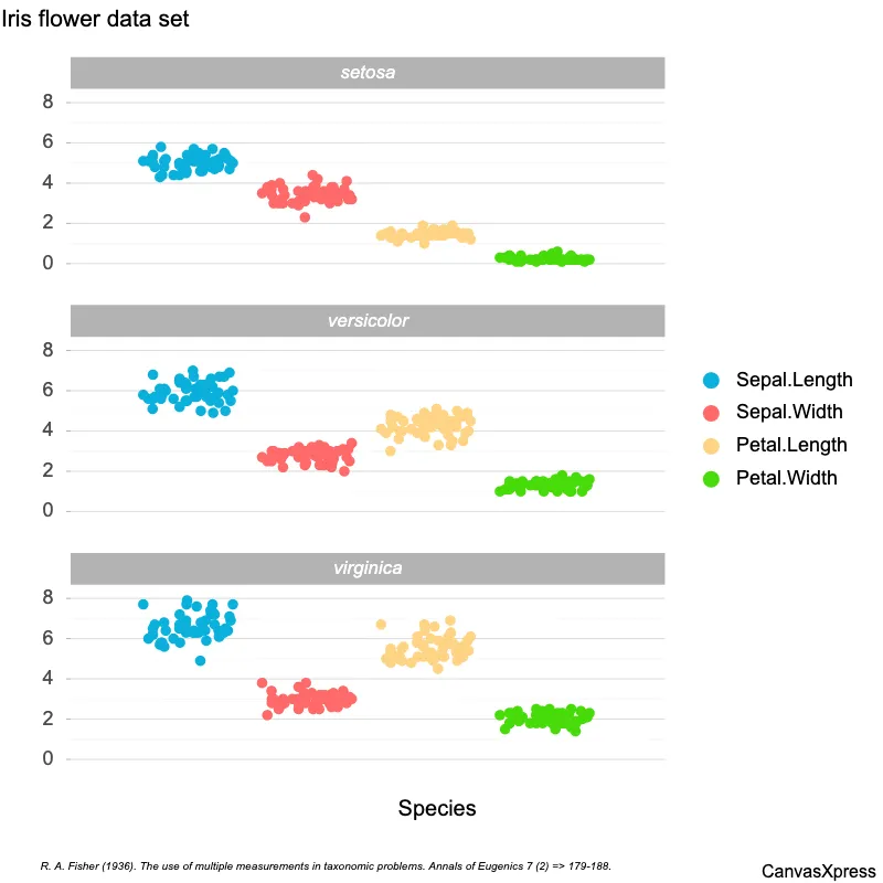
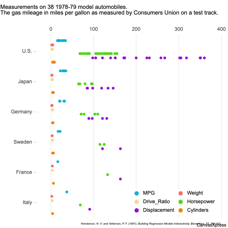
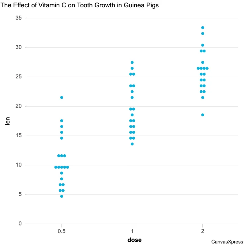
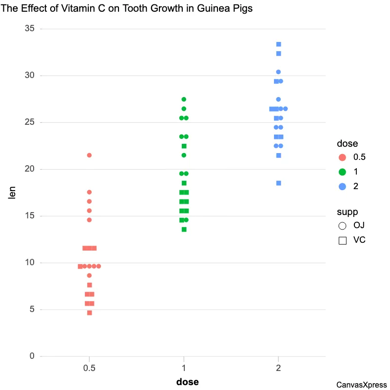
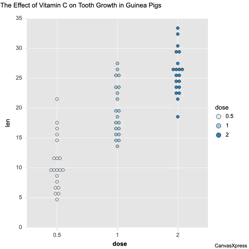
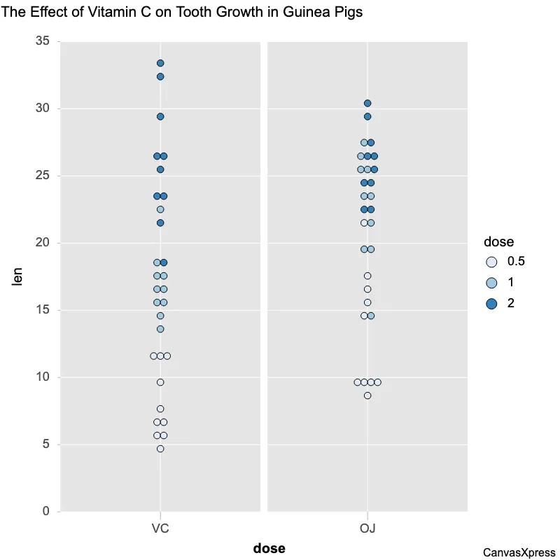
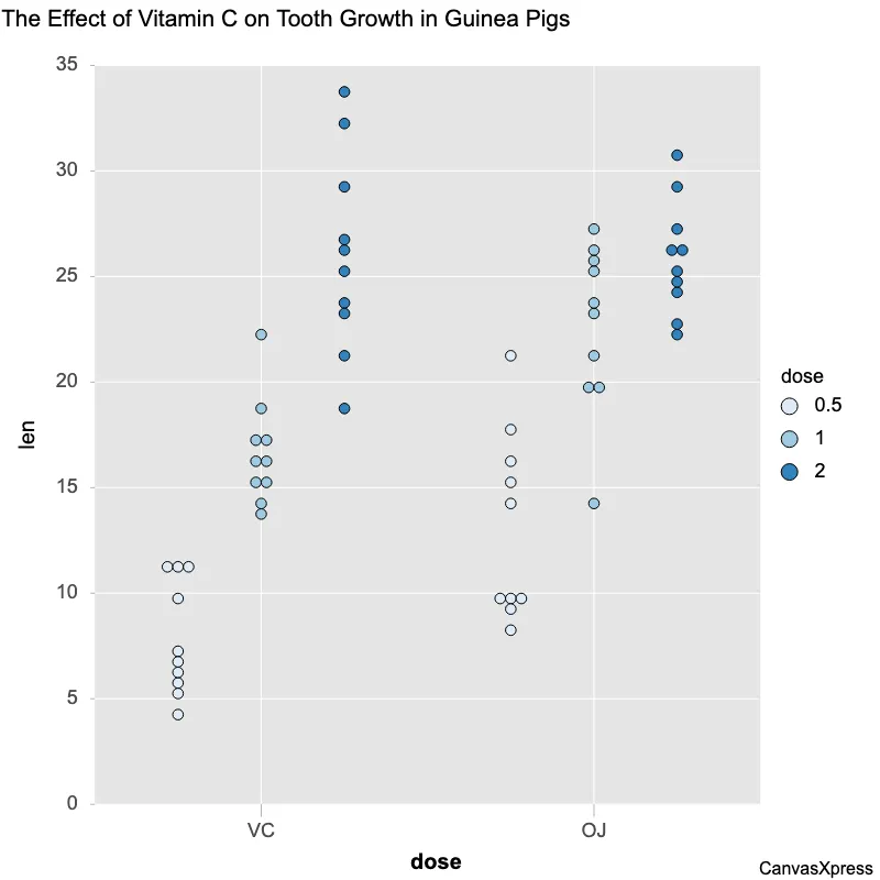
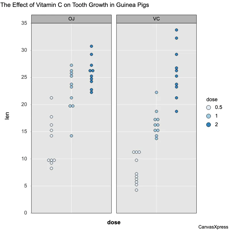
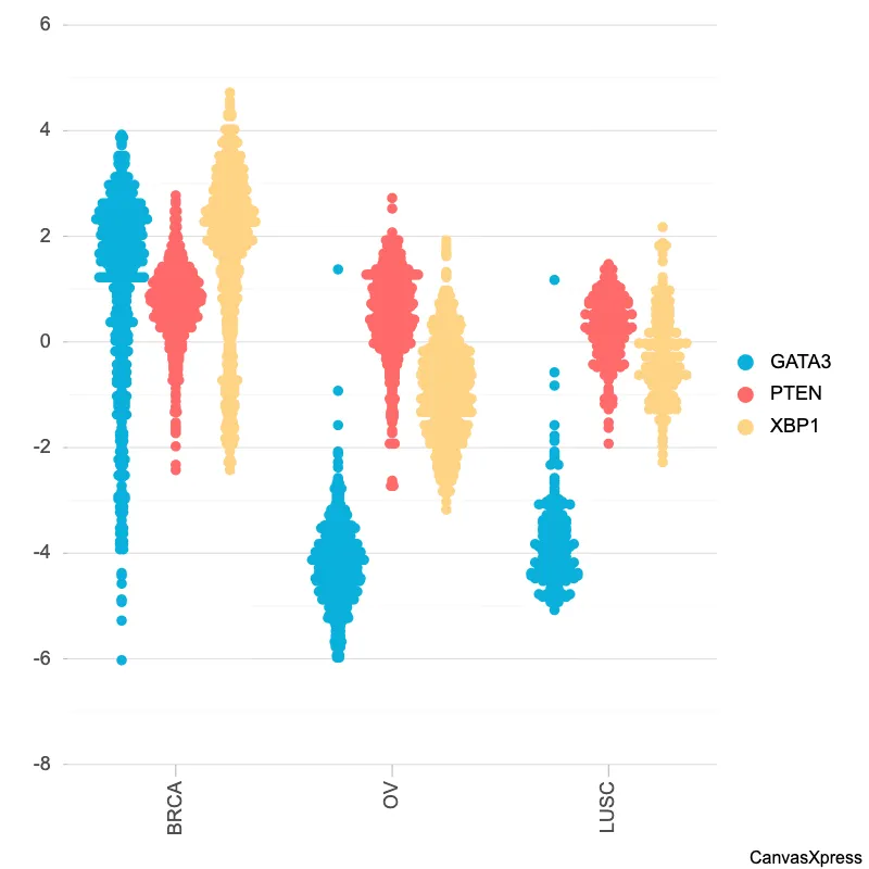
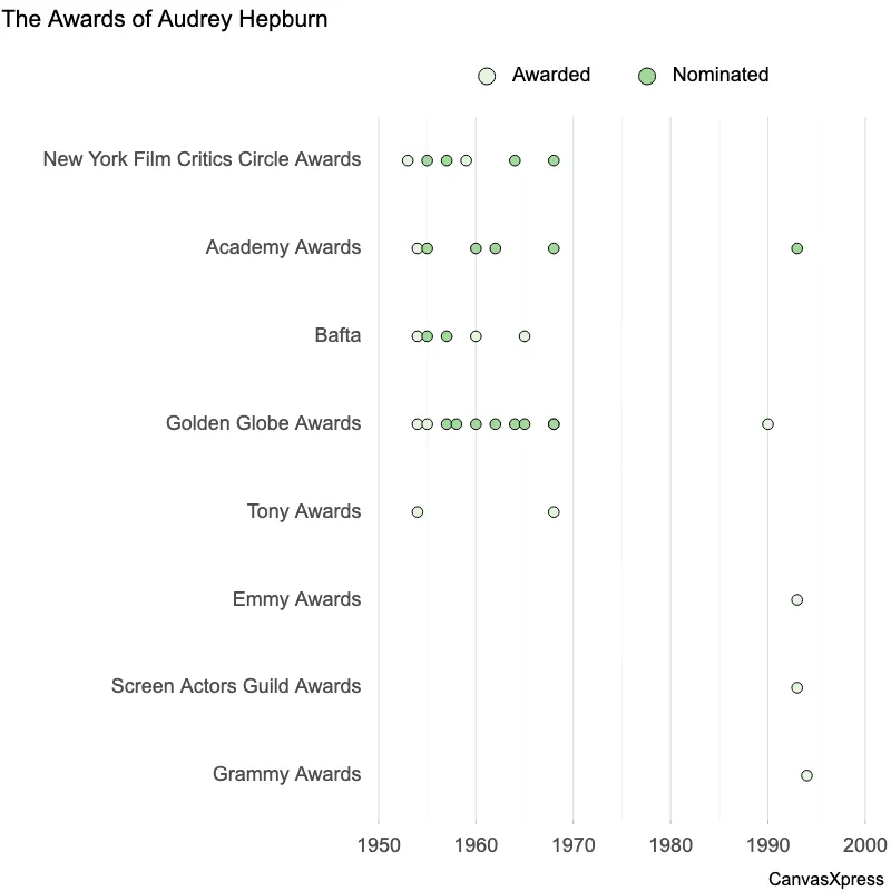
Dot plots are ideal for visualizing distributions, particularly when dealing with smaller datasets. They offer a clear and intuitive way to show the frequency of individual data points. This makes them useful for quickly identifying clusters, outliers, and the overall shape of the data. Compared to histograms, dot plots maintain the identity of each data point. This level of detail is beneficial when precise values are crucial and the sample size is not overwhelmingly large. They are easy to understand and interpret, making them a good choice for presentations and reports aimed at a broad audience.
<html>

  <head>
    <!-- Include the CanvasXpress library in your HTML file -->
    <link rel="stylesheet" href="https://www.canvasxpress.org/dist/canvasXpress.css" type="text/css"/>
    <script src="https://www.canvasxpress.org/dist/canvasXpress.min.js"></script>
  </head>

  <body>

    <!-- Create a canvas element for the chart with the desired dimensions -->
    <div>
      <canvas id="canvasId" width="600" height="600"></canvas>
    </div>


    <!-- Create a script to initialize the chart -->
    <script>

      // Use a data frame (2D-array) for the graph
      var data = [
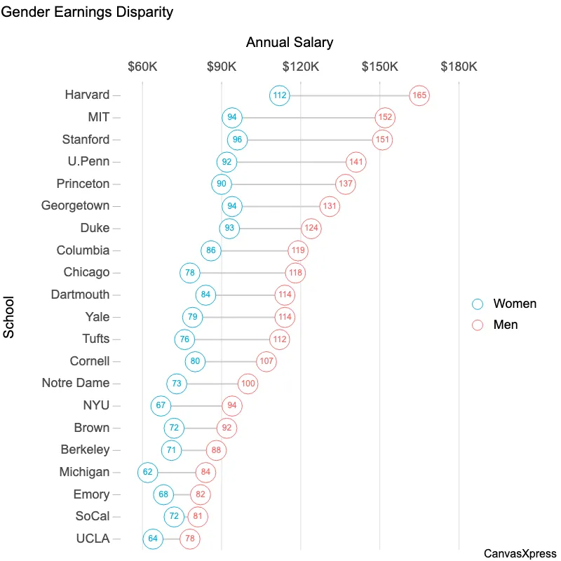
        [ "Id", "Women", "Men"],
        [ "MIT", 94, 152],
        [ "Stanford", 96, 151],
        [ "Harvard", 112, 165],
        [ "U.Penn", 92, 141],
        [ "Princeton", 90, 137],
        [ "Chicago", 78, 118],
        [ "Georgetown", 94, 131],
        [ "Tufts", 76, 112],
        [ "Yale", 79, 114],
        [ "Columbia", 86, 119],
        [ "Duke", 93, 124],
        [ "Dartmouth", 84, 114],
        [ "NYU", 67, 94],
        [ "Notre Dame", 73, 100],
        [ "Cornell", 80, 107],
        [ "Michigan", 62, 84],
        [ "Brown", 72, 92],
        [ "Berkeley", 71, 88],
        [ "Emory", 68, 82],
        [ "UCLA", 64, 78],
        [ "SoCal", 72, 81 ]
      ];

      // Create the configuration for the graph
      var config = {
        "axisAlgorithm": "wilkinson",
        "dataPointSizeScaleFactor": 3,
        "dataTextScaleFontFactor": 0.6,
        "dotplotType": "stacked",
        "graphType": "Dotplot",
        "plotStyle": "open",
        "showDataValues": true,
        "smpTitle": "School",
        "sortDir": "descending",
        "title": "Gender Earnings Disparity",
        "xAxis": ["Women", "Men"],
        "xAxis2Title": "Annual Salary",
        "xAxisGridMinorShow": false,
        "xAxisTickFormat": "$%sK",
        "xAxisTitle": "Annual Salary"
      }

      // Event used to create graph (optional)
      var events = false

      // Functions after rendering graph
      var afterRender = [
        [
          "sortSamplesByVariable",
          ["Men"]
        ]
      ]

      // Call the CanvasXpress function to create the graph
      var cX = new CanvasXpress("canvasId", data, config, events, false, afterRender);

    </script>

  </body>

</html>
<html>

  <head>
    <!-- Include the CanvasXpress library in your HTML file -->
    <link rel="stylesheet" href="https://www.canvasxpress.org/dist/canvasXpress.css" type="text/css"/>
    <script src="https://www.canvasxpress.org/dist/canvasXpress.min.js"></script>
  </head>

  <body>

    <!-- Create a canvas element for the chart with the desired dimensions -->
    <div>
      <canvas id="canvasId" width="600" height="600"></canvas>
    </div>


    <!-- Create a script to initialize the chart -->
    <script>

      // Create the data for the graph
      var data = {
         "y" : {
            "data" : [
              [94,96,112,92,90,78,94,76,79,86,93,84,67,73,80,62,72,71,68,64,72],
              [152,151,165,141,137,118,131,112,114,119,124,114,94,100,107,84,92,88,82,78,81]
            ],
            "smps" : ["MIT","Stanford","Harvard","U.Penn","Princeton","Chicago","Georgetown","Tufts","Yale","Columbia","Duke","Dartmouth","NYU","Notre Dame","Cornell","Michigan","Brown","Berkeley","Emory","UCLA","SoCal"],
            "vars" : ["Women","Men"]
         }
      }

      // Create the configuration for the graph
      var config = {
        "axisAlgorithm": "wilkinson",
        "dataPointSizeScaleFactor": 3,
        "dataTextScaleFontFactor": 0.6,
        "dotplotType": "stacked",
        "graphType": "Dotplot",
        "plotStyle": "open",
        "showDataValues": true,
        "smpTitle": "School",
        "sortDir": "descending",
        "title": "Gender Earnings Disparity",
        "xAxis": ["Women", "Men"],
        "xAxis2Title": "Annual Salary",
        "xAxisGridMinorShow": false,
        "xAxisTickFormat": "$%sK",
        "xAxisTitle": "Annual Salary"
      }

      // Event used to create graph (optional)
      var events = false

      // Functions after rendering graph
      [
        [
          "sortSamplesByVariable",
          ["Men"]
        ]
      ]
      // Call the CanvasXpress function to create the graph
      var cX = new CanvasXpress("canvasId", data, config, events);

    </script>

  </body>

</html>
library(canvasXpress)
y=read.table("https://www.canvasxpress.org/data/r/cX-dumbbell-dat.txt", header=TRUE, sep="\t", quote="", row.names=1, fill=TRUE, check.names=FALSE, stringsAsFactors=FALSE)
canvasXpress(
data=y,
axisAlgorithm="wilkinson",
dataPointSizeScaleFactor=3,
dataTextScaleFontFactor=0.6,
dotplotType="stacked",
graphType="Dotplot",
plotStyle="open",
showDataValues=TRUE,
smpTitle="School",
sortDir="descending",
title="Gender Earnings Disparity",
xAxis=list("Women", "Men"),
xAxis2Title="Annual Salary",
xAxisGridMinorShow=FALSE,
xAxisTickFormat="$%sK",
xAxisTitle="Annual Salary",
afterRender=list(list("sortSamplesByVariable", list("Men")))
)
