TrendPlot (stacked bars over a stacked area)
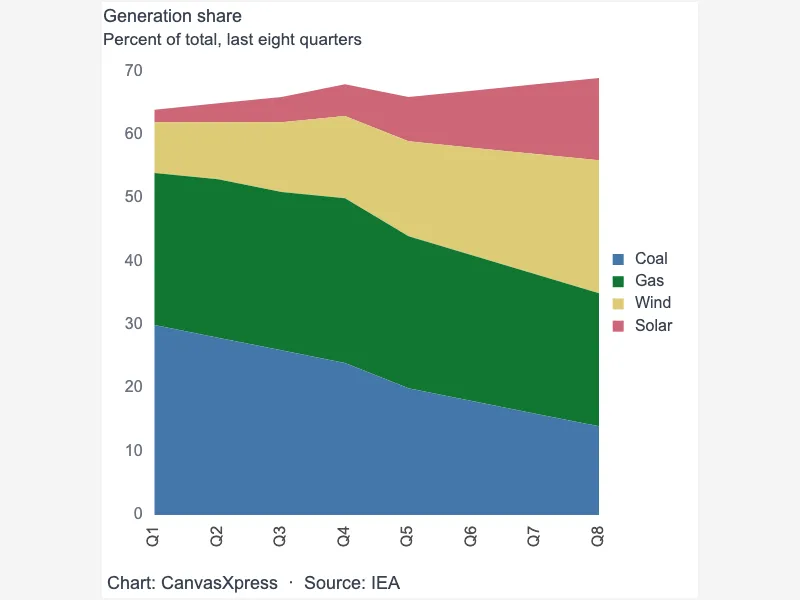
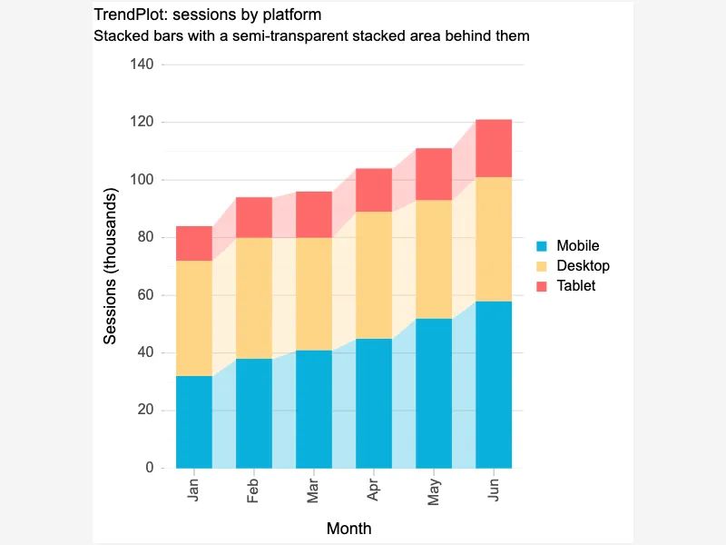
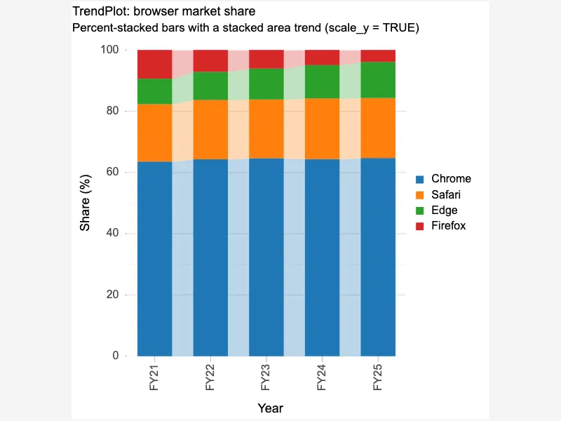
Area graphs provide an excellent way to showcase changes in quantity over time. They are particularly useful for visualizing trends and comparing the magnitude of different categories within a dataset. Unlike line graphs, area graphs emphasize the cumulative value of each category, making them suitable for depicting proportions or totals. Common applications include financial data, website traffic analysis, and population demographics. The filled area beneath the line helps highlight the overall volume or quantity involved, making it easier to identify significant increases or decreases. Effective area graphs use clear legends, distinct colors, and appropriate labels for enhanced readability.


<html>

  <head>
    <!-- Include the CanvasXpress library in your HTML file -->
    <link rel="stylesheet" href="https://www.canvasxpress.org/dist/canvasXpress.css" type="text/css"/>
    <script src="https://www.canvasxpress.org/dist/canvasXpress.min.js"></script>
  </head>

  <body>

    <!-- Create a canvas element for the chart with the desired dimensions -->
    <div>
      <canvas id="canvasId" width="600" height="600"></canvas>
    </div>


    <!-- Create a script to initialize the chart -->
    <script>

      // Use a data frame (2D-array) for the graph
      var data =

      // Create the configuration for the graph
      var config = {
         "graphType" : "Area",
         "graphOrientation" : "vertical",
         "areaType" : "stacked",
         "areaStyle" : "translucent",
         "areaShowColumns" : true,
         "areaColumnWidth" : 0.6,
         "colorScheme" : "CanvasXpress",
         "title" : "TrendPlot: sessions by platform",
         "subtitle" : "Stacked bars with a semi-transparent stacked area behind them",
         "smpTitle" : "Month",
         "xAxisTitle" : "Sessions (thousands)",
         "xAxis" : [
            "Mobile",
            "Desktop",
            "Tablet"
         ]
      }

      // Event used to create graph (optional)
      var events = false

      // Call the CanvasXpress function to create the graph
      var cX = new CanvasXpress("canvasId", data, config, events);

    </script>

  </body>

</html>
<html>

  <head>
    <!-- Include the CanvasXpress library in your HTML file -->
    <link rel="stylesheet" href="https://www.canvasxpress.org/dist/canvasXpress.css" type="text/css"/>
    <script src="https://www.canvasxpress.org/dist/canvasXpress.min.js"></script>
  </head>

  <body>

    <!-- Create a canvas element for the chart with the desired dimensions -->
    <div>
      <canvas id="canvasId" width="600" height="600"></canvas>
    </div>


    <!-- Create a script to initialize the chart -->
    <script>

      // Create the data for the graph
      var data = {
         "y" : {
            "vars" : [
               "Mobile",
               "Desktop",
               "Tablet"
            ],
            "smps" : [
               "Jan",
               "Feb",
               "Mar",
               "Apr",
               "May",
               "Jun"
            ],
            "data" : [
               [
                  32,
                  38,
                  41,
                  45,
                  52,
                  58
               ],
               [
                  40,
                  42,
                  39,
                  44,
                  41,
                  43
               ],
               [
                  12,
                  14,
                  16,
                  15,
                  18,
                  20
               ]
            ]
         }
      }

      // Create the configuration for the graph
      var config = {
         "graphType" : "Area",
         "graphOrientation" : "vertical",
         "areaType" : "stacked",
         "areaStyle" : "translucent",
         "areaShowColumns" : true,
         "areaColumnWidth" : 0.6,
         "colorScheme" : "CanvasXpress",
         "title" : "TrendPlot: sessions by platform",
         "subtitle" : "Stacked bars with a semi-transparent stacked area behind them",
         "smpTitle" : "Month",
         "xAxisTitle" : "Sessions (thousands)",
         "xAxis" : [
            "Mobile",
            "Desktop",
            "Tablet"
         ]
      }

      // Event used to create graph (optional)
      var events = false

            // Call the CanvasXpress function to create the graph
      var cX = new CanvasXpress("canvasId", data, config, events);

    </script>

  </body>

</html>
library(canvasXpress)
y=read.table("https://www.canvasxpress.org/data/r/cX-area19-dat.txt", header=TRUE, sep="\t", quote="", row.names=1, fill=TRUE, check.names=FALSE, stringsAsFactors=FALSE)
canvasXpress(
data=y,
areaColumnWidth=0.6,
areaShowColumns=TRUE,
areaStyle="translucent",
areaType="stacked",
colorScheme="CanvasXpress",
graphOrientation="vertical",
graphType="Area",
smpTitle="Month",
subtitle="Stacked bars with a semi-transparent stacked area behind them",
title="TrendPlot: sessions by platform",
xAxis=list("Mobile", "Desktop", "Tablet"),
xAxisTitle="Sessions (thousands)"
)
from canvasxpress.canvas import CanvasXpress
from canvasxpress.plot import show_in_browser

if __name__ == "__main__":
  # Define the chart with its data and configuration
  chart: CanvasXpress = CanvasXpress(
    render_to = "area19",
    data = {
      "y": {
        "vars": ["Mobile", "Desktop", "Tablet"],
        "smps": ["Jan", "Feb", "Mar", "Apr", "May", "Jun"],
        "data": [
          [32, 38, 41, 45, 52, 58],
          [40, 42, 39, 44, 41, 43],
          [12, 14, 16, 15, 18, 20]
        ]
      }
    },
    config = {
      "graphType": "Area",
      "graphOrientation": "vertical",
      "areaType": "stacked",
      "areaStyle": "translucent",
      "areaShowColumns": True,
      "areaColumnWidth": 0.6,
      "colorScheme": "CanvasXpress",
      "title": "TrendPlot: sessions by platform",
      "subtitle": "Stacked bars with a semi-transparent stacked area behind them",
      "smpTitle": "Month",
      "xAxisTitle": "Sessions (thousands)",
      "xAxis": ["Mobile", "Desktop", "Tablet"]
    },
    width = 600,
    height = 600
  )

  # Display the chart in its own Web page
  show_in_browser(chart)
Run this notebook:

from canvasxpress.canvas import CanvasXpress
from canvasxpress.plot import graph

graph(
  CanvasXpress(
    render_to = "area19",
    data = {
      "y": {
        "vars": ["Mobile", "Desktop", "Tablet"],
        "smps": ["Jan", "Feb", "Mar", "Apr", "May", "Jun"],
        "data": [
          [32, 38, 41, 45, 52, 58],
          [40, 42, 39, 44, 41, 43],
          [12, 14, 16, 15, 18, 20]
        ]
      }
    },
    config = {
      "graphType": "Area",
      "graphOrientation": "vertical",
      "areaType": "stacked",
      "areaStyle": "translucent",
      "areaShowColumns": True,
      "areaColumnWidth": 0.6,
      "colorScheme": "CanvasXpress",
      "title": "TrendPlot: sessions by platform",
      "subtitle": "Stacked bars with a semi-transparent stacked area behind them",
      "smpTitle": "Month",
      "xAxisTitle": "Sessions (thousands)",
      "xAxis": ["Mobile", "Desktop", "Tablet"]
    },
    width = 600,
    height = 600
  )
)
using CanvasXpress

canvasxpress(Dict(
  "y" => Dict(
    "vars" => ["Mobile", "Desktop", "Tablet"],
    "smps" => ["Jan", "Feb", "Mar", "Apr", "May", "Jun"],
    "data" => [
      [32, 38, 41, 45, 52, 58],
      [40, 42, 39, 44, 41, 43],
      [12, 14, 16, 15, 18, 20]
    ]
  )
);
  graphType = "Area",
  graphOrientation = "vertical",
  areaType = "stacked",
  areaStyle = "translucent",
  areaShowColumns = true,
  areaColumnWidth = 0.6,
  colorScheme = "CanvasXpress",
  title = "TrendPlot: sessions by platform",
  subtitle = "Stacked bars with a semi-transparent stacked area behind them",
  smpTitle = "Month",
  xAxisTitle = "Sessions (thousands)",
  xAxis = ["Mobile", "Desktop", "Tablet"]
)