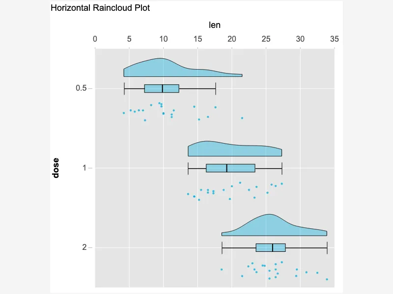
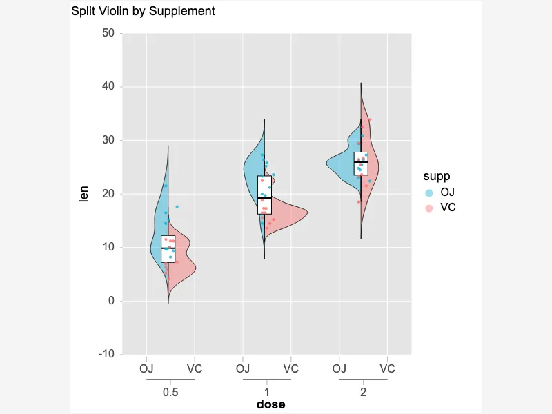
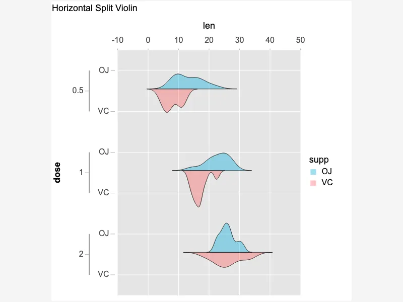
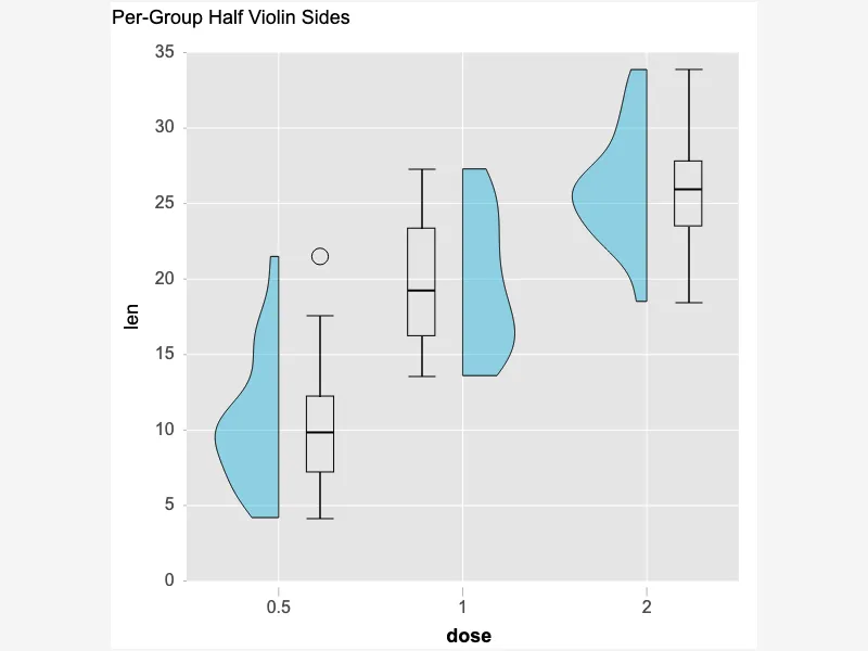
Colorful Connected Violin Plots for Group Comparison
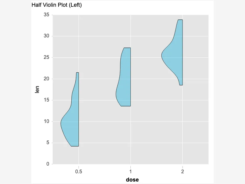
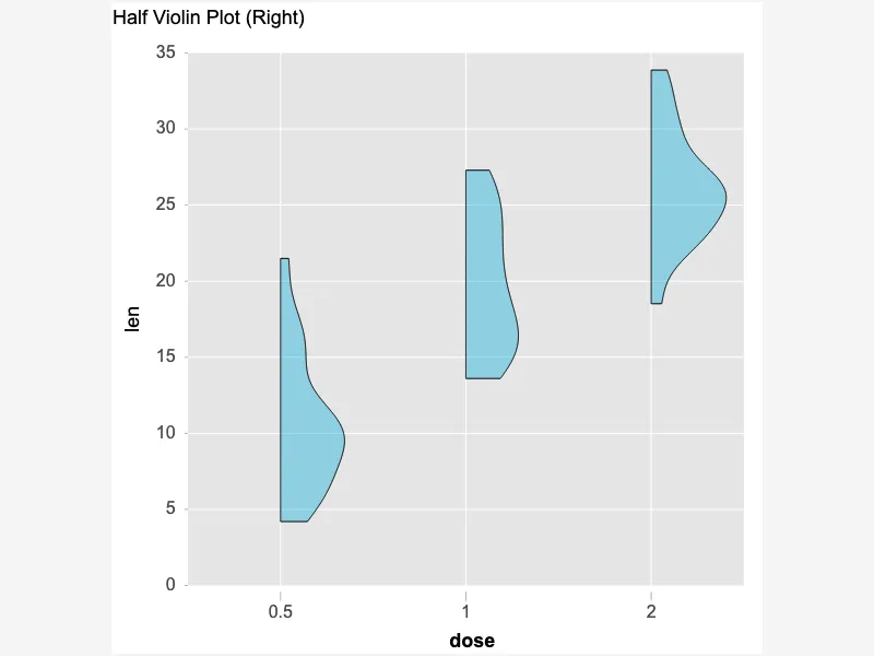
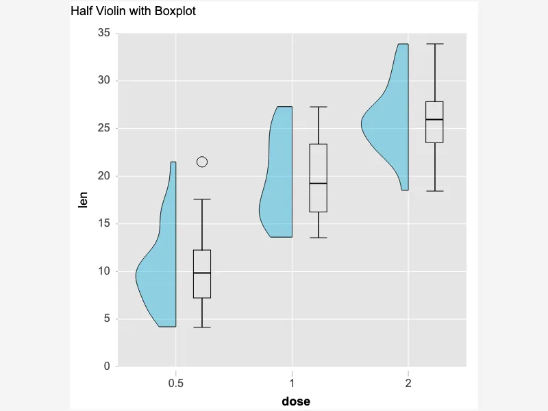
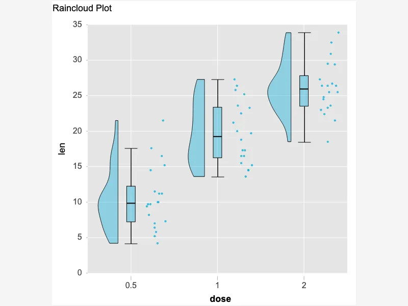
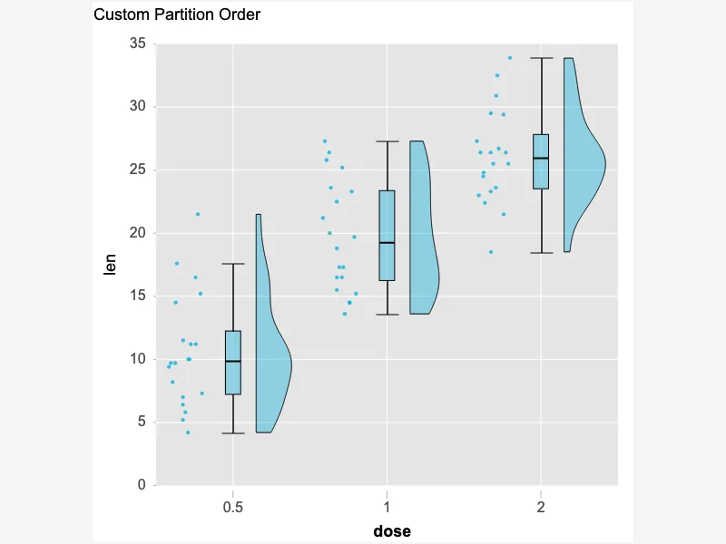
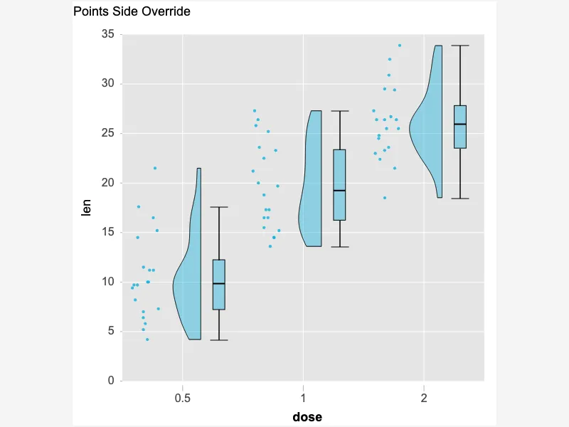
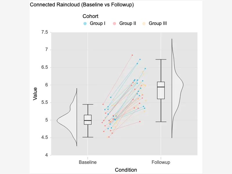
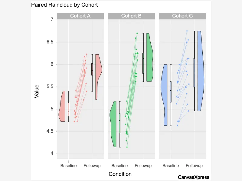
Violin plots offer a compelling visualization combining box plots and kernel density estimations. They showcase data distribution, including median, quartiles, and the probability density of the data at different values. This detailed view helps compare distributions across multiple groups effectively. Unlike box plots which only show summary statistics, violin plots provide a richer understanding of the data shape and spread, revealing skewness and the presence of outliers more clearly. They are particularly useful for identifying differences and similarities between various datasets. This enhanced visualization improves data interpretation and communication.


<html>

  <head>
    <!-- Include the CanvasXpress library in your HTML file -->
    <link rel="stylesheet" href="https://www.canvasxpress.org/dist/canvasXpress.css" type="text/css"/>
    <script src="https://www.canvasxpress.org/dist/canvasXpress.min.js"></script>
  </head>

  <body>

    <!-- Create a canvas element for the chart with the desired dimensions -->
    <div>
      <canvas id="canvasId" width="600" height="600"></canvas>
    </div>


    <!-- Create a script to initialize the chart -->
    <script>

      // Use a data frame (2D-array) for the graph
      var data = [
        [ "Id", "len", "order", "dose", "supp"],
        [ "Var1", 4.2, 1, "0.5", "VC"],
        [ "Var2", 11.5, 2, "0.5", "VC"],
        [ "Var3", 7.3, 3, "0.5", "VC"],
        [ "Var4", 5.8, 4, "0.5", "VC"],
        [ "Var5", 6.4, 5, "0.5", "VC"],
        [ "Var6", 10, 6, "0.5", "VC"],
        [ "Var7", 11.2, 7, "0.5", "VC"],
        [ "Var8", 11.2, 8, "0.5", "VC"],
        [ "Var9", 5.2, 9, "0.5", "VC"],
        [ "Var10", 7, 10, "0.5", "VC"],
        [ "Var11", 16.5, 1, "1", "VC"],
        [ "Var12", 16.5, 2, "1", "VC"],
        [ "Var13", 15.2, 3, "1", "VC"],
        [ "Var14", 17.3, 4, "1", "VC"],
        [ "Var15", 22.5, 5, "1", "VC"],
        [ "Var16", 17.3, 6, "1", "VC"],
        [ "Var17", 13.6, 7, "1", "VC"],
        [ "Var18", 14.5, 8, "1", "VC"],
        [ "Var19", 18.8, 9, "1", "VC"],
        [ "Var20", 15.5, 10, "1", "VC"],
        [ "Var21", 23.6, 1, "2", "VC"],
        [ "Var22", 18.5, 2, "2", "VC"],
        [ "Var23", 33.9, 3, "2", "VC"],
        [ "Var24", 25.5, 4, "2", "VC"],
        [ "Var25", 26.4, 5, "2", "VC"],
        [ "Var26", 32.5, 6, "2", "VC"],
        [ "Var27", 26.7, 7, "2", "VC"],
        [ "Var28", 21.5, 8, "2", "VC"],
        // ... (data truncated after 29 records for clarity)
      ]

      // Create the configuration for the graph
      var config = {
         "axisAlgorithm" : "rPretty",
         "axisTitleFontStyle" : "bold",
         "background" : "white",
         "backgroundType" : "panel",
         "boxplotConnect" : true,
         "colorBy" : "supp",
         "colorScheme" : "GGPlot",
         "graphOrientation" : "vertical",
         "graphType" : "Boxplot",
         "groupingFactors" : ["dose","supp"],
         "guidesColor" : "white",
         "guidesLineType" : "solid",
         "guidesShow" : true,
         "panelBackgroundColor" : "#E5E5E5",
         "showBoxplotIfViolin" : true,
         "showBoxplotOriginalData" : true,
         "showLegend" : true,
         "showViolinBoxplot" : true,
         "smpTextRotate" : 90,
         "smpTitle" : "dose",
         "smpTitleFontStyle" : "bold",
         "stringSampleFactors" : ["dose"],
         "title" : "The Effect of Vitamin C on Tooth Growth in Guinea Pigs",
         "xAxis": ["len"],
         "violinColor" : "gold",
         "xAxis2Show" : false,
         "xAxisGridMajorColor" : "white",
         "xAxisGridMinorShow" : false,
         "xAxisTitle" : "len"
      }

      // Event used to create graph (optional)
      var events = false

      // Call the CanvasXpress function to create the graph
      var cX = new CanvasXpress("canvasId", data, config, events);

    </script>

  </body>

</html>
<html>

  <head>
    <!-- Include the CanvasXpress library in your HTML file -->
    <link rel="stylesheet" href="https://www.canvasxpress.org/dist/canvasXpress.css" type="text/css"/>
    <script src="https://www.canvasxpress.org/dist/canvasXpress.min.js"></script>
  </head>

  <body>

    <!-- Create a canvas element for the chart with the desired dimensions -->
    <div>
      <canvas id="canvasId" width="600" height="600"></canvas>
    </div>


    <!-- Create a script to initialize the chart -->
    <script>

      // Create the data for the graph
      var data = {
         "x" : {
            "dose" : ["0.5","0.5","0.5","0.5","0.5","0.5","0.5","0.5","0.5","0.5","1","1","1","1","1","1","1","1","1","1","2","2","2","2","2","2","2","2","2","2","0.5","0.5","0.5","0.5","0.5","0.5","0.5","0.5","0.5","0.5","1","1","1","1","1","1","1","1","1","1","2","2","2","2","2","2","2","2","2","2"],
            "order" : [1,2,3,4,5,6,7,8,9,10,1,2,3,4,5,6,7,8,9,10,1,2,3,4,5,6,7,8,9,10,1,2,3,4,5,6,7,8,9,10,1,2,3,4,5,6,7,8,9,10,1,2,3,4,5,6,7,8,9,10],
            "supp" : ["VC","VC","VC","VC","VC","VC","VC","VC","VC","VC","VC","VC","VC","VC","VC","VC","VC","VC","VC","VC","VC","VC","VC","VC","VC","VC","VC","VC","VC","VC","OJ","OJ","OJ","OJ","OJ","OJ","OJ","OJ","OJ","OJ","OJ","OJ","OJ","OJ","OJ","OJ","OJ","OJ","OJ","OJ","OJ","OJ","OJ","OJ","OJ","OJ","OJ","OJ","OJ","OJ"]
         },
         "y" : {
            "data" : [
              [4.2,11.5,7.3,5.8,6.4,10,11.2,11.2,5.2,7,16.5,16.5,15.2,17.3,22.5,17.3,13.6,14.5,18.8,15.5,23.6,18.5,33.9,25.5,26.4,32.5,26.7,21.5,23.3,29.5,15.2,21.5,17.6,9.7,14.5,10,8.2,9.4,16.5,9.7,19.7,23.3,23.6,26.4,20,25.2,25.8,21.2,14.5,27.3,25.5,26.4,22.4,24.5,24.8,30.9,26.4,27.3,29.4,23]
            ],
            "smps" : ["Var1","Var2","Var3","Var4","Var5","Var6","Var7","Var8","Var9","Var10","Var11","Var12","Var13","Var14","Var15","Var16","Var17","Var18","Var19","Var20","Var21","Var22","Var23","Var24","Var25","Var26","Var27","Var28","Var29","Var30","Var31","Var32","Var33","Var34","Var35","Var36","Var37","Var38","Var39","Var40","Var41","Var42","Var43","Var44","Var45","Var46","Var47","Var48","Var49","Var50","Var51","Var52","Var53","Var54","Var55","Var56","Var57","Var58","Var59","Var60"],
            "vars" : ["len"]
         }
      }

      // Create the configuration for the graph
      var config = {
         "axisAlgorithm" : "rPretty",
         "axisTitleFontStyle" : "bold",
         "background" : "white",
         "backgroundType" : "panel",
         "boxplotConnect" : true,
         "colorBy" : "supp",
         "colorScheme" : "GGPlot",
         "graphOrientation" : "vertical",
         "graphType" : "Boxplot",
         "groupingFactors" : ["dose","supp"],
         "guidesColor" : "white",
         "guidesLineType" : "solid",
         "guidesShow" : true,
         "panelBackgroundColor" : "#E5E5E5",
         "showBoxplotIfViolin" : true,
         "showBoxplotOriginalData" : true,
         "showLegend" : true,
         "showViolinBoxplot" : true,
         "smpTextRotate" : 90,
         "smpTitle" : "dose",
         "smpTitleFontStyle" : "bold",
         "stringSampleFactors" : ["dose"],
         "title" : "The Effect of Vitamin C on Tooth Growth in Guinea Pigs",
         "xAxis": ["len"],
         "violinColor" : "gold",
         "xAxis2Show" : false,
         "xAxisGridMajorColor" : "white",
         "xAxisGridMinorShow" : false,
         "xAxisTitle" : "len"
      }

      // Event used to create graph (optional)
      var events = false

            // Call the CanvasXpress function to create the graph
      var cX = new CanvasXpress("canvasId", data, config, events);

    </script>

  </body>

</html>
library(canvasXpress)
y=read.table("https://www.canvasxpress.org/data/r/cX-toothgrowth-dat.txt", header=TRUE, sep="\t", quote="", row.names=1, fill=TRUE, check.names=FALSE, stringsAsFactors=FALSE)
x=read.table("https://www.canvasxpress.org/data/r/cX-toothgrowth-smp.txt", header=TRUE, sep="\t", quote="", row.names=1, fill=TRUE, check.names=FALSE, stringsAsFactors=FALSE)
canvasXpress(
data=y,
smpAnnot=x,
axisAlgorithm="rPretty",
axisTitleFontStyle="bold",
background="white",
backgroundType="panel",
boxplotConnect=TRUE,
colorBy="supp",
colorScheme="GGPlot",
graphOrientation="vertical",
graphType="Boxplot",
groupingFactors=list("dose", "supp"),
guidesColor="white",
guidesLineType="solid",
guidesShow=TRUE,
panelBackgroundColor="#E5E5E5",
showBoxplotIfViolin=TRUE,
showBoxplotOriginalData=TRUE,
showLegend=TRUE,
showViolinBoxplot=TRUE,
smpTextRotate=90,
smpTitle="dose",
smpTitleFontStyle="bold",
stringSampleFactors=list("dose"),
title="The Effect of Vitamin C on Tooth Growth in Guinea Pigs",
violinColor="gold",
xAxis=list("len"),
xAxis2Show=FALSE,
xAxisGridMajorColor="white",
xAxisGridMinorShow=FALSE,
xAxisTitle="len"
)
from canvasxpress.canvas import CanvasXpress
from canvasxpress.plot import show_in_browser

if __name__ == "__main__":
  # Define the chart with its data and configuration
  chart: CanvasXpress = CanvasXpress(
    render_to = "violin15",
    data = {
      "x": {
        "dose": ["0.5", "0.5", "0.5", "0.5", "0.5", "0.5", "0.5", "0.5", "0.5", "0.5", "1", "1", "1", "1", "1", "1", "1", "1", "1", "1", "2", "2", "2", "2", "2", "2", "2", "2", "2", "2", "0.5", "0.5", "0.5", "0.5", "0.5", "0.5", "0.5", "0.5", "0.5", "0.5", "1", "1", "1", "1", "1", "1", "1", "1", "1", "1", "2", "2", "2", "2", "2", "2", "2", "2", "2", "2"],
        "order": [1, 2, 3, 4, 5, 6, 7, 8, 9, 10, 1, 2, 3, 4, 5, 6, 7, 8, 9, 10, 1, 2, 3, 4, 5, 6, 7, 8, 9, 10, 1, 2, 3, 4, 5, 6, 7, 8, 9, 10, 1, 2, 3, 4, 5, 6, 7, 8, 9, 10, 1, 2, 3, 4, 5, 6, 7, 8, 9, 10],
        "supp": ["VC", "VC", "VC", "VC", "VC", "VC", "VC", "VC", "VC", "VC", "VC", "VC", "VC", "VC", "VC", "VC", "VC", "VC", "VC", "VC", "VC", "VC", "VC", "VC", "VC", "VC", "VC", "VC", "VC", "VC", "OJ", "OJ", "OJ", "OJ", "OJ", "OJ", "OJ", "OJ", "OJ", "OJ", "OJ", "OJ", "OJ", "OJ", "OJ", "OJ", "OJ", "OJ", "OJ", "OJ", "OJ", "OJ", "OJ", "OJ", "OJ", "OJ", "OJ", "OJ", "OJ", "OJ"]
      },
      "y": {
        "data": [
          [4.2, 11.5, 7.3, 5.8, 6.4, 10, 11.2, 11.2, 5.2, 7, 16.5, 16.5, 15.2, 17.3, 22.5, 17.3, 13.6, 14.5, 18.8, 15.5, 23.6, 18.5, 33.9, 25.5, 26.4, 32.5, 26.7, 21.5, 23.3, 29.5, 15.2, 21.5, 17.6, 9.7, 14.5, 10, 8.2, 9.4, 16.5, 9.7, 19.7, 23.3, 23.6, 26.4, 20, 25.2, 25.8, 21.2, 14.5, 27.3, 25.5, 26.4, 22.4, 24.5, 24.8, 30.9, 26.4, 27.3, 29.4, 23]
        ],
        "smps": ["Var1", "Var2", "Var3", "Var4", "Var5", "Var6", "Var7", "Var8", "Var9", "Var10", "Var11", "Var12", "Var13", "Var14", "Var15", "Var16", "Var17", "Var18", "Var19", "Var20", "Var21", "Var22", "Var23", "Var24", "Var25", "Var26", "Var27", "Var28", "Var29", "Var30", "Var31", "Var32", "Var33", "Var34", "Var35", "Var36", "Var37", "Var38", "Var39", "Var40", "Var41", "Var42", "Var43", "Var44", "Var45", "Var46", "Var47", "Var48", "Var49", "Var50", "Var51", "Var52", "Var53", "Var54", "Var55", "Var56", "Var57", "Var58", "Var59", "Var60"],
        "vars": ["len"]
      }
    },
    config = {
      "axisAlgorithm": "rPretty",
      "axisTitleFontStyle": "bold",
      "background": "white",
      "backgroundType": "panel",
      "boxplotConnect": True,
      "colorBy": "supp",
      "colorScheme": "GGPlot",
      "graphOrientation": "vertical",
      "graphType": "Boxplot",
      "groupingFactors": ["dose", "supp"],
      "guidesColor": "white",
      "guidesLineType": "solid",
      "guidesShow": True,
      "panelBackgroundColor": "#E5E5E5",
      "showBoxplotIfViolin": True,
      "showBoxplotOriginalData": True,
      "showLegend": True,
      "showViolinBoxplot": True,
      "smpTextRotate": 90,
      "smpTitle": "dose",
      "smpTitleFontStyle": "bold",
      "stringSampleFactors": ["dose"],
      "title": "The Effect of Vitamin C on Tooth Growth in Guinea Pigs",
      "xAxis": ["len"],
      "violinColor": "gold",
      "xAxis2Show": False,
      "xAxisGridMajorColor": "white",
      "xAxisGridMinorShow": False,
      "xAxisTitle": "len"
    },
    width = 600,
    height = 600
  )

  # Display the chart in its own Web page
  show_in_browser(chart)
Run this notebook:

from canvasxpress.canvas import CanvasXpress
from canvasxpress.plot import graph

graph(
  CanvasXpress(
    render_to = "violin15",
    data = {
      "x": {
        "dose": ["0.5", "0.5", "0.5", "0.5", "0.5", "0.5", "0.5", "0.5", "0.5", "0.5", "1", "1", "1", "1", "1", "1", "1", "1", "1", "1", "2", "2", "2", "2", "2", "2", "2", "2", "2", "2", "0.5", "0.5", "0.5", "0.5", "0.5", "0.5", "0.5", "0.5", "0.5", "0.5", "1", "1", "1", "1", "1", "1", "1", "1", "1", "1", "2", "2", "2", "2", "2", "2", "2", "2", "2", "2"],
        "order": [1, 2, 3, 4, 5, 6, 7, 8, 9, 10, 1, 2, 3, 4, 5, 6, 7, 8, 9, 10, 1, 2, 3, 4, 5, 6, 7, 8, 9, 10, 1, 2, 3, 4, 5, 6, 7, 8, 9, 10, 1, 2, 3, 4, 5, 6, 7, 8, 9, 10, 1, 2, 3, 4, 5, 6, 7, 8, 9, 10],
        "supp": ["VC", "VC", "VC", "VC", "VC", "VC", "VC", "VC", "VC", "VC", "VC", "VC", "VC", "VC", "VC", "VC", "VC", "VC", "VC", "VC", "VC", "VC", "VC", "VC", "VC", "VC", "VC", "VC", "VC", "VC", "OJ", "OJ", "OJ", "OJ", "OJ", "OJ", "OJ", "OJ", "OJ", "OJ", "OJ", "OJ", "OJ", "OJ", "OJ", "OJ", "OJ", "OJ", "OJ", "OJ", "OJ", "OJ", "OJ", "OJ", "OJ", "OJ", "OJ", "OJ", "OJ", "OJ"]
      },
      "y": {
        "data": [
          [4.2, 11.5, 7.3, 5.8, 6.4, 10, 11.2, 11.2, 5.2, 7, 16.5, 16.5, 15.2, 17.3, 22.5, 17.3, 13.6, 14.5, 18.8, 15.5, 23.6, 18.5, 33.9, 25.5, 26.4, 32.5, 26.7, 21.5, 23.3, 29.5, 15.2, 21.5, 17.6, 9.7, 14.5, 10, 8.2, 9.4, 16.5, 9.7, 19.7, 23.3, 23.6, 26.4, 20, 25.2, 25.8, 21.2, 14.5, 27.3, 25.5, 26.4, 22.4, 24.5, 24.8, 30.9, 26.4, 27.3, 29.4, 23]
        ],
        "smps": ["Var1", "Var2", "Var3", "Var4", "Var5", "Var6", "Var7", "Var8", "Var9", "Var10", "Var11", "Var12", "Var13", "Var14", "Var15", "Var16", "Var17", "Var18", "Var19", "Var20", "Var21", "Var22", "Var23", "Var24", "Var25", "Var26", "Var27", "Var28", "Var29", "Var30", "Var31", "Var32", "Var33", "Var34", "Var35", "Var36", "Var37", "Var38", "Var39", "Var40", "Var41", "Var42", "Var43", "Var44", "Var45", "Var46", "Var47", "Var48", "Var49", "Var50", "Var51", "Var52", "Var53", "Var54", "Var55", "Var56", "Var57", "Var58", "Var59", "Var60"],
        "vars": ["len"]
      }
    },
    config = {
      "axisAlgorithm": "rPretty",
      "axisTitleFontStyle": "bold",
      "background": "white",
      "backgroundType": "panel",
      "boxplotConnect": True,
      "colorBy": "supp",
      "colorScheme": "GGPlot",
      "graphOrientation": "vertical",
      "graphType": "Boxplot",
      "groupingFactors": ["dose", "supp"],
      "guidesColor": "white",
      "guidesLineType": "solid",
      "guidesShow": True,
      "panelBackgroundColor": "#E5E5E5",
      "showBoxplotIfViolin": True,
      "showBoxplotOriginalData": True,
      "showLegend": True,
      "showViolinBoxplot": True,
      "smpTextRotate": 90,
      "smpTitle": "dose",
      "smpTitleFontStyle": "bold",
      "stringSampleFactors": ["dose"],
      "title": "The Effect of Vitamin C on Tooth Growth in Guinea Pigs",
      "xAxis": ["len"],
      "violinColor": "gold",
      "xAxis2Show": False,
      "xAxisGridMajorColor": "white",
      "xAxisGridMinorShow": False,
      "xAxisTitle": "len"
    },
    width = 600,
    height = 600
  )
)
using CanvasXpress

canvasxpress(Dict(
  "x" => Dict(
    "dose" => ["0.5", "0.5", "0.5", "0.5", "0.5", "0.5", "0.5", "0.5", "0.5", "0.5", "1", "1", "1", "1", "1", "1", "1", "1", "1", "1", "2", "2", "2", "2", "2", "2", "2", "2", "2", "2", "0.5", "0.5", "0.5", "0.5", "0.5", "0.5", "0.5", "0.5", "0.5", "0.5", "1", "1", "1", "1", "1", "1", "1", "1", "1", "1", "2", "2", "2", "2", "2", "2", "2", "2", "2", "2"],
    "order" => [1, 2, 3, 4, 5, 6, 7, 8, 9, 10, 1, 2, 3, 4, 5, 6, 7, 8, 9, 10, 1, 2, 3, 4, 5, 6, 7, 8, 9, 10, 1, 2, 3, 4, 5, 6, 7, 8, 9, 10, 1, 2, 3, 4, 5, 6, 7, 8, 9, 10, 1, 2, 3, 4, 5, 6, 7, 8, 9, 10],
    "supp" => ["VC", "VC", "VC", "VC", "VC", "VC", "VC", "VC", "VC", "VC", "VC", "VC", "VC", "VC", "VC", "VC", "VC", "VC", "VC", "VC", "VC", "VC", "VC", "VC", "VC", "VC", "VC", "VC", "VC", "VC", "OJ", "OJ", "OJ", "OJ", "OJ", "OJ", "OJ", "OJ", "OJ", "OJ", "OJ", "OJ", "OJ", "OJ", "OJ", "OJ", "OJ", "OJ", "OJ", "OJ", "OJ", "OJ", "OJ", "OJ", "OJ", "OJ", "OJ", "OJ", "OJ", "OJ"]
  ),
  "y" => Dict(
    "data" => [
      [4.2, 11.5, 7.3, 5.8, 6.4, 10, 11.2, 11.2, 5.2, 7, 16.5, 16.5, 15.2, 17.3, 22.5, 17.3, 13.6, 14.5, 18.8, 15.5, 23.6, 18.5, 33.9, 25.5, 26.4, 32.5, 26.7, 21.5, 23.3, 29.5, 15.2, 21.5, 17.6, 9.7, 14.5, 10, 8.2, 9.4, 16.5, 9.7, 19.7, 23.3, 23.6, 26.4, 20, 25.2, 25.8, 21.2, 14.5, 27.3, 25.5, 26.4, 22.4, 24.5, 24.8, 30.9, 26.4, 27.3, 29.4, 23]
    ],
    "smps" => ["Var1", "Var2", "Var3", "Var4", "Var5", "Var6", "Var7", "Var8", "Var9", "Var10", "Var11", "Var12", "Var13", "Var14", "Var15", "Var16", "Var17", "Var18", "Var19", "Var20", "Var21", "Var22", "Var23", "Var24", "Var25", "Var26", "Var27", "Var28", "Var29", "Var30", "Var31", "Var32", "Var33", "Var34", "Var35", "Var36", "Var37", "Var38", "Var39", "Var40", "Var41", "Var42", "Var43", "Var44", "Var45", "Var46", "Var47", "Var48", "Var49", "Var50", "Var51", "Var52", "Var53", "Var54", "Var55", "Var56", "Var57", "Var58", "Var59", "Var60"],
    "vars" => ["len"]
  )
);
  axisAlgorithm = "rPretty",
  axisTitleFontStyle = "bold",
  background = "white",
  backgroundType = "panel",
  boxplotConnect = true,
  colorBy = "supp",
  colorScheme = "GGPlot",
  graphOrientation = "vertical",
  graphType = "Boxplot",
  groupingFactors = ["dose", "supp"],
  guidesColor = "white",
  guidesLineType = "solid",
  guidesShow = true,
  panelBackgroundColor = "#E5E5E5",
  showBoxplotIfViolin = true,
  showBoxplotOriginalData = true,
  showLegend = true,
  showViolinBoxplot = true,
  smpTextRotate = 90,
  smpTitle = "dose",
  smpTitleFontStyle = "bold",
  stringSampleFactors = ["dose"],
  title = "The Effect of Vitamin C on Tooth Growth in Guinea Pigs",
  xAxis = ["len"],
  violinColor = "gold",
  xAxis2Show = false,
  xAxisGridMajorColor = "white",
  xAxisGridMinorShow = false,
  xAxisTitle = "len"
)