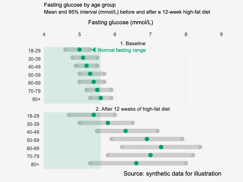
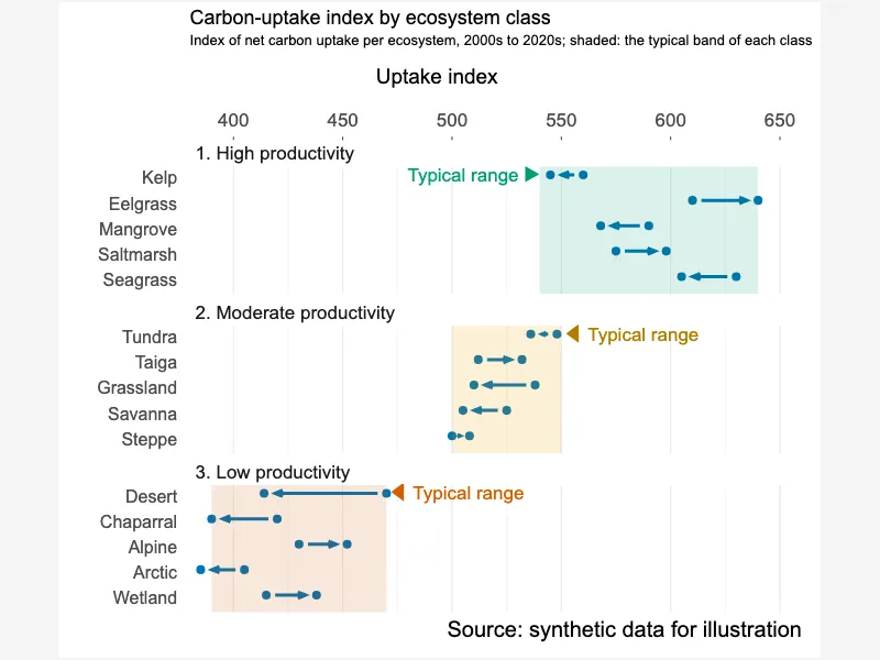
Arrow plot in grouped panels with shaded bands
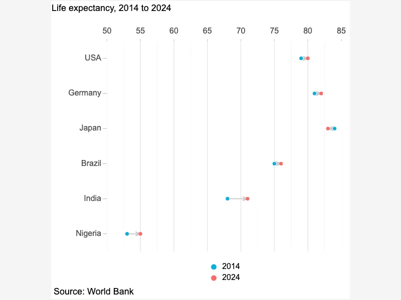
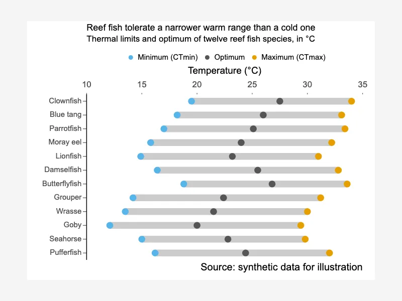
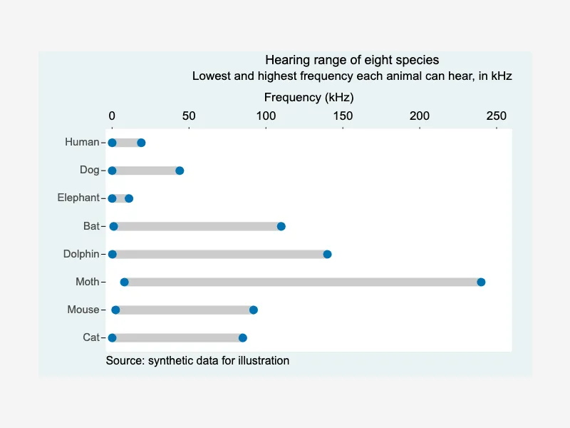
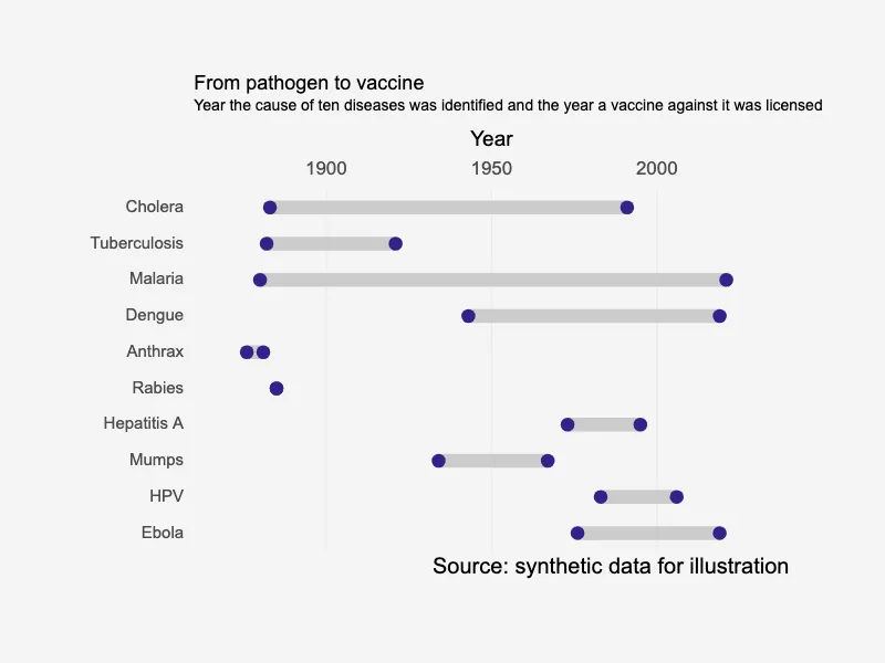
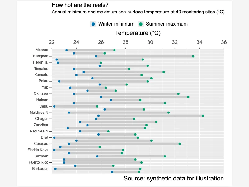
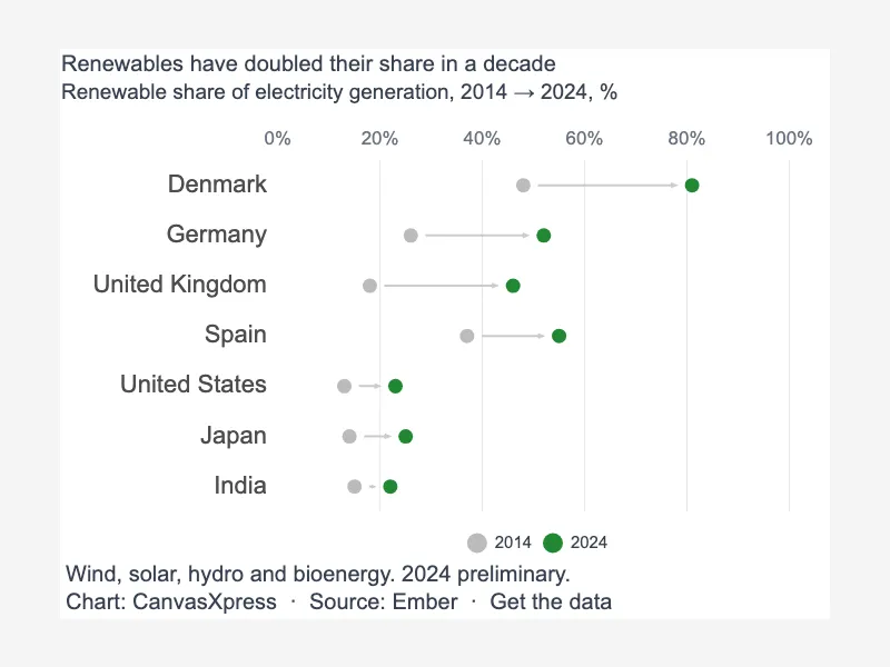
Dumbbell graphs display the relationship between two data points for multiple categories by connecting them with a line. It effectively shows the difference or change between these two values for each item, allowing for easy comparison of magnitudes and variations across the dataset. This visualization is useful for highlighting shifts or disparities.


<html>

  <head>
    <!-- Include the CanvasXpress library in your HTML file -->
    <link rel="stylesheet" href="https://www.canvasxpress.org/dist/canvasXpress.css" type="text/css"/>
    <script src="https://www.canvasxpress.org/dist/canvasXpress.min.js"></script>
  </head>

  <body>

    <!-- Create a canvas element for the chart with the desired dimensions -->
    <div>
      <canvas id="canvasId" width="600" height="600"></canvas>
    </div>


    <!-- Create a script to initialize the chart -->
    <script>

      // Use a data frame (2D-array) for the graph
      var data =

      // Create the configuration for the graph
      var config = {
         "graphType" : "Dumbbell",
         "dumbbellType" : "arrow",
         "dumbbellArrowDirection" : "order",
         "theme" : "bw",
         "colorScheme" : "User",
         "colors" : [
            "#0072B2",
            "#0072B2"
         ],
         "title" : "Carbon-uptake index by ecosystem class",
         "subtitle" : "Index of net carbon uptake per ecosystem, 2000s to 2020s; shaded: the typical band of each class",
         "xAxis" : [
            "2000s",
            "2020s"
         ],
         "xAxisTitle" : "Uptake index",
         "connectByColor" : "#0072B2",
         "connectByWidth" : 3,
         "dataPointSizeScaleFactor" : 0.8,
         "setMinX" : 380,
         "setMaxX" : 660,
         "smpLabelInterval" : 1,
         "showLegend" : false,
         "segregateSamplesBy" : [
            "Group"
         ],
         "stripBackgroundColor" : "rgba(255,255,255,0)",
         "stripTextAlign" : "left",
         "stripBackgroundBorderColor" : "rgba(255,255,255,0)",
         "layoutTopology" : "3X1",
         "decorations" : {
            "range" : [
               {
                  "value" : 540,
                  "value2" : 640,
                  "color" : "rgba(0,158,115,0.14)",
                  "scope" : "1. High productivity",
                  "tooltip" : "Typical high-productivity band"
               },
               {
                  "value" : 500,
                  "value2" : 550,
                  "color" : "rgba(230,159,0,0.16)",
                  "scope" : "2. Moderate productivity",
                  "tooltip" : "Typical moderate-productivity band"
               },
               {
                  "value" : 390,
                  "value2" : 470,
                  "color" : "rgba(213,94,0,0.14)",
                  "scope" : "3. Low productivity",
                  "tooltip" : "Typical low-productivity band"
               }
            ],
            "text" : [
               {
                  "value" : 510,
                  "smpId" : 0,
                  "panel" : 1,
                  "label" : "Typical range ▶",
                  "color" : "#009E73",
                  "labelScaleFontFactor" : 0.9
               },
               {
                  "value" : 582,
                  "smpId" : 0,
                  "panel" : 2,
                  "label" : "◀ Typical range",
                  "color" : "#B07C00",
                  "labelScaleFontFactor" : 0.9
               },
               {
                  "value" : 502,
                  "smpId" : 0,
                  "panel" : 3,
                  "label" : "◀ Typical range",
                  "color" : "#D55E00",
                  "labelScaleFontFactor" : 0.9
               }
            ]
         },
         "citation" : "Source: synthetic data for illustration"
      }

      // Event used to create graph (optional)
      var events = false

      // Call the CanvasXpress function to create the graph
      var cX = new CanvasXpress("canvasId", data, config, events);

    </script>

  </body>

</html>
<html>

  <head>
    <!-- Include the CanvasXpress library in your HTML file -->
    <link rel="stylesheet" href="https://www.canvasxpress.org/dist/canvasXpress.css" type="text/css"/>
    <script src="https://www.canvasxpress.org/dist/canvasXpress.min.js"></script>
  </head>

  <body>

    <!-- Create a canvas element for the chart with the desired dimensions -->
    <div>
      <canvas id="canvasId" width="600" height="600"></canvas>
    </div>


    <!-- Create a script to initialize the chart -->
    <script>

      // Create the data for the graph
      var data = {
         "y" : {
            "vars" : [
               "2000s",
               "2020s"
            ],
            "smps" : [
               "Kelp",
               "Eelgrass",
               "Mangrove",
               "Saltmarsh",
               "Seagrass",
               "Tundra",
               "Taiga",
               "Grassland",
               "Savanna",
               "Steppe",
               "Desert",
               "Chaparral",
               "Alpine",
               "Arctic",
               "Wetland"
            ],
            "data" : [
               [
                  560,
                  610,
                  590,
                  575,
                  630,
                  548,
                  512,
                  538,
                  525,
                  500,
                  470,
                  420,
                  430,
                  405,
                  415
               ],
               [
                  545,
                  640,
                  568,
                  598,
                  605,
                  536,
                  532,
                  510,
                  505,
                  508,
                  414,
                  390,
                  452,
                  385,
                  438
               ]
            ]
         },
         "x" : {
            "Group" : [
               "1. High productivity",
               "1. High productivity",
               "1. High productivity",
               "1. High productivity",
               "1. High productivity",
               "2. Moderate productivity",
               "2. Moderate productivity",
               "2. Moderate productivity",
               "2. Moderate productivity",
               "2. Moderate productivity",
               "3. Low productivity",
               "3. Low productivity",
               "3. Low productivity",
               "3. Low productivity",
               "3. Low productivity"
            ]
         }
      }

      // Create the configuration for the graph
      var config = {
         "graphType" : "Dumbbell",
         "dumbbellType" : "arrow",
         "dumbbellArrowDirection" : "order",
         "theme" : "bw",
         "colorScheme" : "User",
         "colors" : [
            "#0072B2",
            "#0072B2"
         ],
         "title" : "Carbon-uptake index by ecosystem class",
         "subtitle" : "Index of net carbon uptake per ecosystem, 2000s to 2020s; shaded: the typical band of each class",
         "xAxis" : [
            "2000s",
            "2020s"
         ],
         "xAxisTitle" : "Uptake index",
         "connectByColor" : "#0072B2",
         "connectByWidth" : 3,
         "dataPointSizeScaleFactor" : 0.8,
         "setMinX" : 380,
         "setMaxX" : 660,
         "smpLabelInterval" : 1,
         "showLegend" : false,
         "segregateSamplesBy" : [
            "Group"
         ],
         "stripBackgroundColor" : "rgba(255,255,255,0)",
         "stripTextAlign" : "left",
         "stripBackgroundBorderColor" : "rgba(255,255,255,0)",
         "layoutTopology" : "3X1",
         "decorations" : {
            "range" : [
               {
                  "value" : 540,
                  "value2" : 640,
                  "color" : "rgba(0,158,115,0.14)",
                  "scope" : "1. High productivity",
                  "tooltip" : "Typical high-productivity band"
               },
               {
                  "value" : 500,
                  "value2" : 550,
                  "color" : "rgba(230,159,0,0.16)",
                  "scope" : "2. Moderate productivity",
                  "tooltip" : "Typical moderate-productivity band"
               },
               {
                  "value" : 390,
                  "value2" : 470,
                  "color" : "rgba(213,94,0,0.14)",
                  "scope" : "3. Low productivity",
                  "tooltip" : "Typical low-productivity band"
               }
            ],
            "text" : [
               {
                  "value" : 510,
                  "smpId" : 0,
                  "panel" : 1,
                  "label" : "Typical range ▶",
                  "color" : "#009E73",
                  "labelScaleFontFactor" : 0.9
               },
               {
                  "value" : 582,
                  "smpId" : 0,
                  "panel" : 2,
                  "label" : "◀ Typical range",
                  "color" : "#B07C00",
                  "labelScaleFontFactor" : 0.9
               },
               {
                  "value" : 502,
                  "smpId" : 0,
                  "panel" : 3,
                  "label" : "◀ Typical range",
                  "color" : "#D55E00",
                  "labelScaleFontFactor" : 0.9
               }
            ]
         },
         "citation" : "Source: synthetic data for illustration"
      }

      // Event used to create graph (optional)
      var events = false

            // Call the CanvasXpress function to create the graph
      var cX = new CanvasXpress("canvasId", data, config, events);

    </script>

  </body>

</html>
library(canvasXpress)
y=read.table("https://www.canvasxpress.org/data/r/cX-dumbbell15-dat.txt", header=TRUE, sep="\t", quote="", row.names=1, fill=TRUE, check.names=FALSE, stringsAsFactors=FALSE)
x=read.table("https://www.canvasxpress.org/data/r/cX-dumbbell15-smp.txt", header=TRUE, sep="\t", quote="", row.names=1, fill=TRUE, check.names=FALSE, stringsAsFactors=FALSE)
canvasXpress(
data=y,
smpAnnot=x,
citation="Source: synthetic data for illustration",
colorScheme="User",
colors=list("#0072B2", "#0072B2"),
connectByColor="#0072B2",
connectByWidth=3,
dataPointSizeScaleFactor=0.8,
decorations=list(range=list(list(color="rgba(0,158,115,0.14)", scope="1. High productivity", tooltip="Typical high-productivity band", value=540, value2=640), list(color="rgba(230,159,0,0.16)", scope="2. Moderate productivity", tooltip="Typical moderate-productivity band", value=500, value2=550), list(color="rgba(213,94,0,0.14)", scope="3. Low productivity", tooltip="Typical low-productivity band", value=390, value2=470)), text=list(list(color="#009E73", label="Typical range ▶", labelScaleFontFactor=0.9, panel=1, smpId=0, value=510), list(color="#B07C00", label="◀ Typical range", labelScaleFontFactor=0.9, panel=2, smpId=0, value=582), list(color="#D55E00", label="◀ Typical range", labelScaleFontFactor=0.9, panel=3, smpId=0, value=502))),
dumbbellArrowDirection="order",
dumbbellType="arrow",
graphType="Dumbbell",
layoutTopology="3X1",
segregateSamplesBy=list("Group"),
setMaxX=660,
setMinX=380,
showLegend=FALSE,
smpLabelInterval=1,
stripBackgroundBorderColor="rgba(255,255,255,0)",
stripBackgroundColor="rgba(255,255,255,0)",
stripTextAlign="left",
subtitle="Index of net carbon uptake per ecosystem, 2000s to 2020s; shaded: the typical band of each class",
theme="bw",
title="Carbon-uptake index by ecosystem class",
xAxis=list("2000s", "2020s"),
xAxisTitle="Uptake index"
)
from canvasxpress.canvas import CanvasXpress
from canvasxpress.plot import show_in_browser

if __name__ == "__main__":
  # Define the chart with its data and configuration
  chart: CanvasXpress = CanvasXpress(
    render_to = "dumbbell15",
    data = {
      "y": {
        "vars": ["2000s", "2020s"],
        "smps": ["Kelp", "Eelgrass", "Mangrove", "Saltmarsh", "Seagrass", "Tundra", "Taiga", "Grassland", "Savanna", "Steppe", "Desert", "Chaparral", "Alpine", "Arctic", "Wetland"],
        "data": [
          [560, 610, 590, 575, 630, 548, 512, 538, 525, 500, 470, 420, 430, 405, 415],
          [545, 640, 568, 598, 605, 536, 532, 510, 505, 508, 414, 390, 452, 385, 438]
        ]
      },
      "x": {
        "Group": ["1. High productivity", "1. High productivity", "1. High productivity", "1. High productivity", "1. High productivity", "2. Moderate productivity", "2. Moderate productivity", "2. Moderate productivity", "2. Moderate productivity", "2. Moderate productivity", "3. Low productivity", "3. Low productivity", "3. Low productivity", "3. Low productivity", "3. Low productivity"]
      }
    },
    config = {
      "graphType": "Dumbbell",
      "dumbbellType": "arrow",
      "dumbbellArrowDirection": "order",
      "theme": "bw",
      "colorScheme": "User",
      "colors": ["#0072B2", "#0072B2"],
      "title": "Carbon-uptake index by ecosystem class",
      "subtitle": "Index of net carbon uptake per ecosystem, 2000s to 2020s; shaded: the typical band of each class",
      "xAxis": ["2000s", "2020s"],
      "xAxisTitle": "Uptake index",
      "connectByColor": "#0072B2",
      "connectByWidth": 3,
      "dataPointSizeScaleFactor": 0.8,
      "setMinX": 380,
      "setMaxX": 660,
      "smpLabelInterval": 1,
      "showLegend": False,
      "segregateSamplesBy": ["Group"],
      "stripBackgroundColor": "rgba(255,255,255,0)",
      "stripTextAlign": "left",
      "stripBackgroundBorderColor": "rgba(255,255,255,0)",
      "layoutTopology": "3X1",
      "decorations": {
        "range": [
          {
            "value": 540,
            "value2": 640,
            "color": "rgba(0,158,115,0.14)",
            "scope": "1. High productivity",
            "tooltip": "Typical high-productivity band"
          },
          {
            "value": 500,
            "value2": 550,
            "color": "rgba(230,159,0,0.16)",
            "scope": "2. Moderate productivity",
            "tooltip": "Typical moderate-productivity band"
          },
          {
            "value": 390,
            "value2": 470,
            "color": "rgba(213,94,0,0.14)",
            "scope": "3. Low productivity",
            "tooltip": "Typical low-productivity band"
          }
        ],
        "text": [
          {
            "value": 510,
            "smpId": 0,
            "panel": 1,
            "label": "Typical range ▶",
            "color": "#009E73",
            "labelScaleFontFactor": 0.9
          },
          {
            "value": 582,
            "smpId": 0,
            "panel": 2,
            "label": "◀ Typical range",
            "color": "#B07C00",
            "labelScaleFontFactor": 0.9
          },
          {
            "value": 502,
            "smpId": 0,
            "panel": 3,
            "label": "◀ Typical range",
            "color": "#D55E00",
            "labelScaleFontFactor": 0.9
          }
        ]
      },
      "citation": "Source: synthetic data for illustration"
    },
    width = 760,
    height = 720
  )

  # Display the chart in its own Web page
  show_in_browser(chart)
Run this notebook:

from canvasxpress.canvas import CanvasXpress
from canvasxpress.plot import graph

graph(
  CanvasXpress(
    render_to = "dumbbell15",
    data = {
      "y": {
        "vars": ["2000s", "2020s"],
        "smps": ["Kelp", "Eelgrass", "Mangrove", "Saltmarsh", "Seagrass", "Tundra", "Taiga", "Grassland", "Savanna", "Steppe", "Desert", "Chaparral", "Alpine", "Arctic", "Wetland"],
        "data": [
          [560, 610, 590, 575, 630, 548, 512, 538, 525, 500, 470, 420, 430, 405, 415],
          [545, 640, 568, 598, 605, 536, 532, 510, 505, 508, 414, 390, 452, 385, 438]
        ]
      },
      "x": {
        "Group": ["1. High productivity", "1. High productivity", "1. High productivity", "1. High productivity", "1. High productivity", "2. Moderate productivity", "2. Moderate productivity", "2. Moderate productivity", "2. Moderate productivity", "2. Moderate productivity", "3. Low productivity", "3. Low productivity", "3. Low productivity", "3. Low productivity", "3. Low productivity"]
      }
    },
    config = {
      "graphType": "Dumbbell",
      "dumbbellType": "arrow",
      "dumbbellArrowDirection": "order",
      "theme": "bw",
      "colorScheme": "User",
      "colors": ["#0072B2", "#0072B2"],
      "title": "Carbon-uptake index by ecosystem class",
      "subtitle": "Index of net carbon uptake per ecosystem, 2000s to 2020s; shaded: the typical band of each class",
      "xAxis": ["2000s", "2020s"],
      "xAxisTitle": "Uptake index",
      "connectByColor": "#0072B2",
      "connectByWidth": 3,
      "dataPointSizeScaleFactor": 0.8,
      "setMinX": 380,
      "setMaxX": 660,
      "smpLabelInterval": 1,
      "showLegend": False,
      "segregateSamplesBy": ["Group"],
      "stripBackgroundColor": "rgba(255,255,255,0)",
      "stripTextAlign": "left",
      "stripBackgroundBorderColor": "rgba(255,255,255,0)",
      "layoutTopology": "3X1",
      "decorations": {
        "range": [
          {
            "value": 540,
            "value2": 640,
            "color": "rgba(0,158,115,0.14)",
            "scope": "1. High productivity",
            "tooltip": "Typical high-productivity band"
          },
          {
            "value": 500,
            "value2": 550,
            "color": "rgba(230,159,0,0.16)",
            "scope": "2. Moderate productivity",
            "tooltip": "Typical moderate-productivity band"
          },
          {
            "value": 390,
            "value2": 470,
            "color": "rgba(213,94,0,0.14)",
            "scope": "3. Low productivity",
            "tooltip": "Typical low-productivity band"
          }
        ],
        "text": [
          {
            "value": 510,
            "smpId": 0,
            "panel": 1,
            "label": "Typical range ▶",
            "color": "#009E73",
            "labelScaleFontFactor": 0.9
          },
          {
            "value": 582,
            "smpId": 0,
            "panel": 2,
            "label": "◀ Typical range",
            "color": "#B07C00",
            "labelScaleFontFactor": 0.9
          },
          {
            "value": 502,
            "smpId": 0,
            "panel": 3,
            "label": "◀ Typical range",
            "color": "#D55E00",
            "labelScaleFontFactor": 0.9
          }
        ]
      },
      "citation": "Source: synthetic data for illustration"
    },
    width = 760,
    height = 720
  )
)
using CanvasXpress

canvasxpress(Dict(
  "y" => Dict(
    "vars" => ["2000s", "2020s"],
    "smps" => ["Kelp", "Eelgrass", "Mangrove", "Saltmarsh", "Seagrass", "Tundra", "Taiga", "Grassland", "Savanna", "Steppe", "Desert", "Chaparral", "Alpine", "Arctic", "Wetland"],
    "data" => [
      [560, 610, 590, 575, 630, 548, 512, 538, 525, 500, 470, 420, 430, 405, 415],
      [545, 640, 568, 598, 605, 536, 532, 510, 505, 508, 414, 390, 452, 385, 438]
    ]
  ),
  "x" => Dict(
    "Group" => ["1. High productivity", "1. High productivity", "1. High productivity", "1. High productivity", "1. High productivity", "2. Moderate productivity", "2. Moderate productivity", "2. Moderate productivity", "2. Moderate productivity", "2. Moderate productivity", "3. Low productivity", "3. Low productivity", "3. Low productivity", "3. Low productivity", "3. Low productivity"]
  )
);
  graphType = "Dumbbell",
  dumbbellType = "arrow",
  dumbbellArrowDirection = "order",
  theme = "bw",
  colorScheme = "User",
  colors = ["#0072B2", "#0072B2"],
  title = "Carbon-uptake index by ecosystem class",
  subtitle = "Index of net carbon uptake per ecosystem, 2000s to 2020s; shaded: the typical band of each class",
  xAxis = ["2000s", "2020s"],
  xAxisTitle = "Uptake index",
  connectByColor = "#0072B2",
  connectByWidth = 3,
  dataPointSizeScaleFactor = 0.8,
  setMinX = 380,
  setMaxX = 660,
  smpLabelInterval = 1,
  showLegend = false,
  segregateSamplesBy = ["Group"],
  stripBackgroundColor = "rgba(255,255,255,0)",
  stripTextAlign = "left",
  stripBackgroundBorderColor = "rgba(255,255,255,0)",
  layoutTopology = "3X1",
  decorations = Dict(
    "range" => [
      Dict(
        "value" => 540,
        "value2" => 640,
        "color" => "rgba(0,158,115,0.14)",
        "scope" => "1. High productivity",
        "tooltip" => "Typical high-productivity band"
      ),
      Dict(
        "value" => 500,
        "value2" => 550,
        "color" => "rgba(230,159,0,0.16)",
        "scope" => "2. Moderate productivity",
        "tooltip" => "Typical moderate-productivity band"
      ),
      Dict(
        "value" => 390,
        "value2" => 470,
        "color" => "rgba(213,94,0,0.14)",
        "scope" => "3. Low productivity",
        "tooltip" => "Typical low-productivity band"
      )
    ],
    "text" => [
      Dict(
        "value" => 510,
        "smpId" => 0,
        "panel" => 1,
        "label" => "Typical range ▶",
        "color" => "#009E73",
        "labelScaleFontFactor" => 0.9
      ),
      Dict(
        "value" => 582,
        "smpId" => 0,
        "panel" => 2,
        "label" => "◀ Typical range",
        "color" => "#B07C00",
        "labelScaleFontFactor" => 0.9
      ),
      Dict(
        "value" => 502,
        "smpId" => 0,
        "panel" => 3,
        "label" => "◀ Typical range",
        "color" => "#D55E00",
        "labelScaleFontFactor" => 0.9
      )
    ]
  ),
  citation = "Source: synthetic data for illustration"
)