Diverging bars: ten positive, ten negative
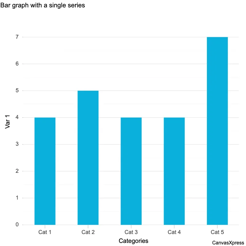
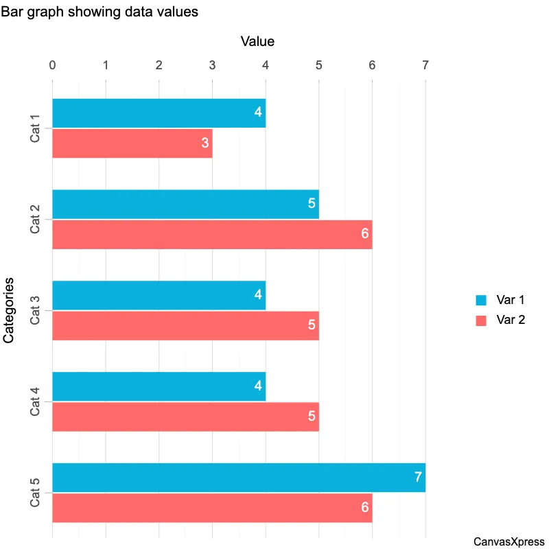
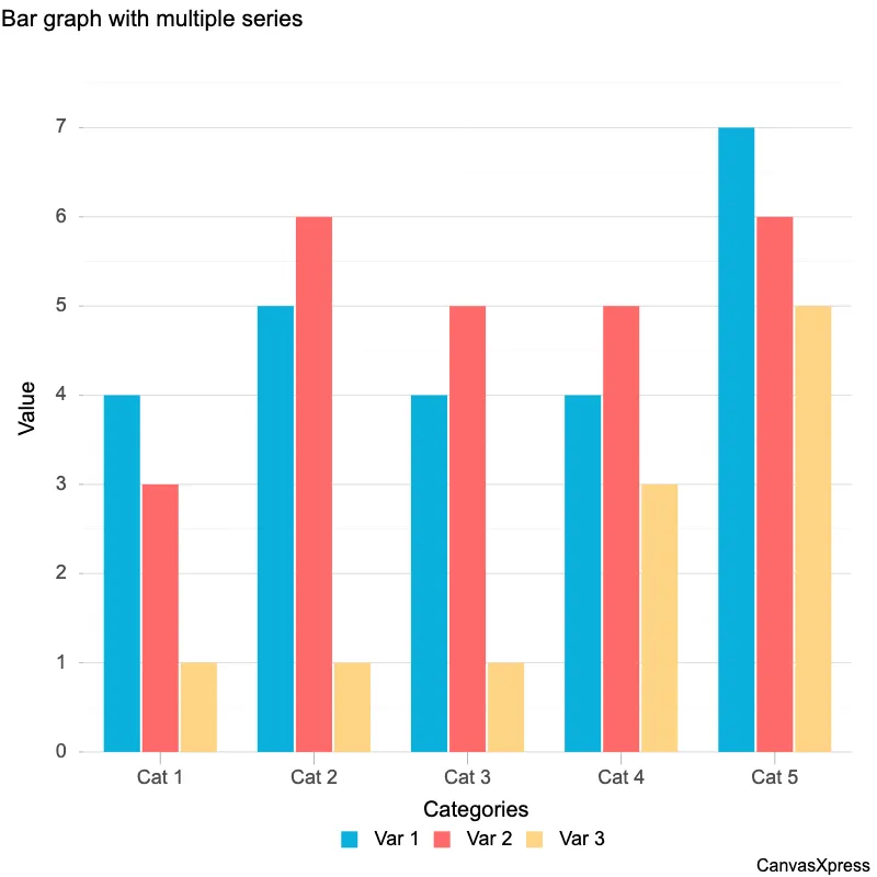
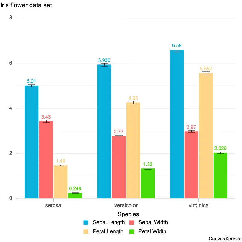
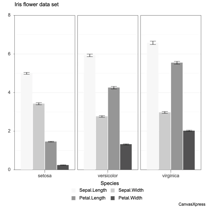
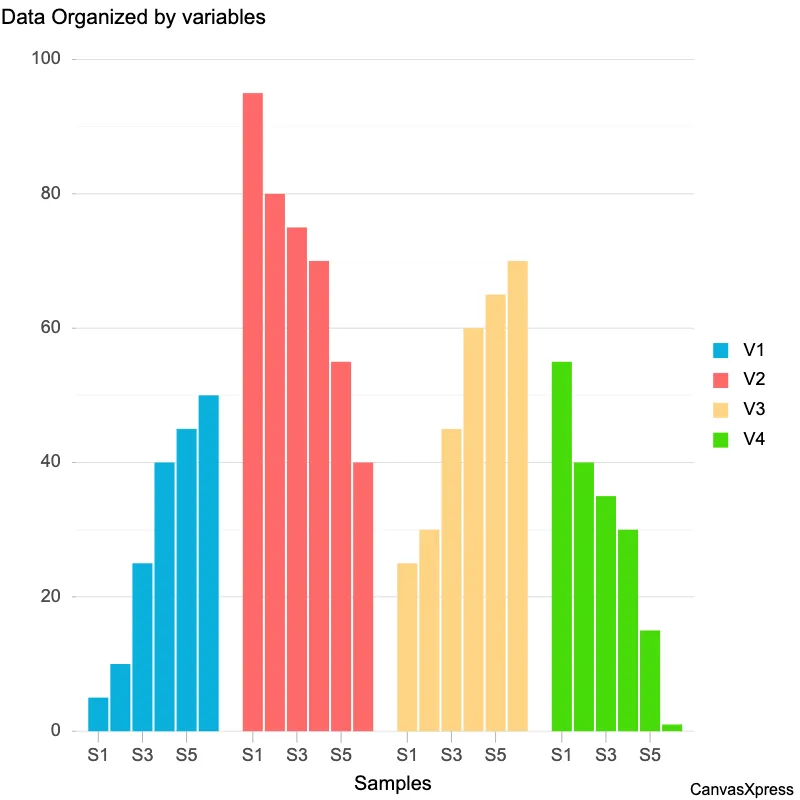
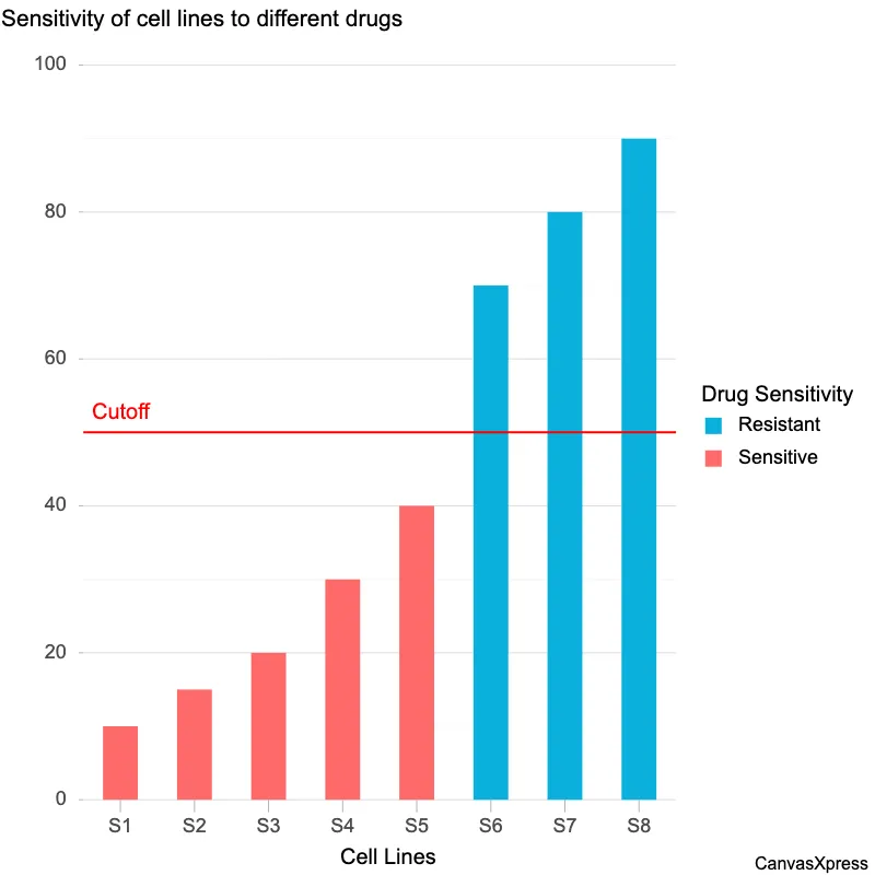
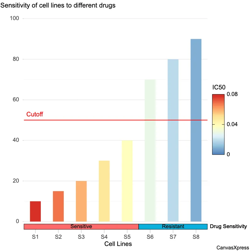
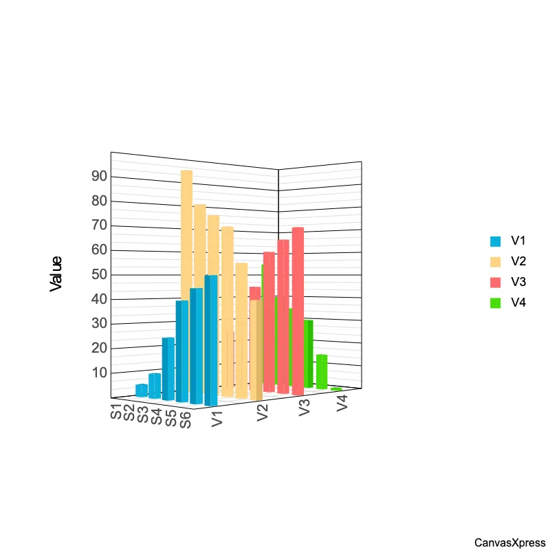
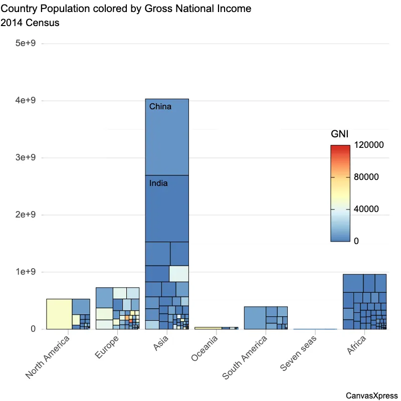
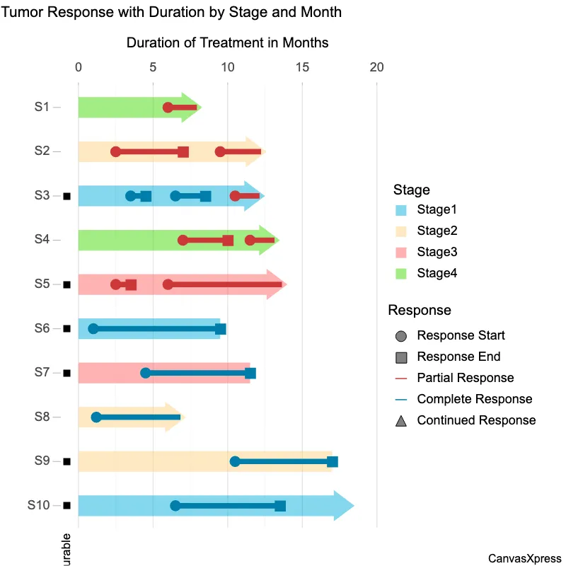
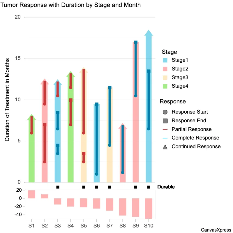
Bar graphs are visual tools used to represent data using rectangular bars of varying heights or lengths. The length of each bar is proportional to the value it represents, making it easy to compare different categories or groups. They are ideal for showcasing discrete data and making comparisons between categories readily apparent. Variations include vertical and horizontal bar graphs, clustered bar graphs for showing multiple data sets, and stacked bar graphs for showing components of a whole. Creating effective bar graphs involves selecting appropriate scales, labeling axes clearly, and using color or patterns to improve understanding. They are frequently used across various fields, from business reports to scientific presentations.


<html>

  <head>
    <!-- Include the CanvasXpress library in your HTML file -->
    <link rel="stylesheet" href="https://www.canvasxpress.org/dist/canvasXpress.css" type="text/css"/>
    <script src="https://www.canvasxpress.org/dist/canvasXpress.min.js"></script>
  </head>

  <body>

    <!-- Create a canvas element for the chart with the desired dimensions -->
    <div>
      <canvas id="canvasId" width="600" height="600"></canvas>
    </div>


    <!-- Create a script to initialize the chart -->
    <script>

      // Use a data frame (2D-array) for the graph
      var data =

      // Create the configuration for the graph
      var config = {
         "graphType" : "Bar",
         "titleAlign" : "plot::0",
         "subtitleAlign" : "plot::0",
         "legendHorizontalJustification" : 0,
         "legendJustifyTo" : "plot",
         "graphOrientation" : "horizontal",
         "theme" : "paulTol",
         "colorBy" : "Trend",
         "colorSpectrum" : [
            "#B5651D",
            "#E9B96E",
            "#F6D9A0",
            "#4FB3A0",
            "#1B7F74",
            "#003D3B"
         ],
         "colorSpectrumZeroValue" : 0,
         "xAxis" : [
            "Trend"
         ],
         "showDataValues" : true,
         "dataValuesPosition" : "inside",
         "dataTextColor" : "#ffffff",
         "dataTextScaleFontFactor" : 0.8,
         "showLegend" : false,
         "title" : "Ocean regions where warming trends diverge most",
         "subtitle" : "Change in sea-surface temperature trend, °C per decade, 2000–2016 versus 1960–2000 (illustrative).",
         "smpTitle" : "",
         "xAxisTitle" : "",
         "sampleSpaceFactor" : 0.25
      }

      // Event used to create graph (optional)
      var events = false

      // Call the CanvasXpress function to create the graph
      var cX = new CanvasXpress("canvasId", data, config, events);

    </script>

  </body>

</html>
<html>

  <head>
    <!-- Include the CanvasXpress library in your HTML file -->
    <link rel="stylesheet" href="https://www.canvasxpress.org/dist/canvasXpress.css" type="text/css"/>
    <script src="https://www.canvasxpress.org/dist/canvasXpress.min.js"></script>
  </head>

  <body>

    <!-- Create a canvas element for the chart with the desired dimensions -->
    <div>
      <canvas id="canvasId" width="600" height="600"></canvas>
    </div>


    <!-- Create a script to initialize the chart -->
    <script>

      // Create the data for the graph
      var data = {
         "y" : {
            "vars" : [
               "Trend"
            ],
            "smps" : [
               "Barents Sea",
               "Kara Sea",
               "Laptev Sea",
               "Svalbard shelf",
               "Chukchi Sea",
               "Bering Strait",
               "Beaufort Sea",
               "Baffin Bay",
               "Labrador Sea",
               "Irminger Sea",
               "Subpolar gyre",
               "Gulf Stream ext.",
               "Sargasso Sea",
               "Azores front",
               "Canary current"
            ],
            "data" : [
               [
                  0.83,
                  0.81,
                  0.76,
                  0.71,
                  0.58,
                  0.58,
                  0.53,
                  0.51,
                  -0.26,
                  -0.29,
                  -0.29,
                  -0.3,
                  -0.31,
                  -0.34,
                  -0.38
               ]
            ]
         },
         "x" : {
            "Direction" : [
               "Warming faster",
               "Warming faster",
               "Warming faster",
               "Warming faster",
               "Warming faster",
               "Warming faster",
               "Warming faster",
               "Warming faster",
               "Warming slower",
               "Warming slower",
               "Warming slower",
               "Warming slower",
               "Warming slower",
               "Warming slower",
               "Warming slower"
            ],
            "Trend" : [
               0.83,
               0.81,
               0.76,
               0.71,
               0.58,
               0.58,
               0.53,
               0.51,
               -0.26,
               -0.29,
               -0.29,
               -0.3,
               -0.31,
               -0.34,
               -0.38
            ]
         }
      }

      // Create the configuration for the graph
      var config = {
         "graphType" : "Bar",
         "titleAlign" : "plot::0",
         "subtitleAlign" : "plot::0",
         "legendHorizontalJustification" : 0,
         "legendJustifyTo" : "plot",
         "graphOrientation" : "horizontal",
         "theme" : "paulTol",
         "colorBy" : "Trend",
         "colorSpectrum" : [
            "#B5651D",
            "#E9B96E",
            "#F6D9A0",
            "#4FB3A0",
            "#1B7F74",
            "#003D3B"
         ],
         "colorSpectrumZeroValue" : 0,
         "xAxis" : [
            "Trend"
         ],
         "showDataValues" : true,
         "dataValuesPosition" : "inside",
         "dataTextColor" : "#ffffff",
         "dataTextScaleFontFactor" : 0.8,
         "showLegend" : false,
         "title" : "Ocean regions where warming trends diverge most",
         "subtitle" : "Change in sea-surface temperature trend, °C per decade, 2000–2016 versus 1960–2000 (illustrative).",
         "smpTitle" : "",
         "xAxisTitle" : "",
         "sampleSpaceFactor" : 0.25
      }

      // Event used to create graph (optional)
      var events = false

            // Call the CanvasXpress function to create the graph
      var cX = new CanvasXpress("canvasId", data, config, events);

    </script>

  </body>

</html>
library(canvasXpress)
y=read.table("https://www.canvasxpress.org/data/r/cX-bar24-dat.txt", header=TRUE, sep="\t", quote="", row.names=1, fill=TRUE, check.names=FALSE, stringsAsFactors=FALSE)
x=read.table("https://www.canvasxpress.org/data/r/cX-bar24-smp.txt", header=TRUE, sep="\t", quote="", row.names=1, fill=TRUE, check.names=FALSE, stringsAsFactors=FALSE)
canvasXpress(
data=y,
smpAnnot=x,
colorBy="Trend",
colorSpectrum=list("#B5651D", "#E9B96E", "#F6D9A0", "#4FB3A0", "#1B7F74", "#003D3B"),
colorSpectrumZeroValue=0,
dataTextColor="#ffffff",
dataTextScaleFontFactor=0.8,
dataValuesPosition="inside",
graphOrientation="horizontal",
graphType="Bar",
legendHorizontalJustification=0,
legendJustifyTo="plot",
sampleSpaceFactor=0.25,
showDataValues=TRUE,
showLegend=FALSE,
smpTitle="",
subtitle="Change in sea-surface temperature trend, °C per decade, 2000–2016 versus 1960–2000 (illustrative).",
subtitleAlign="plot::0",
theme="paulTol",
title="Ocean regions where warming trends diverge most",
titleAlign="plot::0",
xAxis=list("Trend"),
xAxisTitle=""
)
from canvasxpress.canvas import CanvasXpress
from canvasxpress.plot import show_in_browser

if __name__ == "__main__":
  # Define the chart with its data and configuration
  chart: CanvasXpress = CanvasXpress(
    render_to = "bar21",
    data = {
      "y": {
        "vars": ["Trend"],
        "smps": ["Barents Sea", "Kara Sea", "Laptev Sea", "Svalbard shelf", "Chukchi Sea", "Bering Strait", "Beaufort Sea", "Baffin Bay", "Labrador Sea", "Irminger Sea", "Subpolar gyre", "Gulf Stream ext.", "Sargasso Sea", "Azores front", "Canary current"],
        "data": [
          [0.83, 0.81, 0.76, 0.71, 0.58, 0.58, 0.53, 0.51, -0.26, -0.29, -0.29, -0.3, -0.31, -0.34, -0.38]
        ]
      },
      "x": {
        "Direction": ["Warming faster", "Warming faster", "Warming faster", "Warming faster", "Warming faster", "Warming faster", "Warming faster", "Warming faster", "Warming slower", "Warming slower", "Warming slower", "Warming slower", "Warming slower", "Warming slower", "Warming slower"],
        "Trend": [0.83, 0.81, 0.76, 0.71, 0.58, 0.58, 0.53, 0.51, -0.26, -0.29, -0.29, -0.3, -0.31, -0.34, -0.38]
      }
    },
    config = {
      "graphType": "Bar",
      "titleAlign": "plot::0",
      "subtitleAlign": "plot::0",
      "legendHorizontalJustification": 0,
      "legendJustifyTo": "plot",
      "graphOrientation": "horizontal",
      "theme": "paulTol",
      "colorBy": "Trend",
      "colorSpectrum": ["#B5651D", "#E9B96E", "#F6D9A0", "#4FB3A0", "#1B7F74", "#003D3B"],
      "colorSpectrumZeroValue": 0,
      "xAxis": ["Trend"],
      "showDataValues": True,
      "dataValuesPosition": "inside",
      "dataTextColor": "#ffffff",
      "dataTextScaleFontFactor": 0.8,
      "showLegend": False,
      "title": "Ocean regions where warming trends diverge most",
      "subtitle": "Change in sea-surface temperature trend, °C per decade, 2000–2016 versus 1960–2000 (illustrative).",
      "smpTitle": "",
      "xAxisTitle": "",
      "sampleSpaceFactor": 0.25
    },
    width = 760,
    height = 600
  )

  # Display the chart in its own Web page
  show_in_browser(chart)

from canvasxpress.canvas import CanvasXpress
from canvasxpress.plot import graph

graph(
  CanvasXpress(
    render_to = "bar21",
    data = {
      "y": {
        "vars": ["Trend"],
        "smps": ["Barents Sea", "Kara Sea", "Laptev Sea", "Svalbard shelf", "Chukchi Sea", "Bering Strait", "Beaufort Sea", "Baffin Bay", "Labrador Sea", "Irminger Sea", "Subpolar gyre", "Gulf Stream ext.", "Sargasso Sea", "Azores front", "Canary current"],
        "data": [
          [0.83, 0.81, 0.76, 0.71, 0.58, 0.58, 0.53, 0.51, -0.26, -0.29, -0.29, -0.3, -0.31, -0.34, -0.38]
        ]
      },
      "x": {
        "Direction": ["Warming faster", "Warming faster", "Warming faster", "Warming faster", "Warming faster", "Warming faster", "Warming faster", "Warming faster", "Warming slower", "Warming slower", "Warming slower", "Warming slower", "Warming slower", "Warming slower", "Warming slower"],
        "Trend": [0.83, 0.81, 0.76, 0.71, 0.58, 0.58, 0.53, 0.51, -0.26, -0.29, -0.29, -0.3, -0.31, -0.34, -0.38]
      }
    },
    config = {
      "graphType": "Bar",
      "titleAlign": "plot::0",
      "subtitleAlign": "plot::0",
      "legendHorizontalJustification": 0,
      "legendJustifyTo": "plot",
      "graphOrientation": "horizontal",
      "theme": "paulTol",
      "colorBy": "Trend",
      "colorSpectrum": ["#B5651D", "#E9B96E", "#F6D9A0", "#4FB3A0", "#1B7F74", "#003D3B"],
      "colorSpectrumZeroValue": 0,
      "xAxis": ["Trend"],
      "showDataValues": True,
      "dataValuesPosition": "inside",
      "dataTextColor": "#ffffff",
      "dataTextScaleFontFactor": 0.8,
      "showLegend": False,
      "title": "Ocean regions where warming trends diverge most",
      "subtitle": "Change in sea-surface temperature trend, °C per decade, 2000–2016 versus 1960–2000 (illustrative).",
      "smpTitle": "",
      "xAxisTitle": "",
      "sampleSpaceFactor": 0.25
    },
    width = 760,
    height = 600
  )
)
using CanvasXpress

canvasxpress(Dict(
  "y" => Dict(
    "vars" => ["Trend"],
    "smps" => ["Barents Sea", "Kara Sea", "Laptev Sea", "Svalbard shelf", "Chukchi Sea", "Bering Strait", "Beaufort Sea", "Baffin Bay", "Labrador Sea", "Irminger Sea", "Subpolar gyre", "Gulf Stream ext.", "Sargasso Sea", "Azores front", "Canary current"],
    "data" => [
      [0.83, 0.81, 0.76, 0.71, 0.58, 0.58, 0.53, 0.51, -0.26, -0.29, -0.29, -0.3, -0.31, -0.34, -0.38]
    ]
  ),
  "x" => Dict(
    "Direction" => ["Warming faster", "Warming faster", "Warming faster", "Warming faster", "Warming faster", "Warming faster", "Warming faster", "Warming faster", "Warming slower", "Warming slower", "Warming slower", "Warming slower", "Warming slower", "Warming slower", "Warming slower"],
    "Trend" => [0.83, 0.81, 0.76, 0.71, 0.58, 0.58, 0.53, 0.51, -0.26, -0.29, -0.29, -0.3, -0.31, -0.34, -0.38]
  )
);
  graphType = "Bar",
  titleAlign = "plot::0",
  subtitleAlign = "plot::0",
  legendHorizontalJustification = 0,
  legendJustifyTo = "plot",
  graphOrientation = "horizontal",
  theme = "paulTol",
  colorBy = "Trend",
  colorSpectrum = ["#B5651D", "#E9B96E", "#F6D9A0", "#4FB3A0", "#1B7F74", "#003D3B"],
  colorSpectrumZeroValue = 0,
  xAxis = ["Trend"],
  showDataValues = true,
  dataValuesPosition = "inside",
  dataTextColor = "#ffffff",
  dataTextScaleFontFactor = 0.8,
  showLegend = false,
  title = "Ocean regions where warming trends diverge most",
  subtitle = "Change in sea-surface temperature trend, °C per decade, 2000–2016 versus 1960–2000 (illustrative).",
  smpTitle = "",
  xAxisTitle = "",
  sampleSpaceFactor = 0.25
)