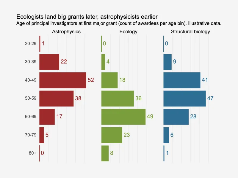
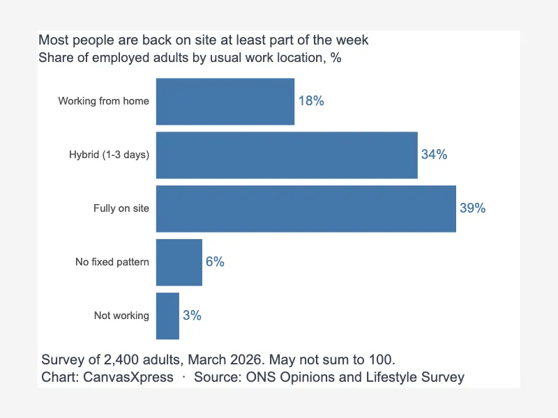
Editorial split bars with value labels
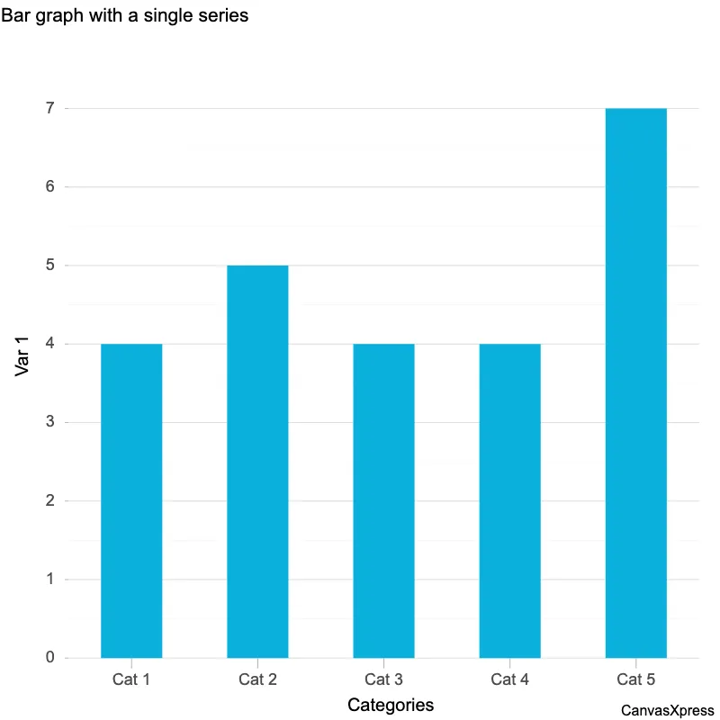
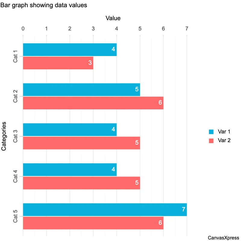
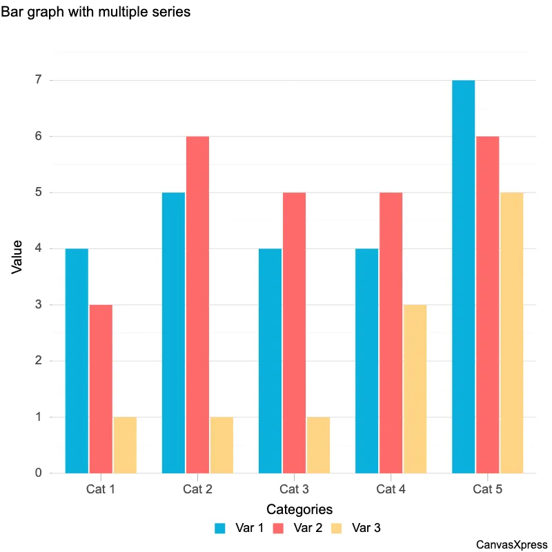
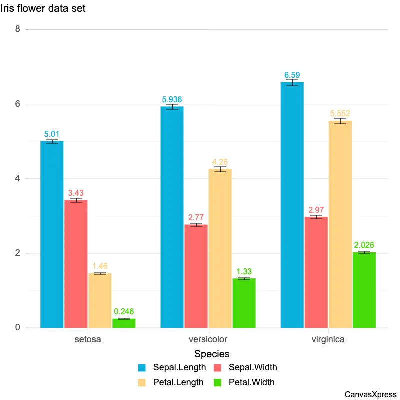
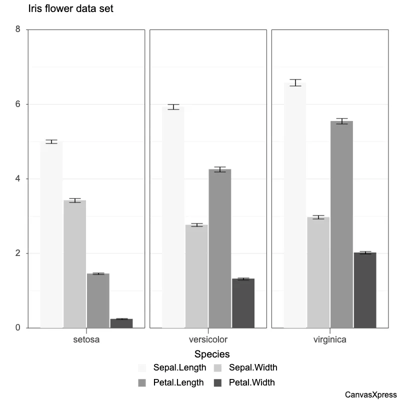
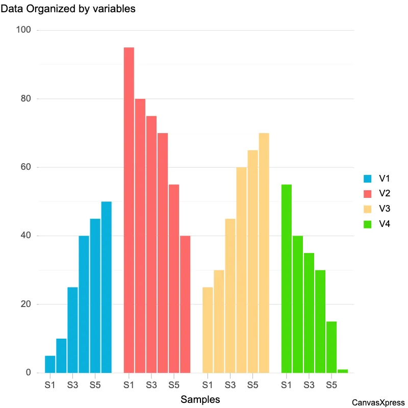
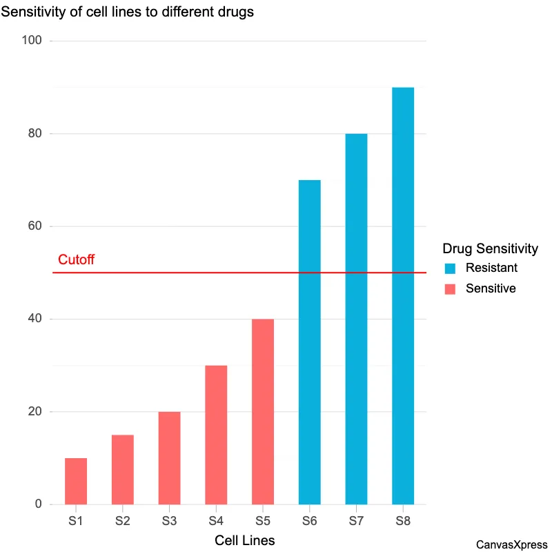
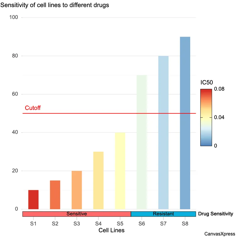
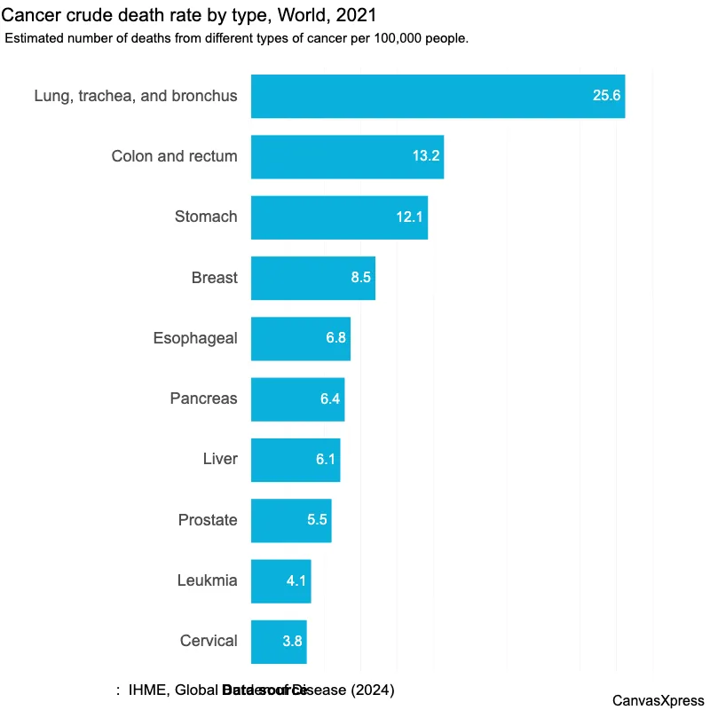
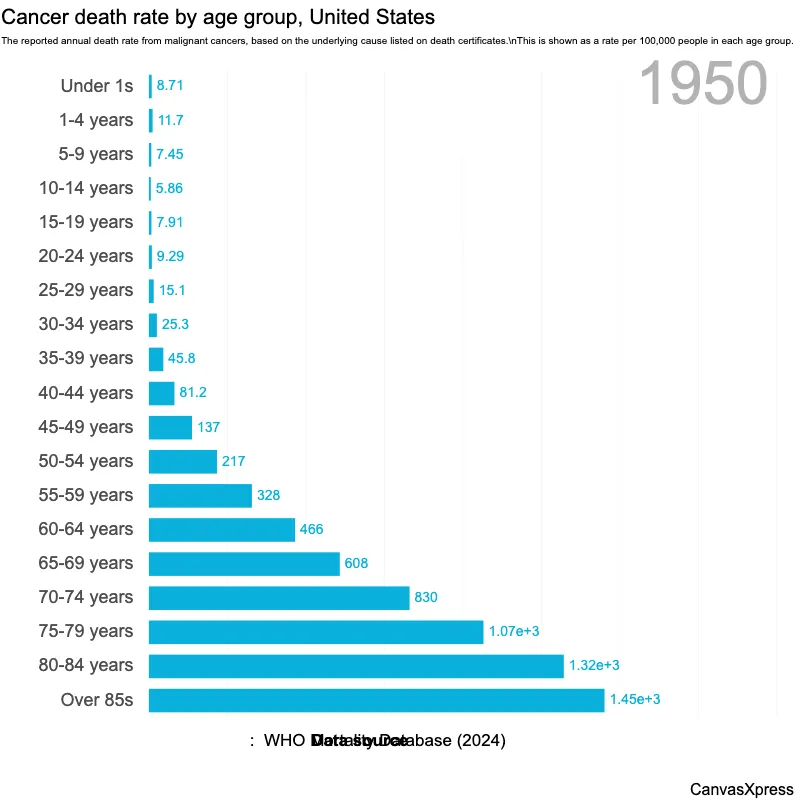
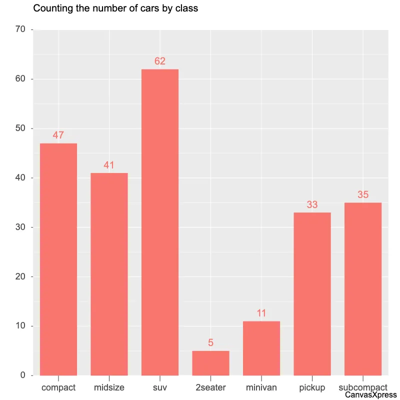
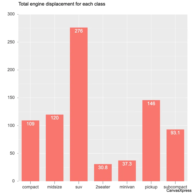
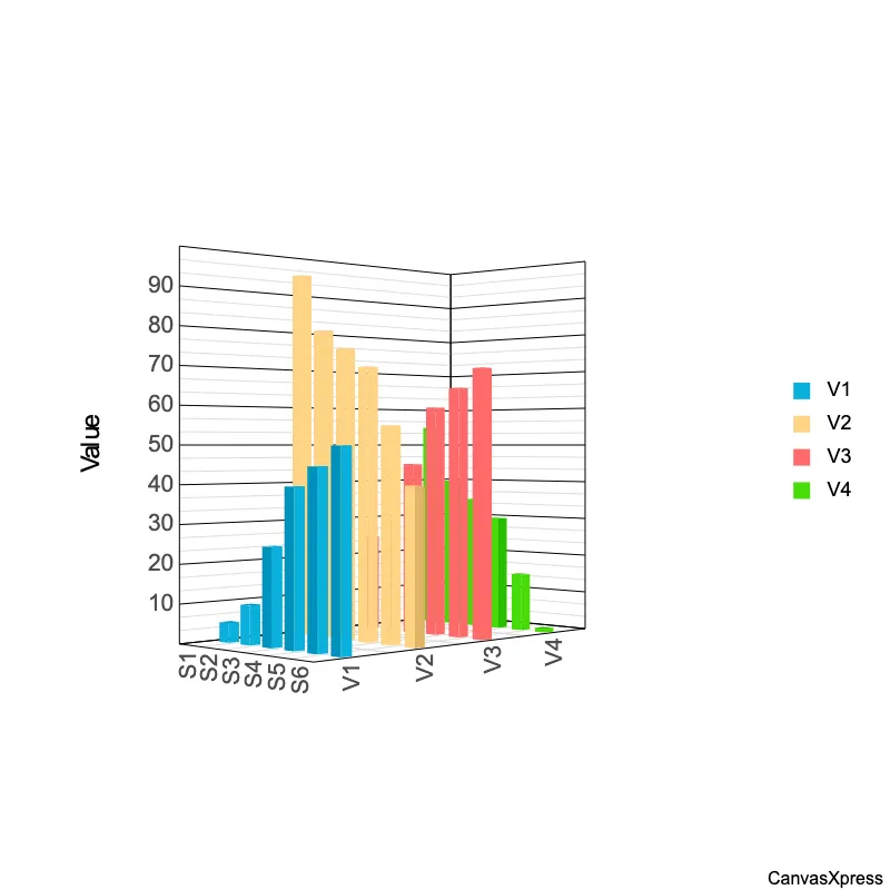
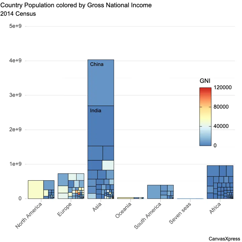
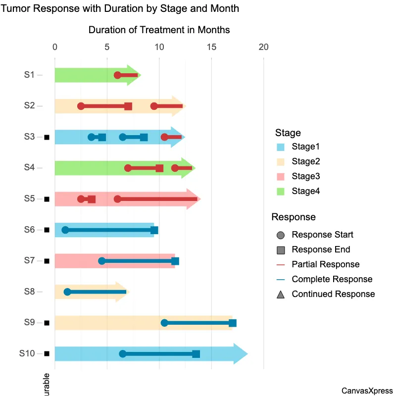
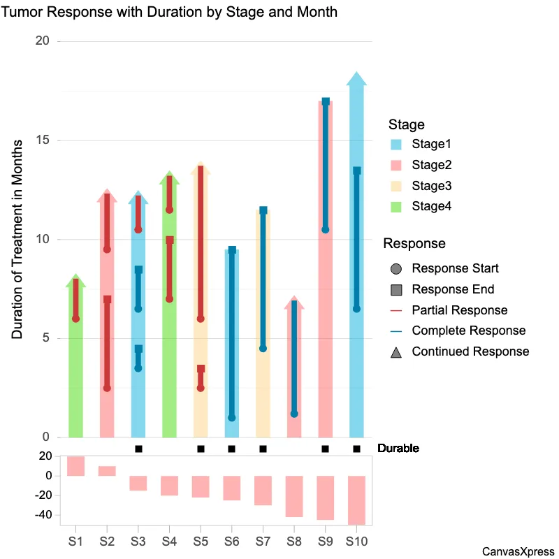
Bar graphs are visual tools used to represent data using rectangular bars of varying heights or lengths. The length of each bar is proportional to the value it represents, making it easy to compare different categories or groups. They are ideal for showcasing discrete data and making comparisons between categories readily apparent. Variations include vertical and horizontal bar graphs, clustered bar graphs for showing multiple data sets, and stacked bar graphs for showing components of a whole. Creating effective bar graphs involves selecting appropriate scales, labeling axes clearly, and using color or patterns to improve understanding. They are frequently used across various fields, from business reports to scientific presentations.


<html>

  <head>
    <!-- Include the CanvasXpress library in your HTML file -->
    <link rel="stylesheet" href="https://www.canvasxpress.org/dist/canvasXpress.css" type="text/css"/>
    <script src="https://www.canvasxpress.org/dist/canvasXpress.min.js"></script>
  </head>

  <body>

    <!-- Create a canvas element for the chart with the desired dimensions -->
    <div>
      <canvas id="canvasId" width="600" height="600"></canvas>
    </div>


    <!-- Create a script to initialize the chart -->
    <script>

      // Use a data frame (2D-array) for the graph
      var data =

      // Create the configuration for the graph
      var config = {
         "graphType" : "Bar",
         "graphOrientation" : "horizontal",
         "theme" : "editorial",
         "colorScheme" : "User",
         "title" : "Most people are back on site at least part of the week",
         "subtitle" : "Share of employed adults by usual work location, %",
         "showLegend" : false,
         "showDataValues" : true,
         "dataLabelNumberFormat" : {
            "style" : "decimal",
            "decimals" : 0,
            "suffix" : "%"
         },
         "xAxisShow" : false,
         "xAxisGridMajorShow" : false,
         "setMaxX" : 46,
         "colors" : [
            "#4477aa"
         ],
         "smpTitle" : "",
         "notes" : "Survey of 2,400 adults, March 2026. May not sum to 100.",
         "source" : "ONS Opinions and Lifestyle Survey",
         "byline" : "Chart: CanvasXpress",
         "showDataDownload" : false,
         "responsiveRules" : [
            {
               "maxWidth" : 480,
               "config" : {
                  "legendPosition" : "bottom",
                  "fontScaleFontFactor" : 0.85
               }
            }
         ]
      }

      // Event used to create graph (optional)
      var events = false

      // Call the CanvasXpress function to create the graph
      var cX = new CanvasXpress("canvasId", data, config, events);

    </script>

  </body>

</html>
<html>

  <head>
    <!-- Include the CanvasXpress library in your HTML file -->
    <link rel="stylesheet" href="https://www.canvasxpress.org/dist/canvasXpress.css" type="text/css"/>
    <script src="https://www.canvasxpress.org/dist/canvasXpress.min.js"></script>
  </head>

  <body>

    <!-- Create a canvas element for the chart with the desired dimensions -->
    <div>
      <canvas id="canvasId" width="600" height="600"></canvas>
    </div>


    <!-- Create a script to initialize the chart -->
    <script>

      // Create the data for the graph
      var data = {
         "y" : {
            "vars" : [
               "Share"
            ],
            "smps" : [
               "Working from home",
               "Hybrid (1-3 days)",
               "Fully on site",
               "No fixed pattern",
               "Not working"
            ],
            "data" : [
               [
                  18,
                  34,
                  39,
                  6,
                  3
               ]
            ]
         }
      }

      // Create the configuration for the graph
      var config = {
         "graphType" : "Bar",
         "graphOrientation" : "horizontal",
         "theme" : "editorial",
         "colorScheme" : "User",
         "title" : "Most people are back on site at least part of the week",
         "subtitle" : "Share of employed adults by usual work location, %",
         "showLegend" : false,
         "showDataValues" : true,
         "dataLabelNumberFormat" : {
            "style" : "decimal",
            "decimals" : 0,
            "suffix" : "%"
         },
         "xAxisShow" : false,
         "xAxisGridMajorShow" : false,
         "setMaxX" : 46,
         "colors" : [
            "#4477aa"
         ],
         "smpTitle" : "",
         "notes" : "Survey of 2,400 adults, March 2026. May not sum to 100.",
         "source" : "ONS Opinions and Lifestyle Survey",
         "byline" : "Chart: CanvasXpress",
         "showDataDownload" : false,
         "responsiveRules" : [
            {
               "maxWidth" : 480,
               "config" : {
                  "legendPosition" : "bottom",
                  "fontScaleFontFactor" : 0.85
               }
            }
         ]
      }

      // Event used to create graph (optional)
      var events = false

            // Call the CanvasXpress function to create the graph
      var cX = new CanvasXpress("canvasId", data, config, events);

    </script>

  </body>

</html>
library(canvasXpress)
y=read.table("https://www.canvasxpress.org/data/r/cX-bar25-dat.txt", header=TRUE, sep="\t", quote="", row.names=1, fill=TRUE, check.names=FALSE, stringsAsFactors=FALSE)
canvasXpress(
data=y,
byline="Chart: CanvasXpress",
colorScheme="User",
colors=list("#4477aa"),
dataLabelNumberFormat=list(decimals=0, style="decimal", suffix="%"),
graphOrientation="horizontal",
graphType="Bar",
notes="Survey of 2,400 adults, March 2026. May not sum to 100.",
responsiveRules=list(list(config=list(fontScaleFontFactor=0.85, legendPosition="bottom"), maxWidth=480)),
setMaxX=46,
showDataDownload=FALSE,
showDataValues=TRUE,
showLegend=FALSE,
smpTitle="",
source="ONS Opinions and Lifestyle Survey",
subtitle="Share of employed adults by usual work location, %",
theme="editorial",
title="Most people are back on site at least part of the week",
xAxisGridMajorShow=FALSE,
xAxisShow=FALSE
)
from canvasxpress.canvas import CanvasXpress
from canvasxpress.plot import show_in_browser

if __name__ == "__main__":
  # Define the chart with its data and configuration
  chart: CanvasXpress = CanvasXpress(
    render_to = "bar22",
    data = {
      "y": {
        "vars": ["Share"],
        "smps": ["Working from home", "Hybrid (1-3 days)", "Fully on site", "No fixed pattern", "Not working"],
        "data": [
          [18, 34, 39, 6, 3]
        ]
      }
    },
    config = {
      "graphType": "Bar",
      "graphOrientation": "horizontal",
      "theme": "editorial",
      "colorScheme": "User",
      "title": "Most people are back on site at least part of the week",
      "subtitle": "Share of employed adults by usual work location, %",
      "showLegend": False,
      "showDataValues": True,
      "dataLabelNumberFormat": {
        "style": "decimal",
        "decimals": 0,
        "suffix": "%"
      },
      "xAxisShow": False,
      "xAxisGridMajorShow": False,
      "setMaxX": 46,
      "colors": ["#4477aa"],
      "smpTitle": "",
      "notes": "Survey of 2,400 adults, March 2026. May not sum to 100.",
      "source": "ONS Opinions and Lifestyle Survey",
      "byline": "Chart: CanvasXpress",
      "showDataDownload": False,
      "responsiveRules": [
        {
          "maxWidth": 480,
          "config": {
            "legendPosition": "bottom",
            "fontScaleFontFactor": 0.85
          }
        }
      ]
    },
    width = 760,
    height = 517
  )

  # Display the chart in its own Web page
  show_in_browser(chart)

from canvasxpress.canvas import CanvasXpress
from canvasxpress.plot import graph

graph(
  CanvasXpress(
    render_to = "bar22",
    data = {
      "y": {
        "vars": ["Share"],
        "smps": ["Working from home", "Hybrid (1-3 days)", "Fully on site", "No fixed pattern", "Not working"],
        "data": [
          [18, 34, 39, 6, 3]
        ]
      }
    },
    config = {
      "graphType": "Bar",
      "graphOrientation": "horizontal",
      "theme": "editorial",
      "colorScheme": "User",
      "title": "Most people are back on site at least part of the week",
      "subtitle": "Share of employed adults by usual work location, %",
      "showLegend": False,
      "showDataValues": True,
      "dataLabelNumberFormat": {
        "style": "decimal",
        "decimals": 0,
        "suffix": "%"
      },
      "xAxisShow": False,
      "xAxisGridMajorShow": False,
      "setMaxX": 46,
      "colors": ["#4477aa"],
      "smpTitle": "",
      "notes": "Survey of 2,400 adults, March 2026. May not sum to 100.",
      "source": "ONS Opinions and Lifestyle Survey",
      "byline": "Chart: CanvasXpress",
      "showDataDownload": False,
      "responsiveRules": [
        {
          "maxWidth": 480,
          "config": {
            "legendPosition": "bottom",
            "fontScaleFontFactor": 0.85
          }
        }
      ]
    },
    width = 760,
    height = 517
  )
)
using CanvasXpress

canvasxpress(Dict(
  "y" => Dict(
    "vars" => ["Share"],
    "smps" => ["Working from home", "Hybrid (1-3 days)", "Fully on site", "No fixed pattern", "Not working"],
    "data" => [
      [18, 34, 39, 6, 3]
    ]
  )
);
  graphType = "Bar",
  graphOrientation = "horizontal",
  theme = "editorial",
  colorScheme = "User",
  title = "Most people are back on site at least part of the week",
  subtitle = "Share of employed adults by usual work location, %",
  showLegend = false,
  showDataValues = true,
  dataLabelNumberFormat = Dict(
    "style" => "decimal",
    "decimals" => 0,
    "suffix" => "%"
  ),
  xAxisShow = false,
  xAxisGridMajorShow = false,
  setMaxX = 46,
  colors = ["#4477aa"],
  smpTitle = "",
  notes = "Survey of 2,400 adults, March 2026. May not sum to 100.",
  source = "ONS Opinions and Lifestyle Survey",
  byline = "Chart: CanvasXpress",
  showDataDownload = false,
  responsiveRules = [
    Dict(
      "maxWidth" => 480,
      "config" => Dict(
        "legendPosition" => "bottom",
        "fontScaleFontFactor" => 0.85
      )
    )
  ]
)