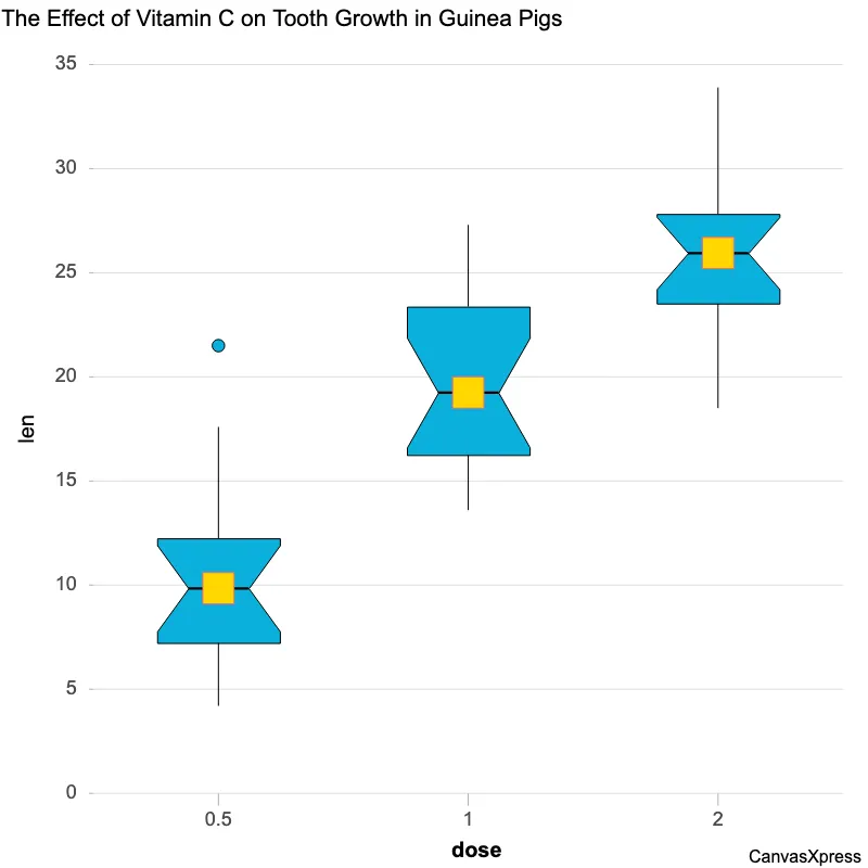
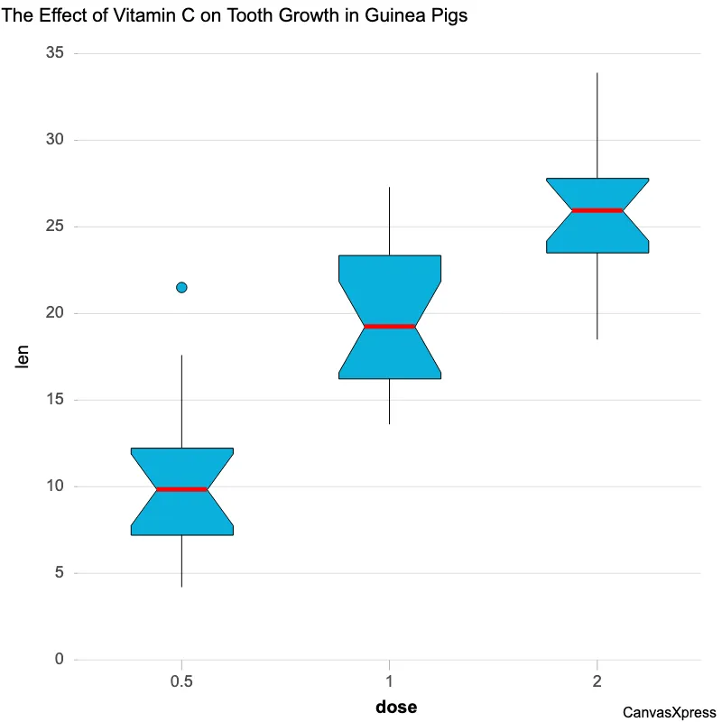
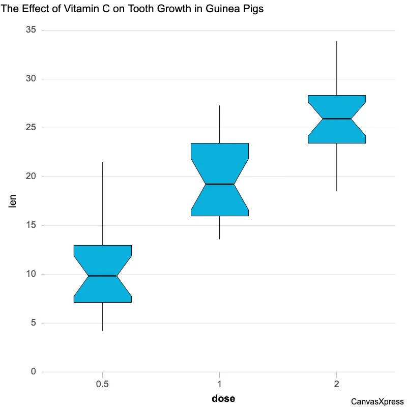
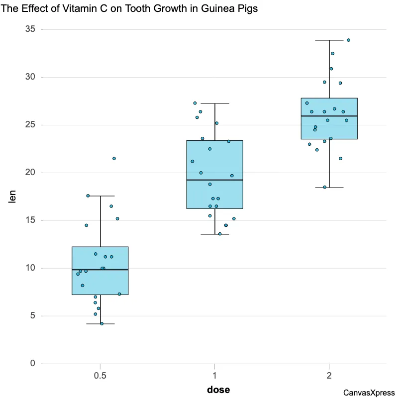
Notched Box Plots: Outliers & Color
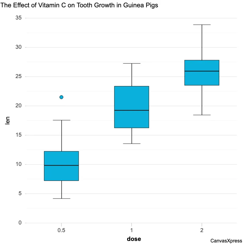
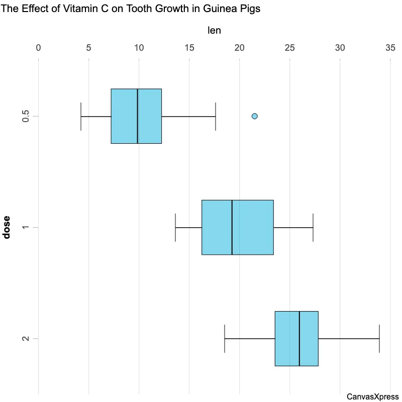
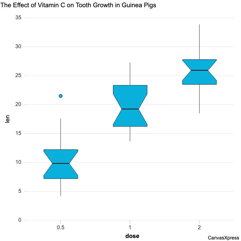
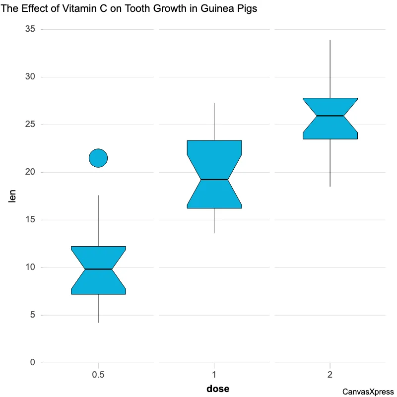
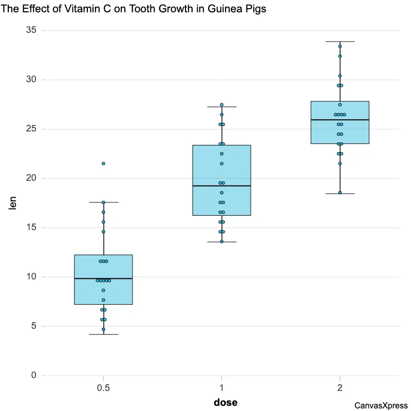
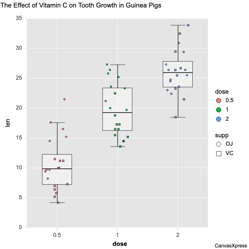
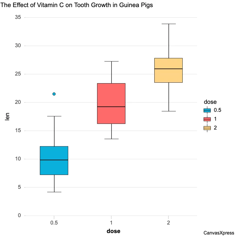
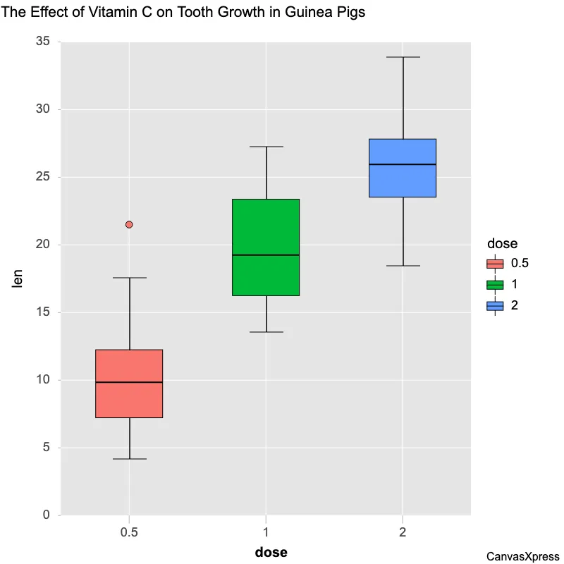
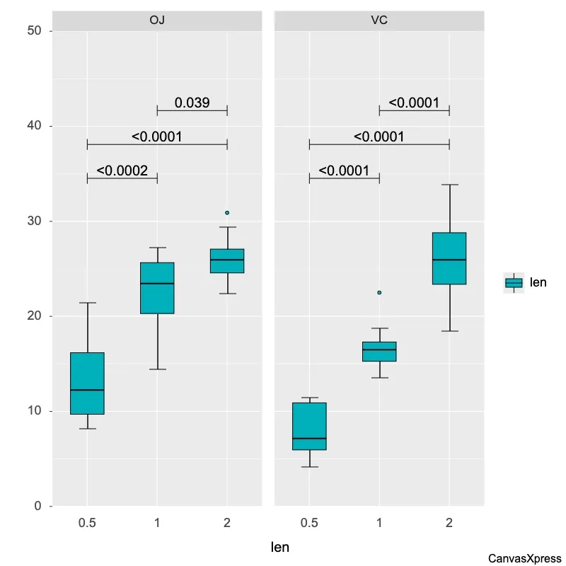
Boxplot graphs, also known as box and whisker plots, offer a compelling way to visually display the distribution and summary statistics of a dataset. They present key descriptive statistics such as median, quartiles, and potential outliers, making them ideal for comparing data across different groups or identifying unusual data points. Understanding boxplot graphs is essential for data analysis. These graphs quickly reveal central tendency, spread, and skewness, providing valuable insights for decision-making. Their effectiveness in visualizing data makes them a staple in various fields, from finance and healthcare to engineering and social sciences.


<html>

  <head>
    <!-- Include the CanvasXpress library in your HTML file -->
    <link rel="stylesheet" href="https://www.canvasxpress.org/dist/canvasXpress.css" type="text/css"/>
    <script src="https://www.canvasxpress.org/dist/canvasXpress.min.js"></script>
  </head>

  <body>

    <!-- Create a canvas element for the chart with the desired dimensions -->
    <div>
      <canvas id="canvasId" width="600" height="600"></canvas>
    </div>


    <!-- Create a script to initialize the chart -->
    <script>

      // Use a data frame (2D-array) for the graph
      var data = [
        [ "Id", "len", "order", "dose", "supp"],
        [ "Var1", 4.2, 1, "0.5", "VC"],
        [ "Var2", 11.5, 2, "0.5", "VC"],
        [ "Var3", 7.3, 3, "0.5", "VC"],
        [ "Var4", 5.8, 4, "0.5", "VC"],
        [ "Var5", 6.4, 5, "0.5", "VC"],
        [ "Var6", 10, 6, "0.5", "VC"],
        [ "Var7", 11.2, 7, "0.5", "VC"],
        [ "Var8", 11.2, 8, "0.5", "VC"],
        [ "Var9", 5.2, 9, "0.5", "VC"],
        [ "Var10", 7, 10, "0.5", "VC"],
        [ "Var11", 16.5, 1, "1", "VC"],
        [ "Var12", 16.5, 2, "1", "VC"],
        [ "Var13", 15.2, 3, "1", "VC"],
        [ "Var14", 17.3, 4, "1", "VC"],
        [ "Var15", 22.5, 5, "1", "VC"],
        [ "Var16", 17.3, 6, "1", "VC"],
        [ "Var17", 13.6, 7, "1", "VC"],
        [ "Var18", 14.5, 8, "1", "VC"],
        [ "Var19", 18.8, 9, "1", "VC"],
        [ "Var20", 15.5, 10, "1", "VC"],
        [ "Var21", 23.6, 1, "2", "VC"],
        [ "Var22", 18.5, 2, "2", "VC"],
        [ "Var23", 33.9, 3, "2", "VC"],
        [ "Var24", 25.5, 4, "2", "VC"],
        [ "Var25", 26.4, 5, "2", "VC"],
        [ "Var26", 32.5, 6, "2", "VC"],
        [ "Var27", 26.7, 7, "2", "VC"],
        [ "Var28", 21.5, 8, "2", "VC"],
        // ... (data truncated after 29 records for clarity)
      ]

      // Create the configuration for the graph
      var config = {
        "axisAlgorithm": "rPretty",
        "axisTitleFontStyle": "bold",
        "boxplotNotched": true,
        "boxplotOutliersRatio": 3,
        "boxplotWhiskersType": "single",
        "graphOrientation": "vertical",
        "graphType": "Boxplot",
        "groupingFactors": ["dose"],
        "showLegend": false,
        "smpTextRotate": 90,
        "smpTitle": "dose",
        "smpTitleFontStyle": "bold",
        "segregateSamplesBy": ["dose"],
        "layoutTopology": "1X3",
        "title": "The Effect of Vitamin C on Tooth Growth in Guinea Pigs",
        "xAxis": ["len"],
        "xAxis2Show": false,
        "xAxisGridMinorShow": false,
        "xAxisTitle": "len"
      }

      // Event used to create graph (optional)
      var events = false

      // Call the CanvasXpress function to create the graph
      var cX = new CanvasXpress("canvasId", data, config, events);

    </script>

  </body>

</html>
<html>

  <head>
    <!-- Include the CanvasXpress library in your HTML file -->
    <link rel="stylesheet" href="https://www.canvasxpress.org/dist/canvasXpress.css" type="text/css"/>
    <script src="https://www.canvasxpress.org/dist/canvasXpress.min.js"></script>
  </head>

  <body>

    <!-- Create a canvas element for the chart with the desired dimensions -->
    <div>
      <canvas id="canvasId" width="600" height="600"></canvas>
    </div>


    <!-- Create a script to initialize the chart -->
    <script>

      // Create the data for the graph
      var data = {
         "x" : {
            "dose" : ["0.5","0.5","0.5","0.5","0.5","0.5","0.5","0.5","0.5","0.5","1","1","1","1","1","1","1","1","1","1","2","2","2","2","2","2","2","2","2","2","0.5","0.5","0.5","0.5","0.5","0.5","0.5","0.5","0.5","0.5","1","1","1","1","1","1","1","1","1","1","2","2","2","2","2","2","2","2","2","2"],
            "order" : [1,2,3,4,5,6,7,8,9,10,1,2,3,4,5,6,7,8,9,10,1,2,3,4,5,6,7,8,9,10,1,2,3,4,5,6,7,8,9,10,1,2,3,4,5,6,7,8,9,10,1,2,3,4,5,6,7,8,9,10],
            "supp" : ["VC","VC","VC","VC","VC","VC","VC","VC","VC","VC","VC","VC","VC","VC","VC","VC","VC","VC","VC","VC","VC","VC","VC","VC","VC","VC","VC","VC","VC","VC","OJ","OJ","OJ","OJ","OJ","OJ","OJ","OJ","OJ","OJ","OJ","OJ","OJ","OJ","OJ","OJ","OJ","OJ","OJ","OJ","OJ","OJ","OJ","OJ","OJ","OJ","OJ","OJ","OJ","OJ"]
         },
         "y" : {
            "data" : [
              [4.2,11.5,7.3,5.8,6.4,10,11.2,11.2,5.2,7,16.5,16.5,15.2,17.3,22.5,17.3,13.6,14.5,18.8,15.5,23.6,18.5,33.9,25.5,26.4,32.5,26.7,21.5,23.3,29.5,15.2,21.5,17.6,9.7,14.5,10,8.2,9.4,16.5,9.7,19.7,23.3,23.6,26.4,20,25.2,25.8,21.2,14.5,27.3,25.5,26.4,22.4,24.5,24.8,30.9,26.4,27.3,29.4,23]
            ],
            "smps" : ["Var1","Var2","Var3","Var4","Var5","Var6","Var7","Var8","Var9","Var10","Var11","Var12","Var13","Var14","Var15","Var16","Var17","Var18","Var19","Var20","Var21","Var22","Var23","Var24","Var25","Var26","Var27","Var28","Var29","Var30","Var31","Var32","Var33","Var34","Var35","Var36","Var37","Var38","Var39","Var40","Var41","Var42","Var43","Var44","Var45","Var46","Var47","Var48","Var49","Var50","Var51","Var52","Var53","Var54","Var55","Var56","Var57","Var58","Var59","Var60"],
            "vars" : ["len"]
         }
      }

      // Create the configuration for the graph
      var config = {
        "axisAlgorithm": "rPretty",
        "axisTitleFontStyle": "bold",
        "boxplotNotched": true,
        "boxplotOutliersRatio": 3,
        "boxplotWhiskersType": "single",
        "graphOrientation": "vertical",
        "graphType": "Boxplot",
        "groupingFactors": ["dose"],
        "showLegend": false,
        "smpTextRotate": 90,
        "smpTitle": "dose",
        "smpTitleFontStyle": "bold",
        "segregateSamplesBy": ["dose"],
        "layoutTopology": "1X3",
        "title": "The Effect of Vitamin C on Tooth Growth in Guinea Pigs",
        "xAxis": ["len"],
        "xAxis2Show": false,
        "xAxisGridMinorShow": false,
        "xAxisTitle": "len"
      }

      // Event used to create graph (optional)
      var events = false

            // Call the CanvasXpress function to create the graph
      var cX = new CanvasXpress("canvasId", data, config, events);

    </script>

  </body>

</html>
library(canvasXpress)
y=read.table("https://www.canvasxpress.org/data/r/cX-toothgrowth-dat.txt", header=TRUE, sep="\t", quote="", row.names=1, fill=TRUE, check.names=FALSE, stringsAsFactors=FALSE)
x=read.table("https://www.canvasxpress.org/data/r/cX-toothgrowth-smp.txt", header=TRUE, sep="\t", quote="", row.names=1, fill=TRUE, check.names=FALSE, stringsAsFactors=FALSE)
canvasXpress(
data=y,
smpAnnot=x,
axisAlgorithm="rPretty",
axisTitleFontStyle="bold",
boxplotNotched=TRUE,
boxplotOutliersRatio=3,
boxplotWhiskersType="single",
graphOrientation="vertical",
graphType="Boxplot",
groupingFactors=list("dose"),
layoutTopology="1X3",
segregateSamplesBy=list("dose"),
showLegend=FALSE,
smpTextRotate=90,
smpTitle="dose",
smpTitleFontStyle="bold",
title="The Effect of Vitamin C on Tooth Growth in Guinea Pigs",
xAxis=list("len"),
xAxis2Show=FALSE,
xAxisGridMinorShow=FALSE,
xAxisTitle="len"
)
from canvasxpress.canvas import CanvasXpress
from canvasxpress.plot import show_in_browser

if __name__ == "__main__":
  # Define the chart with its data and configuration
  chart: CanvasXpress = CanvasXpress(
    render_to = "boxplot4",
    data = {
      "x": {
        "dose": ["0.5", "0.5", "0.5", "0.5", "0.5", "0.5", "0.5", "0.5", "0.5", "0.5", "1", "1", "1", "1", "1", "1", "1", "1", "1", "1", "2", "2", "2", "2", "2", "2", "2", "2", "2", "2", "0.5", "0.5", "0.5", "0.5", "0.5", "0.5", "0.5", "0.5", "0.5", "0.5", "1", "1", "1", "1", "1", "1", "1", "1", "1", "1", "2", "2", "2", "2", "2", "2", "2", "2", "2", "2"],
        "order": [1, 2, 3, 4, 5, 6, 7, 8, 9, 10, 1, 2, 3, 4, 5, 6, 7, 8, 9, 10, 1, 2, 3, 4, 5, 6, 7, 8, 9, 10, 1, 2, 3, 4, 5, 6, 7, 8, 9, 10, 1, 2, 3, 4, 5, 6, 7, 8, 9, 10, 1, 2, 3, 4, 5, 6, 7, 8, 9, 10],
        "supp": ["VC", "VC", "VC", "VC", "VC", "VC", "VC", "VC", "VC", "VC", "VC", "VC", "VC", "VC", "VC", "VC", "VC", "VC", "VC", "VC", "VC", "VC", "VC", "VC", "VC", "VC", "VC", "VC", "VC", "VC", "OJ", "OJ", "OJ", "OJ", "OJ", "OJ", "OJ", "OJ", "OJ", "OJ", "OJ", "OJ", "OJ", "OJ", "OJ", "OJ", "OJ", "OJ", "OJ", "OJ", "OJ", "OJ", "OJ", "OJ", "OJ", "OJ", "OJ", "OJ", "OJ", "OJ"]
      },
      "y": {
        "data": [
          [4.2, 11.5, 7.3, 5.8, 6.4, 10, 11.2, 11.2, 5.2, 7, 16.5, 16.5, 15.2, 17.3, 22.5, 17.3, 13.6, 14.5, 18.8, 15.5, 23.6, 18.5, 33.9, 25.5, 26.4, 32.5, 26.7, 21.5, 23.3, 29.5, 15.2, 21.5, 17.6, 9.7, 14.5, 10, 8.2, 9.4, 16.5, 9.7, 19.7, 23.3, 23.6, 26.4, 20, 25.2, 25.8, 21.2, 14.5, 27.3, 25.5, 26.4, 22.4, 24.5, 24.8, 30.9, 26.4, 27.3, 29.4, 23]
        ],
        "smps": ["Var1", "Var2", "Var3", "Var4", "Var5", "Var6", "Var7", "Var8", "Var9", "Var10", "Var11", "Var12", "Var13", "Var14", "Var15", "Var16", "Var17", "Var18", "Var19", "Var20", "Var21", "Var22", "Var23", "Var24", "Var25", "Var26", "Var27", "Var28", "Var29", "Var30", "Var31", "Var32", "Var33", "Var34", "Var35", "Var36", "Var37", "Var38", "Var39", "Var40", "Var41", "Var42", "Var43", "Var44", "Var45", "Var46", "Var47", "Var48", "Var49", "Var50", "Var51", "Var52", "Var53", "Var54", "Var55", "Var56", "Var57", "Var58", "Var59", "Var60"],
        "vars": ["len"]
      }
    },
    config = {
      "axisAlgorithm": "rPretty",
      "axisTitleFontStyle": "bold",
      "boxplotNotched": True,
      "boxplotOutliersRatio": 3,
      "boxplotWhiskersType": "single",
      "graphOrientation": "vertical",
      "graphType": "Boxplot",
      "groupingFactors": ["dose"],
      "showLegend": False,
      "smpTextRotate": 90,
      "smpTitle": "dose",
      "smpTitleFontStyle": "bold",
      "segregateSamplesBy": ["dose"],
      "layoutTopology": "1X3",
      "title": "The Effect of Vitamin C on Tooth Growth in Guinea Pigs",
      "xAxis": ["len"],
      "xAxis2Show": False,
      "xAxisGridMinorShow": False,
      "xAxisTitle": "len"
    },
    width = 600,
    height = 600
  )

  # Display the chart in its own Web page
  show_in_browser(chart)
Run this notebook:

from canvasxpress.canvas import CanvasXpress
from canvasxpress.plot import graph

graph(
  CanvasXpress(
    render_to = "boxplot4",
    data = {
      "x": {
        "dose": ["0.5", "0.5", "0.5", "0.5", "0.5", "0.5", "0.5", "0.5", "0.5", "0.5", "1", "1", "1", "1", "1", "1", "1", "1", "1", "1", "2", "2", "2", "2", "2", "2", "2", "2", "2", "2", "0.5", "0.5", "0.5", "0.5", "0.5", "0.5", "0.5", "0.5", "0.5", "0.5", "1", "1", "1", "1", "1", "1", "1", "1", "1", "1", "2", "2", "2", "2", "2", "2", "2", "2", "2", "2"],
        "order": [1, 2, 3, 4, 5, 6, 7, 8, 9, 10, 1, 2, 3, 4, 5, 6, 7, 8, 9, 10, 1, 2, 3, 4, 5, 6, 7, 8, 9, 10, 1, 2, 3, 4, 5, 6, 7, 8, 9, 10, 1, 2, 3, 4, 5, 6, 7, 8, 9, 10, 1, 2, 3, 4, 5, 6, 7, 8, 9, 10],
        "supp": ["VC", "VC", "VC", "VC", "VC", "VC", "VC", "VC", "VC", "VC", "VC", "VC", "VC", "VC", "VC", "VC", "VC", "VC", "VC", "VC", "VC", "VC", "VC", "VC", "VC", "VC", "VC", "VC", "VC", "VC", "OJ", "OJ", "OJ", "OJ", "OJ", "OJ", "OJ", "OJ", "OJ", "OJ", "OJ", "OJ", "OJ", "OJ", "OJ", "OJ", "OJ", "OJ", "OJ", "OJ", "OJ", "OJ", "OJ", "OJ", "OJ", "OJ", "OJ", "OJ", "OJ", "OJ"]
      },
      "y": {
        "data": [
          [4.2, 11.5, 7.3, 5.8, 6.4, 10, 11.2, 11.2, 5.2, 7, 16.5, 16.5, 15.2, 17.3, 22.5, 17.3, 13.6, 14.5, 18.8, 15.5, 23.6, 18.5, 33.9, 25.5, 26.4, 32.5, 26.7, 21.5, 23.3, 29.5, 15.2, 21.5, 17.6, 9.7, 14.5, 10, 8.2, 9.4, 16.5, 9.7, 19.7, 23.3, 23.6, 26.4, 20, 25.2, 25.8, 21.2, 14.5, 27.3, 25.5, 26.4, 22.4, 24.5, 24.8, 30.9, 26.4, 27.3, 29.4, 23]
        ],
        "smps": ["Var1", "Var2", "Var3", "Var4", "Var5", "Var6", "Var7", "Var8", "Var9", "Var10", "Var11", "Var12", "Var13", "Var14", "Var15", "Var16", "Var17", "Var18", "Var19", "Var20", "Var21", "Var22", "Var23", "Var24", "Var25", "Var26", "Var27", "Var28", "Var29", "Var30", "Var31", "Var32", "Var33", "Var34", "Var35", "Var36", "Var37", "Var38", "Var39", "Var40", "Var41", "Var42", "Var43", "Var44", "Var45", "Var46", "Var47", "Var48", "Var49", "Var50", "Var51", "Var52", "Var53", "Var54", "Var55", "Var56", "Var57", "Var58", "Var59", "Var60"],
        "vars": ["len"]
      }
    },
    config = {
      "axisAlgorithm": "rPretty",
      "axisTitleFontStyle": "bold",
      "boxplotNotched": True,
      "boxplotOutliersRatio": 3,
      "boxplotWhiskersType": "single",
      "graphOrientation": "vertical",
      "graphType": "Boxplot",
      "groupingFactors": ["dose"],
      "showLegend": False,
      "smpTextRotate": 90,
      "smpTitle": "dose",
      "smpTitleFontStyle": "bold",
      "segregateSamplesBy": ["dose"],
      "layoutTopology": "1X3",
      "title": "The Effect of Vitamin C on Tooth Growth in Guinea Pigs",
      "xAxis": ["len"],
      "xAxis2Show": False,
      "xAxisGridMinorShow": False,
      "xAxisTitle": "len"
    },
    width = 600,
    height = 600
  )
)
using CanvasXpress

canvasxpress(Dict(
  "x" => Dict(
    "dose" => ["0.5", "0.5", "0.5", "0.5", "0.5", "0.5", "0.5", "0.5", "0.5", "0.5", "1", "1", "1", "1", "1", "1", "1", "1", "1", "1", "2", "2", "2", "2", "2", "2", "2", "2", "2", "2", "0.5", "0.5", "0.5", "0.5", "0.5", "0.5", "0.5", "0.5", "0.5", "0.5", "1", "1", "1", "1", "1", "1", "1", "1", "1", "1", "2", "2", "2", "2", "2", "2", "2", "2", "2", "2"],
    "order" => [1, 2, 3, 4, 5, 6, 7, 8, 9, 10, 1, 2, 3, 4, 5, 6, 7, 8, 9, 10, 1, 2, 3, 4, 5, 6, 7, 8, 9, 10, 1, 2, 3, 4, 5, 6, 7, 8, 9, 10, 1, 2, 3, 4, 5, 6, 7, 8, 9, 10, 1, 2, 3, 4, 5, 6, 7, 8, 9, 10],
    "supp" => ["VC", "VC", "VC", "VC", "VC", "VC", "VC", "VC", "VC", "VC", "VC", "VC", "VC", "VC", "VC", "VC", "VC", "VC", "VC", "VC", "VC", "VC", "VC", "VC", "VC", "VC", "VC", "VC", "VC", "VC", "OJ", "OJ", "OJ", "OJ", "OJ", "OJ", "OJ", "OJ", "OJ", "OJ", "OJ", "OJ", "OJ", "OJ", "OJ", "OJ", "OJ", "OJ", "OJ", "OJ", "OJ", "OJ", "OJ", "OJ", "OJ", "OJ", "OJ", "OJ", "OJ", "OJ"]
  ),
  "y" => Dict(
    "data" => [
      [4.2, 11.5, 7.3, 5.8, 6.4, 10, 11.2, 11.2, 5.2, 7, 16.5, 16.5, 15.2, 17.3, 22.5, 17.3, 13.6, 14.5, 18.8, 15.5, 23.6, 18.5, 33.9, 25.5, 26.4, 32.5, 26.7, 21.5, 23.3, 29.5, 15.2, 21.5, 17.6, 9.7, 14.5, 10, 8.2, 9.4, 16.5, 9.7, 19.7, 23.3, 23.6, 26.4, 20, 25.2, 25.8, 21.2, 14.5, 27.3, 25.5, 26.4, 22.4, 24.5, 24.8, 30.9, 26.4, 27.3, 29.4, 23]
    ],
    "smps" => ["Var1", "Var2", "Var3", "Var4", "Var5", "Var6", "Var7", "Var8", "Var9", "Var10", "Var11", "Var12", "Var13", "Var14", "Var15", "Var16", "Var17", "Var18", "Var19", "Var20", "Var21", "Var22", "Var23", "Var24", "Var25", "Var26", "Var27", "Var28", "Var29", "Var30", "Var31", "Var32", "Var33", "Var34", "Var35", "Var36", "Var37", "Var38", "Var39", "Var40", "Var41", "Var42", "Var43", "Var44", "Var45", "Var46", "Var47", "Var48", "Var49", "Var50", "Var51", "Var52", "Var53", "Var54", "Var55", "Var56", "Var57", "Var58", "Var59", "Var60"],
    "vars" => ["len"]
  )
);
  axisAlgorithm = "rPretty",
  axisTitleFontStyle = "bold",
  boxplotNotched = true,
  boxplotOutliersRatio = 3,
  boxplotWhiskersType = "single",
  graphOrientation = "vertical",
  graphType = "Boxplot",
  groupingFactors = ["dose"],
  showLegend = false,
  smpTextRotate = 90,
  smpTitle = "dose",
  smpTitleFontStyle = "bold",
  segregateSamplesBy = ["dose"],
  layoutTopology = "1X3",
  title = "The Effect of Vitamin C on Tooth Growth in Guinea Pigs",
  xAxis = ["len"],
  xAxis2Show = false,
  xAxisGridMinorShow = false,
  xAxisTitle = "len"
)